Simple Ways to Create Color Harmony

We all know that adding aesthetics to any space is challenging. Sometimes you may even end up not doing anything because of some frustrations. However, don’ let these failures overpower you as there are ways to learn how to be successful in combining colors. All you need to do is learn the basics and the rest is up to you. Here you will learn the fundamentals of color coordination, color harmony, and how to create a beautiful home.
Monochromatic
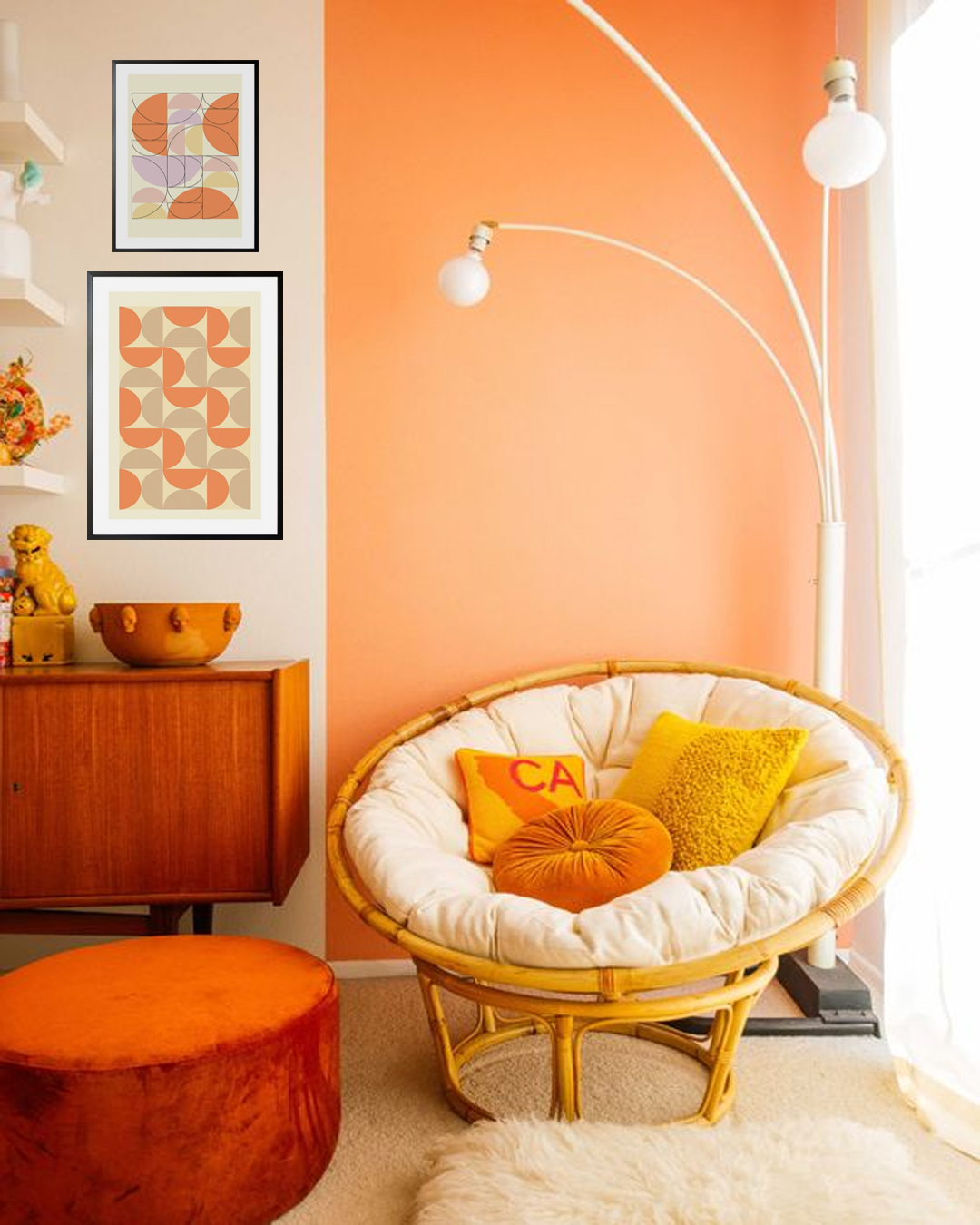
The monochromatic color scheme is based on a single color with the use of different shades, tones, and tints. Tints are achieved by the addition of white, while shades and tones are achieved by adding darker colors, such as gray or black. The color scheme offers a sense of visual cohesion and can help attract attention, create focus, and support legibility.
The downside is, that a monochromatic color scheme is oftentimes associated with being dull or boring. As such, in decorating your home, you usually add accents. Examples are the display of paintings or art and adding cushions or fabric.
Complementary
This color scheme may be a bit challenging to achieve but if successful, the results can be simply stunning. Complementary color schemes are actually a combination of two colors that sit opposite each other on the color wheel. The colors are in high contrast like blue, orange, yellow, and purple. These colors can be used as accents against monochromatic or neutral backgrounds. Another way to use the colors is by using one of them as a base and the other one as an accent.
Neutrals
If you have any doubts or are not confident in using the said color schemes then stick to the classic. Neutral colors are grouped into warm and cold. Examples are black, white, gray, and beige. Examples of warm ones are creamy whites, and shades of brown. These colors can help make any room feel cozy with a classic feel.
Triad
This color combination uses three colors that form a perfect triangle in the color scheme. The colors offer a more intense effect. It is recommended to tr different triads in the color wheel to achieve different visually intense harmonies. Sometimes the combination of vibrant colors can have awesome results.
Analogous
This color harmony uses three to five colors that are all adjacent to each other in the color wheel. It is one of the easiest to use in decorating any living space and paintings.
Split-complementary
This is similar to a complementary color scheme. However, split-complementary is usually used with a primary color and two tertiary colors. You will then be given the chance to explore more colors as you add colors to a painting. The combination of all colors creates gray or neutral colors.


