The Best Color Palettes for Holiday Wall Art This Season
The holiday season is the perfect time to refresh your home décor, and one of the most creative ways to do that is with festive wall art. Whether you’re framing prints, hanging posters, or creating a gallery wall, choosing the right color palette can elevate your space and give it that magical seasonal charm. This year, holiday wall art color trends blend classic favorites with modern twists, giving you plenty of inspiration to make your walls merry and bright.
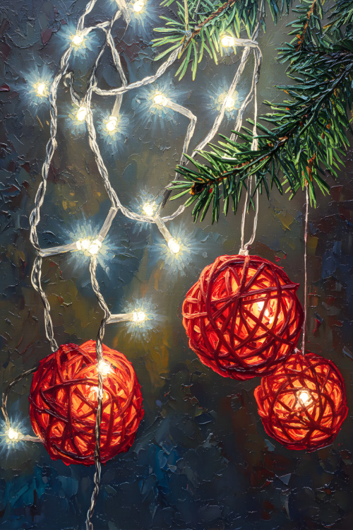
Classic Red and Green with a Modern Twist
Red and green are timeless holiday colors, but this season’s take on the duo adds depth and sophistication. Think deep berry reds paired with muted forest greens, accented with touches of cream or soft gold. This refined version of a classic palette works beautifully in traditional settings and adds warmth to any room. Posters featuring holly, wreaths, or vintage holiday scenes look extra festive in these rich hues.
Winter Whites and Icy Blues
For a more serene and elegant vibe, winter whites paired with icy blues are a standout choice. This palette evokes snow-covered landscapes and frosty mornings. It’s ideal for minimalist or coastal-inspired interiors, giving your holiday art an airy, tranquil feel. Mix prints of snowflakes, snowy forests, or abstract winter scenes in shades of white, silver, and cool blue for a cohesive gallery wall that feels like a breath of fresh winter air.
Jewel Tones with Metallic Accents
If you’re aiming for a bold and luxurious look, jewel tones are the best choice8. Emerald greens, sapphire blues, and amethyst purples bring richness and vibrancy to holiday art. When paired with metallic accents like gold or bronze in frames or print details, this palette feels opulent and festive. These colors work especially well in spaces with darker walls or wood finishes, adding depth and sparkle to your décor.
Warm Neutrals with Festive Pops
Neutral palettes are trending in home décor, and holiday art is no exception. Shades like warm beige, taupe, and soft gray create a cozy backdrop, while pops of seasonal red, forest green, or cinnamon add festive cheer without overwhelming your space. This balanced palette is versatile and complements a wide range of interior styles, from Scandinavian chic to farmhouse cozy.
Pastel Holiday Palette
For something unexpected, pastel hues offer a gentle, whimsical twist on holiday tones. Think blush pink, mint green, and pale lilac paired with soft gold or silver. This lighter palette is perfect for contemporary spaces or those looking to soften traditional holiday décor. Pastel-themed holiday posters or prints featuring simple motifs like stars or ornaments can add charm and uniqueness to your seasonal walls.
In a Nutshell
Choosing the perfect color palette for your holiday wall art can transform your space into a festive haven. Whether you lean toward classic hues or fresh modern combinations, there’s a palette to suit every taste and home style this season. With thoughtful selection, your holiday wall art will not only reflect the spirit of the season but also enhance the overall beauty of your décor.


