Few interior design and visual art techniques have as striking an impact as the “color splash.” This art style, which typically involves a predominantly black-and-white image with a vivid burst of color in one area, has become a popular choice in contemporary art prints. Whether used in photography, abstract pieces, or graphic design, the color splash effect draws attention, tells a story, and adds personality to any space.
What Is Color Splash?
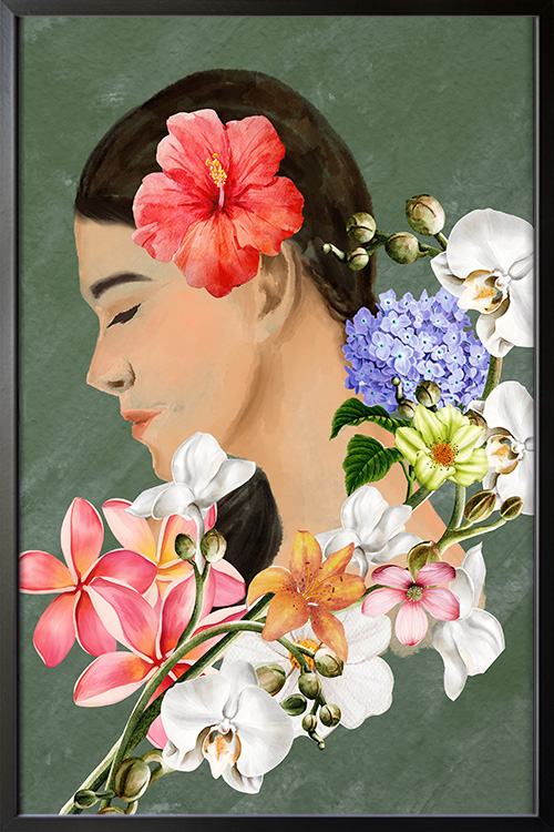
Color splash, also known as selective color, is a creative technique in which one element of an image is highlighted in color while the rest remains monochrome. This approach emphasizes a particular subject or area of interest, creating a dramatic contrast that immediately captures the viewer’s eye. It can be subtle, like a single red umbrella in a grayscale city scene, or bold, like a vibrant flower blooming in a black-and-white field.
Emotional and Visual Impact
Color splash is mighty because it evokes emotion and guides the viewer’s focus. Artists can highlight themes like passion, isolation, nostalgia, or vibrancy by isolating color. The technique encourages deeper engagement with the piece, prompting viewers to ask: “Why this color?” or “Why this object?” It turns the ordinary into something symbolic and thought-provoking.
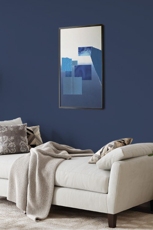
From a visual perspective, the contrast between grayscale and color creates a striking dynamic. The color element pops off the canvas or print, making it an excellent choice for a room’s feature walls or focal points. It’s an eye-catching addition that doesn’t overwhelm a space but rather enhances it with intentional flair.
Versatility Across Styles
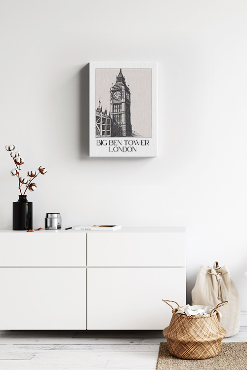
One of the most inspiring aspects of color splash in art prints is its versatility. It seamlessly fits into various genres, from fashion photography to urban landscapes, abstract patterns, and portraiture. The neutral background of these prints allows them to blend effortlessly into different design styles, including modern, industrial, minimalist, and even traditional interiors. This versatility can inspire you to experiment and create unique decor styles.
Art lovers who prefer a more subdued color palette in their decor can use color splash prints to introduce just the right amount of energy and visual interest without committing to bold, full-color artwork. It’s an ideal middle ground for those who want personality and vibrancy in a refined, elegant way.
Making a Personal Statement
Many people are drawn to color splash art because of the personal stories it can tell. A black-and-white photograph of a meaningful place with just one colorful detail—a red door, a yellow taxi, or a blue dress—can capture a memory or emotion in a way that feels intimate and unique. These prints often become more than just decor; they become conversation starters and cherished pieces within a home, fostering a sense of connection and engagement.
In a Nutshell
Color splash art prints are more than just visually appealing. They are expressive, modern, and deeply personal. They can highlight emotion, create visual contrast, and complement a wide range of interior styles, making a bold statement without overpowering a room. Whether you’re decorating a living room, office, or bedroom, a well-placed color splash print can transform your space and leave a lasting impression, empowering you to make confident and impactful design choices.