The Benefits of a Neutral Color Palette in Interior Design

Big Ben Tower London Sketch Canvas in a white room with white drawers and native weave basket

When designing a timeless, elegant, and effortlessly stylish home, neutral colors are hard to beat. From warm beiges and soft whites to calming grays and subtle pastels, a neutral palette offers possibilities for creating beautiful, livable spaces. 

Let’s explore why neutral colors continue to be favorites among designers and homeowners alike and how they can transform interiors. 

Create a Sense of Space and Light

Neutral tones, especially lighter shades like white, ivory, and pale gray, reflect natural light and make any room more open and airy. If you’re working with a small space or rooms that don’t get much sunlight, neutrals can instantly brighten things up and give the illusion of more space. 

Timeless Style That Never Goes Out of Fashion

Design trends come and go, but neutral colors are always in. Their classic appeal makes them a safe and smart choice if you want to design a home that feels fresh today and for the future. This timeless appeal provides a sense of security in your design choices. Starting with a neutral base, you can easily swap out accessories or accents as trends evolve without overhauling your entire space. 

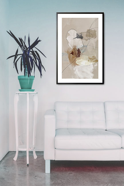
A Calm, Relaxing Environment

One of the most significant advantages of neutral colors is the peaceful atmosphere they create. Soft, muted tones naturally evoke a sense of calm, making them ideal for bedrooms, living areas, and any space where you want to relax and unwind after a busy day.

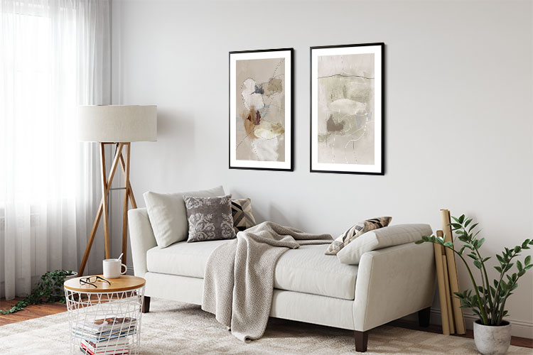
Versatility That Works With Any Style

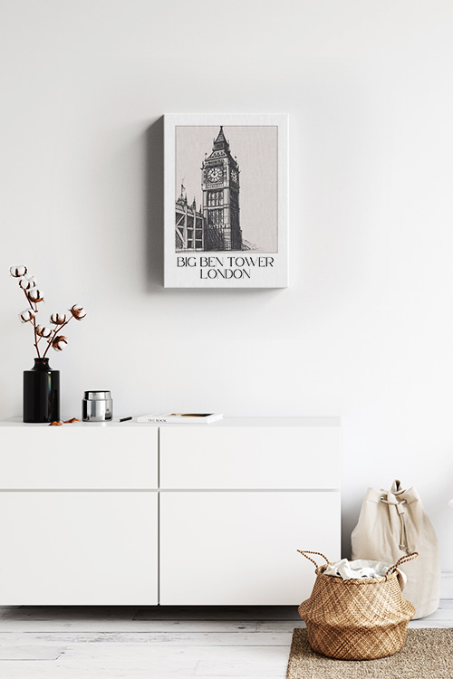
Neutral colors are the chameleons of interior design, seamlessly blending with any style. Whether your taste is modern, traditional, rustic, or eclectic, a neutral palette complements everything. These tones pair beautifully with different textures, patterns, and materials, allowing you to play with your decor while maintaining a cohesive look. This versatility empowers you to be creative and confident in your design choices. 

Easy to Maintain and Decorate Around

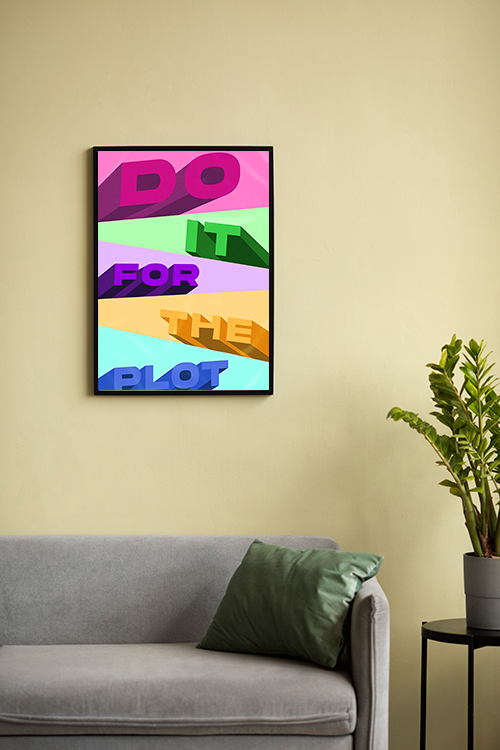
Neutral shades are not just aesthetically pleasing, they are also surprisingly practical. Compared to darker or more saturated colors, they tend to show less dust and wear. This practicality reassures you about the longevity of your design. Plus, they provide the perfect backdrop for bold accents, colorful art, and statement furniture, making it easy to refresh your space without repainting whenever your style evolves. 

In a Nutshell

If you plan a home makeover or simply want to refresh a room, consider starting with a neutral color palette. Not only does it offer timeless beauty and flexibility, but it also lays the foundation for a peaceful, polished, and perfectly personalized space.

Decorating Homes with Neutrals: A Timeless and Elegant Approach

Neutral Tone paint and lines no. 1 poster in interior

Neutral colors have long been a versatile part of our homes’ interior decorations. Their timeless and sophisticated beauty suits any home style, be it modern, rustic, or classic. Decorating with neutrals allows you to create a serene and inviting atmosphere, offering a wide spectrum of possibilities. From soft whites to deep charcoals, neutral palettes provide elegance, versatility, and a sense of tranquility. Here are some ideas on how to use neutrals in your home decor, empowering you to unleash your creativity. 

Understanding the Neutral Palette

Neutrals are not only limited to white and beige. The spectrum includes a variety of shades such as grays, taupes, creams, soft browns, and even muted pastels that act as neutrals. Warm neutrals like sandy beige and soft caramels bring coziness, while cool neutrals like slate gray and crisp white provide a modern and airy feel. 

Layering Tones for Depth

Layering, a key concept when decorating with neutrals, involves the strategic use of various hues within the same palette. Instead of using a single color throughout, consider pairing light cream walls with a darker beige sofa and taupe throw pillows. This subtle contrast prevents the space from feeling flat or monotonous, and adds depth and visual interest to your decor. 

Playing with Texture

Texture is crucial when using a neutral color scheme, adding dimension and warmth. Incorporate a mix of linen, wool, wood, and stone to enhance visual interest. A knitted throw and a reclaimed wood coffee table make a neutral space feel rich and inviting. 

Adding Statement Pieces

While neutral decor is all about subtlety, adding statement pieces can elevate the overall look. A striking light fixture, a bold patterned rug, or an oversized piece of artwork in neutral tones can serve as focal points without disrupting the harmony of the space. For instance, a unique chandelier in a metallic finish can add a touch of luxury, a rug with a geometric pattern can introduce visual interest, and a large abstract painting can become a captivating focal point in a neutral room. 

Balancing Light and Dark Neutrals

For a well-balanced design, it’s important to consider mixing light and dark neutrals. A room dominated by light shades may feel too sterile, while one filled with only dark tones can be heavy. By contrast, soft ivory walls with espresso furniture or a gray-toned room with warm beige accents can maintain equilibrium, giving you the confidence to make bold design decisions.

Introducing Natural Elements

Bringing in natural elements is a key aspect of enhancing the beauty of a neutral space. Indoor plants, wooden furniture, and stone countertops not only add an organic touch but also create a soothing environment. Greenery, in particular, stands out beautifully against a neutral backdrop, adding a touch of freshness and vibrancy, and helping you feel relaxed and at peace in your home. 

Using Neutrals in Different Rooms

Neutrals are versatile and work well in every room. In the living room, neutral-toned sofas and area rugs create a cozy and inviting setting. In the bedroom, soft beige bedding and curtains exude a calming ambiance. White cabinetry paired with a gray backsplash pins the kitchen, providing a clean and timeless look.

Enhancing with Metallic Accents

Metallic finishes such as gold, brass, or silver can add a touch of luxury to neutral decor. Consider using metallic light fixtures, mirror frames, or decorative accessories to introduce a subtle shimmer and elevate the design.

In a Nutshell

Decorating with neutrals is a timeless approach that offers flexibility, elegance, and a soothing environment. You can create an inviting and effortlessly stylish space by layering shades, incorporating textures, and balancing light and dark hues.  Whether designing a modern sanctuary or a cozy retreat, a neutral palette provides the perfect foundation for any home decor style.

The Benefits of a Neutral-Colored Palette in Interior Design

Gallery Wall art set Neutral Tone Paint and Lines Poster- 2

A neutral color palette in interior design offers timeless elegance, versatility, and a sense of tranquility. Whether designing a home or a commercial space, neutral tones provide a sophisticated foundation that enhances a space’s overall aesthetic and functionality. 

Timeless Appeal

One of the most significant advantages of a neutral color scheme is its timeless quality. Unlike bold colors that may go out of fashion, shades like beige, gray, white, and taupe remain stylish for years. This makes neutrals a smart choice for homeowners who want a classic look without the need for frequent updates. 

Versatility and Flexibility

Neutral colors, with their versatile nature, serve as a perfect canvas for a variety of design styles, from modern minimalism to rustic charm. They allow for easy updates by simply changing accent pieces such as pillows, rugs, or artwork. Whether your preference leans towards contemporary or traditional, a neutral base opens up a world of design possibilities. 

Creates a Calming Atmosphere

Soft, muted tones create a serene and relaxing environment. Colors like warm beige or soft gray evoke a sense of comfort and tranquility, making them ideal for bedrooms, living rooms, and even office spaces. A neutral palette helps reduce visual clutter, making the mind feel more at ease and promoting a sense of calm in your home. 

Enhances Natural Light

Light-colored neutrals, such as off-white or pale gray, reflect natural light, making a room feel brighter and more spacious. This is especially beneficial in smaller spaces or rooms with limited windows, where neutral tones can create a more open and airy feel. 

Increases Home Value

Neutral-colored interiors have a broad market appeal, making homes more attractive to potential buyers. These universally appealing shades provide a neutral canvas that allows buyers to envision their decor, thereby increasing the likelihood of a successful sale and potentially boosting the home’s value. 

Easy to layer with Textures and Accents

A neutral palette does not mean a lack of character. Neutral spaces can feel rich and inviting by incorporating different textures like wood, linen, or leather. Pops of color in accessories, artwork, or furniture can be easily changed to refresh the look without a complete redesign. 

In a Nutshell

A neutral-colored palette in interior design is an excellent choice for those seeking elegance, versatility, and a soothing ambiance. It provides a timeless backdrop that adapts effortlessly to different styles, inspiring you to get creative with your design choices. Whether designing a home or a commercial space, neutral colors create an inviting, stylish, and practical environment, allowing you to express your unique style.

A Splash of Personality: Adding Colors to Your Home

Abstract Patter and vibrant colors Poster

Our homes are sanctuaries, reflecting our personalities and moods. But sometimes, neutral walls and beige furniture can make our living spaces feel slightly bland. Enter the magic of color! Colors have a profound impact on our emotions and well-being. Introducing them strategically can breathe new life into your home, creating a stylish and refreshing space.

Understanding Color Psychology

Before revamping your homes, it’s helpful to understand how different colors affect us. Here’s a quick rundown:

  • Warm Colors (Reds, Oranges, Yellows): These colors evoke energy, warmth, and optimism. They’re perfect for social spaces like living rooms or kitchens but can feel overwhelming in bedrooms.
  • Cool Colors (Blues, Greens): Cool colors promote calmness, peace, and relaxation. Ideal for bedrooms and bathrooms, they can make overly large rooms feel cozier.
  • Neutrals (Whites, Grays, Beiges): Neutrals provide a clean canvas and a sense of balance. They can be used throughout the home and paired with bolder accent colors.

Choosing the Right Colors for Your Space

When picking your palette, consider the function of each room. Consider vibrant reds or yellows for energetic spaces like workout rooms or playrooms. Need a calming retreat? Try serene blues or lavenders for your bedroom. Remember the power of natural light! Rooms with ample sunlight can handle bolder colors, while rooms with less light might benefit from lighter, airier shades.

Beyond Walls: Adding Color with Flair

Paint isn’t the only way to embrace color! Here are some creative ideas:

  • Furniture: A statement sofa in a rich emerald green or a mustard yellow armchair can instantly add personality.
  • Rugs: Area rugs come in a vast array of colors and patterns. They add visual interest while anchoring furniture arrangements.
  • Textiles: Throw pillows, curtains, and tablecloths offer quick pops of color and can be easily swapped out for seasonal changes.
  • Artwork: Vibrant paintings, sculptures, posters, canvas prints, or photographs can be conversation starters and inject personality into your space.

Color Harmony: Striking the Right Balance

While bold colors are exciting, maintaining balance is critical. Here are some tips:

  • The 60-30-10 rule: This classic design principle recommends using a dominant color (60%), a secondary color (30%), and an accent color (10%) to create a cohesive yet visually exciting space.
  • Color matching: Use a color wheel for inspiration. Colors opposite each other on the wheel (complementary colors) create a vibrant contrast, while colors next to each other (analogous colors) create a more harmonious feel.
  • Feel free to experiment: Start with smaller areas like an accent wall or furniture. Observe how the colors feel in the room before committing to more significant changes.

Final Touches and Considerations

Remember, good lighting plays a crucial role in how colors appear. Invest in dimmers or layered lighting options to adjust the mood and make your chosen colors shine. Consider the existing finishes in your home. Wood floors pair well with warmer tones, while sleek metal accents complement cooler hues.

In a nutshell

Adding color to your home is a fun and personal journey. Embrace the process, be bold (or not!), and most importantly, create a space that reflects your unique style and makes you feel happy and inspired. After all, a splash of color can go a long way in transforming your house into a proper home.

A Warm Welcome: The Resurgence of Warm Colors in Interior Design

Seoul Colored City Map Canvas

Cool greys and crisp blues dominated the interior design scene for a while. But lately, there’s been a shift towards a more inviting atmosphere. Warm colors make a comeback, infusing homes with coziness, sophistication, and personality. This trend isn’t about a single shade; it’s a spectrum of warmth offering a variety of design possibilities.

Earthy Inspiration

Earthy tones, such as beiges, caramels, and rich browns, lead the charge. These grounding colors evoke a sense of comfort and create a natural foundation for a space. Their incredible versatility allows you to build a warm and inviting base, inspiring you to layer in bolder accents or pops of color and unleash your creativity.

Beyond Neutrals

While earthy tones provide a solid base, the comeback of warm colors goes beyond neutrals. We’re seeing a resurgence of richer, more saturated shades. Terracotta, a burnt orange hue, is widespread, adding a touch of earthy elegance. And then, there are the deep, luxurious jewel tones like emerald green and sapphire blue. These colors make a bold statement, offering a sense of luxury and drama that will surely intrigue and excite you.

Bold and Beautiful

Don’t be afraid of bolder hues! Warm reds, from fiery scarlets to sultry burgundies, are back in a big way. These colors add drama and sophistication, perfect for creating an accent wall or incorporating a statement piece of furniture. They also bring a sense of daring and adventure to your space, encouraging you to step out of your comfort zone.

Pops of Playfulness

Warm colors aren’t just about boldness; they can also be playful! Soft pinks, yellows, and lavenders add a touch of whimsy and cheerfulness. These can be used for throw pillows, artwork, or even an accent chair, injecting personality into your space.

Why the Warmth

The reasons behind this trend are multifaceted. After a period of uncertainty, people are craving a sense of comfort and security in their homes. Warm colors naturally evoke these feelings, creating a more inviting and cozy atmosphere. Additionally, warm colors tend to be more stimulating and energetic, reflecting a renewed focus on the joys of life.

Embrace Your Personality

This trend also caters to a desire for personalization. The wide range of warm colors allows you to tailor your space to your unique style. Whether you prefer the earthy sophistication of browns or the playful charm of pastels, there’s a warm hue to reflect your personality and create a space that feels truly your own.

The comeback of warm colors in interior design is more than just aesthetics; it’s about creating a comfortable, inviting space that reflects your personality. So, don’t be afraid to embrace the warmth and create a home that feels like a haven.

What are the Ideal Colors for the Nursery?

Cute Sea Otter Canvas

Choosing nursery colors depends on various factors, such as personal preference, desired atmosphere, and the child’s gender. Here are some things you need to consider when preparing the room or your baby’s arrival:

Soft and Calming Colors

Opt for colors that can create a soothing and relaxing atmosphere. Soft pastel shades like light blue, greens, yellows, or lavenders are not just aesthetically pleasing. They can also positively impact your baby’s mood and sleep patterns. As such, you can be confident that you’re making the right choice for your little one. 

Neutral Colors

Neutral tones like beige, ivory, or soft grays can create a serene and timeless look. They likewise provide a versatile backdrop for various themes or decorations. 

Accent Colors

You can add accents or brighter colors. Examples are coral, mint, and soft peach, which bring vibrancy without overwhelming the space. 

Gender-Neutral Options

If you prefer to avoid traditional pink or blue themes, gender-neutral colors like mint green, lemon yellow, or light gray can be stylish and adaptable.

Check the Lighting

Take into account the natural light in the room. Darker colors make the room look and feel smaller, while lighter colors help brighten the space.

Theme and Decor

If you have a specific theme (like animals, nature, or a favorite storybook), choose colors that complement that theme. 

Longevity

Select colors that will grow with the child. Avoid overly juvenile themes if you plan on keeping the same decor for several years. 

Ultimately, the ideal colors for a nursery create a peaceful and nurturing atmosphere for both the baby and the parents. It is a good idea to test paint samples on the wall to see how they look under different lighting conditions before making a final decision. 

Why Colors Matter in Interior Decoration

Do It For The Plot Poster

Color plays a crucial role in interior decoration for several reasons:

Setting the Mood

Colors can evoke emotions and set the overall mood of a space. For example, warm colors like reds, oranges, and yellows can create a cozy and inviting atmosphere, while cool colors like blues and greens can promote calmness and relaxation.

Creating Visual Interest

The right combination of colors can add depth and dimension to a room. The contrast between colors or shades can highlight architectural features, furniture pieces, or artworks, making the space visually appealing.

Influencing Perception of Space

Colors can affect how we perceive the size and shape of a room. Lighter colors make a space feel larger and more open, while darker colors can create a more intimate and enclosed feeling.

Reflecting Personal Style

Color choices in interior design often reflect the homeowner’s or designer’s personality and style preferences. Whether bold, vibrant, subtle, or neutral, colors can express individuality and create a personalized space.

Enhancing Functionality

Colors can also enhance a space’s functionality. For example, bright colors in a kitchen or workspace can promote energy and productivity, while soothing colors in a bedroom can encourage relaxation and better sleep.

Connecting Spaces

Consistent color schemes throughout different rooms can create a sense of harmony and flow within a home. Thoughtful use of color can unify spaces and create a cohesive design theme.

Adapting to Light Conditions

The beauty of color is its adaptability. It can change and transform under different lighting conditions. By choosing colors that work well under specific lighting, we can ensure that our rooms always look their best, no matter the time of day or the type of light.

In summary, color is not just a tool in interior decoration, it is a transformative force. It has the power to shape a space’s aesthetics, functionality, and emotional impact. By carefully considering our color choices, we can turn a room into a harmonious and welcoming environment perfectly tailored to our needs and preferences.

How Different Colors Affect the Brain

Flowers pattern colors Poster

Colors profoundly impact our emotions, perceptions, and even physical well-being. The psychological and physiological effects of color can influence our mood, behavior, and cognitive function. Here’s an overview of how different colors can affect the brain:

Red

  • Emotion and Energy: Red is a stimulating color often associated with passion, excitement, and energy. It can raise heart rate and increase adrenaline, so it’s frequently used to grab attention.
  • Alertness: It can enhance metabolism and increase levels of alertness. However, excessive exposure may lead to feelings of aggression or anxiety.

Blue

  • Calmness and Serenity: Blue is known for its calming effects and is often associated with tranquility and peace. It can lower heart rate and reduce stress.
  • Productivity: Blue can also improve focus and productivity, making it a popular choice for offices and study spaces.

Yellow

  • Happiness and Optimism: Yellow is a bright and cheerful color that can evoke happiness and positivity. It’s often associated with sunlight and warmth.
  • Attention: It can stimulate mental processes and nervous system activity. However, too much yellow might lead to feelings of frustration or agitation.

Green

  • Balance and Harmony: Green is associated with nature and can be soothing and refreshing. It promotes feelings of balance, harmony, and calm.
  • Relaxation: Green can help reduce stress and promote relaxation, making it a good choice for bedrooms and living spaces.

Orange

  • Excitement and Enthusiasm: Orange combines the energy of red and the cheerfulness of yellow. It can stimulate activity and socialization, making it an excellent color for social spaces.
  • Appetite: Orange can also increase appetite, so it’s often used in dining areas.

Purple

  • Creativity and Luxury: Purple is often associated with creativity, luxury, and spirituality. It can inspire imagination and artistic expression.
  • Calm and Peaceful: Lighter shades of purple, such as lavender, have calming effects similar to blue.

Pink

  • Calm and Nurturing: Pink is often associated with calmness and nurturing, especially in its softer shades. It’s also associated with love and compassion.
  • Reduction of Aggression: Studies have shown that exposure to pink can reduce aggression and promote calm behavior.

White

  • Cleanliness and Simplicity: White is associated with purity, cleanliness, and simplicity. It can make spaces feel more extensive and more open.
  • Focus: White can also help with focus and mental clarity, but too much white might feel sterile and uninviting.

Black

  • Power and Elegance: Black is often associated with sophistication, energy, and elegance. It can add depth and a sense of grounding to a space.
  • Mood: While black can be dramatic and stylish, too much black can sometimes lead to feelings of sadness or heaviness.

Gray

  • Neutrality and Balance: Gray is a neutral color that can create a sense of balance and calm. It’s often used as a background color to highlight other colors.
  • Sophistication: Depending on the shade, gray can also evoke a sense of sophistication and formality.

Brown

  • Comfort and Stability: Brown is associated with earthiness and can create a sense of comfort and stability. It’s a grounding color that can make spaces feel cozy and secure.
  • Warmth: Brown tones can add warmth and richness to a space.

Understanding the impact of colors can help you make informed decisions when designing your living environment, ensuring that the space promotes the desired mood and functionality.

Why You Need Colors In Your Space

French poster art wall

Room makeovers can be time-consuming and expensive. However, there are easy and creative ways to freshen up your space. Adding colors with trendy prints is one remarkable way to transform the interior appearance quickly. 

The effects of colors on behavior

Color psychology studies hues as a determinant of human behavior. Several studies have shown that colors can affect a person’s mood and mind. This observation can be traced back to Ancient Egypt, wherein they studied the effects of color on mood and used them to give people several benefits. 

Psychology has studied the effects of color on human behavior. Colors are used in many industries, such as business, advertisement, design, and art. In general, colors are divided into cool and warm colors. Each group is known to affect human mood and behavior.

What are the colors to add

You may wonder how colors affect the environment. There are three ways in which colors behave. They can be active, passive, or neutral. For instance, neutral colors such as black, gray, white, and brown establish balance in the interior appearance. These colors can buffer the effects of cool and warm colors. 

Warm colors evoke warmth, reminding us of the sun and fire. Examples are red, yellow, and orange. Cool colors, such as blue, green, and purple, evoke an incredible feeling, reminding us of water and plants. For hundreds of years, this concept has been studied and recorded and is used in many ways. 

Here are some colors and their meanings:

Red

It is associated with energy, war, danger, strength, power, determination, Valentine’s Day passion, desire, love, and intimacy. This is why many establishments decorate their interior with shades of red during the celebration. The shade is also employed in the kitchen as it stimulates the appetite. Choose this color if you want to add excitement to your room. 

Orange

It is associated with sunshine, joy, and warm tropics. This color symbolizes happiness, creativity, success, encouragement, and stimulation. 

Yellow

Represents joy, happiness, intellect, and energy. The color is perfect for adding to the kitchen, bathrooms, dining room, and hallway. This is a cheerful color if the right shade is chosen. It can also blend with neutral colors for a more sophisticated-looking interior.

Green 

It is the color of nature and is considered a calming color for the eye. It symbolizes harmony, growth, freshness, and fertility. Adding green to your home gives it a soothing and relaxing atmosphere. 

Blue 

It is the most popular color in many countries. It symbolizes trust, loyalty, wisdom, confidence, intelligence, faith, and truth. The color is also said to benefit the mind and body due to its relaxing effects. 

Purple

Its mysterious color can add drama and sophistication to any living space. 

Warm Colors For A Cheerful Vibe

Contemporary Art Wall

Many studies have shown that colors have a significant impact on the behavior of most individuals. Generally, there are two types of colors: warm and cool. These have substantial effects on mood and behavior. It is just right to learn more about colors and color combinations so you will be able to create a vibrant room environment.

Bright colors for your rooms

When decorating your home, you often think about the color scheme, especially on the walls. It is one of the most essential elements in interior decorating. Colors are known to help set the mood in a room considerably. 

Colors are generally divided into warm and cool colors. Warm colors like red, orange, and yellow are known to be comfortable and inviting. They are commonly used in rooms where guests are usually received and where numerous activities are generally done. The living room, for example, is one of the rooms that need warm colors so that it appears welcoming and cozier.

Give your living room a cheerful vibe

The living room is one of the busiest rooms in the house. It is where we receive our guests, do bonding activities with the family, watch television shows, work, study, and relax. Incorporating warm colors can make the living room look more comfortable and relaxing—a perfect place to stay and rest after work or school. 

Therefore, decorating the living room in a way that combines your style and personality is essential. The first thing that comes to mind whenever we talk about home makeovers is the color of the paint to use. Bright colors and neutral colors are commonly used colors in the living room. These colors are easy to use as they instantly blend with other decorative elements. 

Add warm colors to the bedroom

The bedroom walls are often seen in cool colors. Cool colors like blue are known to help in giving good sleeping habits. However, experts also believe in adding warm, bright colors with soothing tones. These will create a room that pops with colors while encouraging relaxation. 

Warm colors in the playroom

The playroom is where all the fun and excitement happens. A room where you can share quality time with your little ones for learning and playing. Add colors that can energize and excite their minds. However, be careful with your color choices as they depend on your child’s personality. For hyperactive kids, adding anything with shades of red is not recommended. Red is known to promote activity, thus increasing the heart and respiratory rates. 

Prints with warm colors

It is also expected to see rooms only with posters on the walls. You can treat these walls as big canvases where you can design and display your art. It is also an excellent opportunity to create impressive wall art that can be the room’s focal point. 

Posters have numerous designs available that can add colors to your rooms. Bohemian-inspired prints are perfect to make any room look vibrant. These posters can easily add style and statement to your rooms. Posters that feature abstract art are likewise great examples of prints that can make any room appear lively. 

In artdesign.ph, we have a wide range of poster print collections that can quickly help you complete the interior decorating project. The prints are also affordable, so you can still decorate your rooms even if you are tight on the budget.