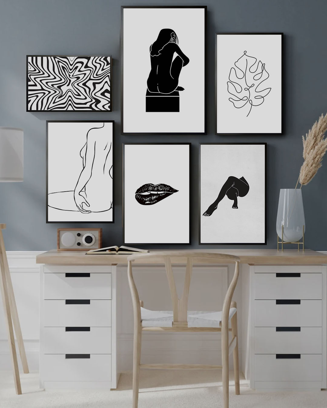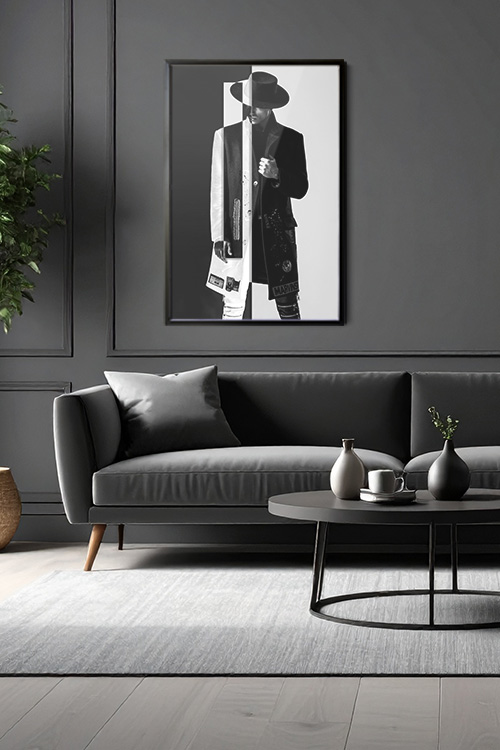
When it comes to timeless interior design, nothing feels quite as effortlessly stylish as a monochrome living room. Rooted in simplicity yet rich in sophistication, this look focuses on a restrained palette—often shades of black, white, and gray—to create a space that feels modern, sleek, and endlessly versatile.
A clean canvas
The beauty of a monochrome scheme lies in its simplicity. White or light gray walls create a fresh backdrop, setting the tone for a calm, cohesive space. From there, darker accents like charcoal sofas, black frames, or bold patterned rugs can anchor the room with depth and definition.
Play with contrast
Monochrome design thrives on the balance of contrast and texture. Pairing light and dark elements instantly adds drama and interest without feeling overwhelming. Imagine a crisp white sofa softened by black throw pillows, or a dark coffee table balanced by a pale rug. The push and pull between tones creates a balanced rhythm that feels elegant yet approachable. The variety of textures, from plush to matte, glossy to woven, adds depth and keeps the space from feeling flat, inspiring you to experiment with your own design.
Texture is everything
Because the palette is limited, texture becomes the star of the show. Plush rugs, matte finishes, glossy surfaces, or woven fabrics all bring variety and warmth. A velvet cushion next to a sleek leather armchair or a soft wool throw draped over a metal-framed chair adds depth and keeps the space from feeling flat.
Add subtle accents
Though monochrome is primarily neutral, small accents can enhance its beauty. Metallic finishes in gold, silver, or brass add a touch of glamour. A pop of greenery from indoor plants introduces freshness without breaking the palette. Other subtle accents like a textured throw, a unique vase, or a decorative tray can also prevent the room from looking too stark or cold.
Keep it personal
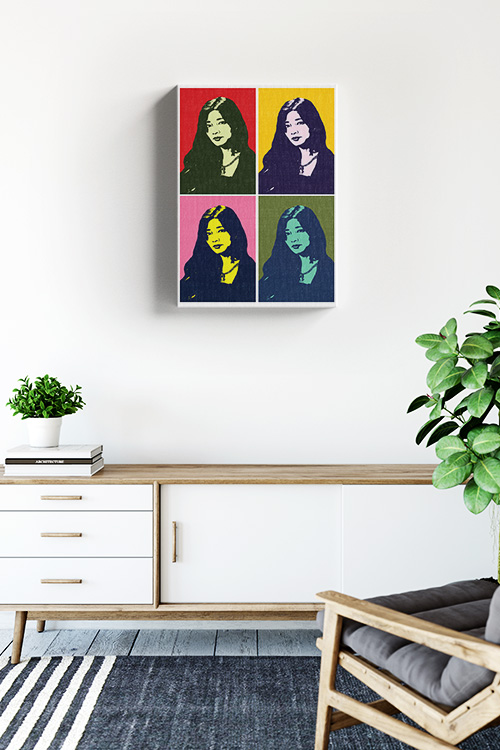
A monochrome living room doesn’t have to feel formal or distant. Personal touches like black-and-white family photos, abstract art, or sculptural décor bring character into the space. The trick is to curate carefully, allowing each piece to breathe while keeping the overall look clean and uncluttered. This personalization makes the space feel uniquely yours, creating a sense of connection and comfort that is unmatched in other design styles.
Timeless and versatile
The best part of a monochrome living room is its adaptability. It can lean minimalist and modern, or cozy and classic, depending on how you style it. The restrained palette makes it easy to refresh with minor updates—swap out pillows, rotate art, or shift accessories—while the overall look stays elegant year after year. This adaptability empowers you to be creative and make the space your own, giving you the freedom to experiment and evolve your design.
In a Nutshell
Monochrome elegance proves that sometimes, less truly is more. With the right balance of contrast, texture, and thoughtful detail, your living room can be both chic and inviting—a space that feels timelessly sophisticated, elevating your home to a new level of style and grace.