How to Create a Luxurious Bedroom with Art Prints

Peace of Mind Canvas

A luxurious bedroom isn’t just about expensive furniture or high-end materials–it’s about creating a space that feels intentional, elegant, and uniquely yours. One of the most effective and accessible ways to elevate your bedroom’s aesthetic is through art prints. Whether drawn to modern minimalism or classic glamour, the right art can instantly transform your space into a refined sanctuary. Here’s how to create a luxurious bedroom using art prints.

Choose a Theme or Mood

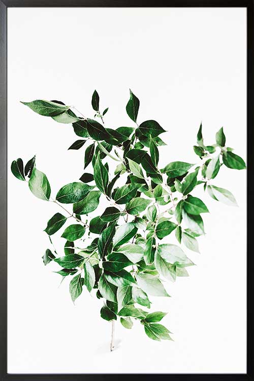
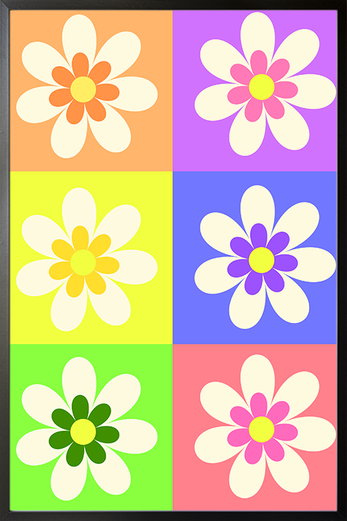
Before selecting art prints, define the mood you want for the bedroom. Do you want a serene, spa-like atmosphere? Or are you going for something bold and dramatic? Your chosen mood will guide your selection. Soft abstract pieces or nature-inspired prints evoke tranquility, while high-contrast photography or vivid pop art adds drama and sophistication. 

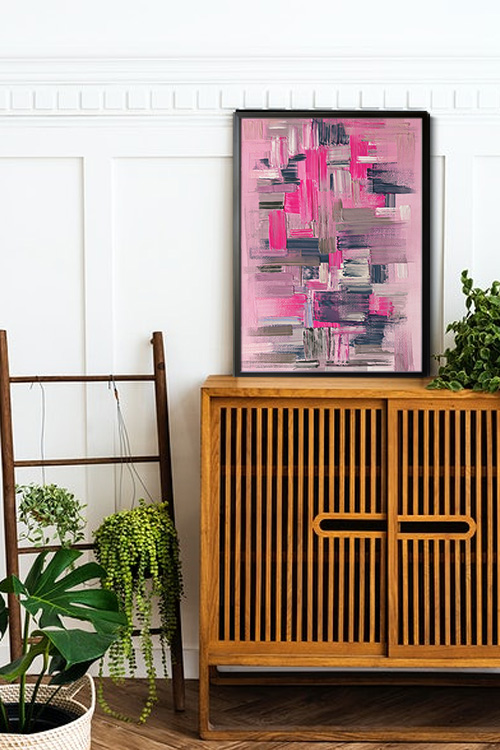
Focus on Quality Over Quantity

Luxury often comes from restraint. Instead of crowding every wall with art, go for fewer, high-impact pieces. Invest in good-quality prints with crisp resolution, and elevate them with beautiful frames–think metallic finishes, sleek black, or classic wood. A well-framed art print can rival an original painting in visual impact, making you feel discerning and sophisticated. 

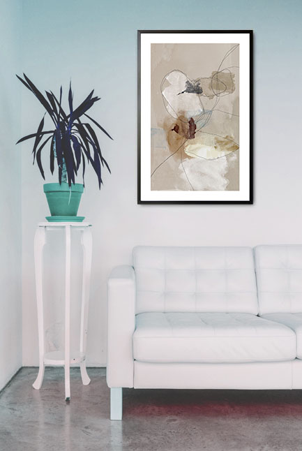
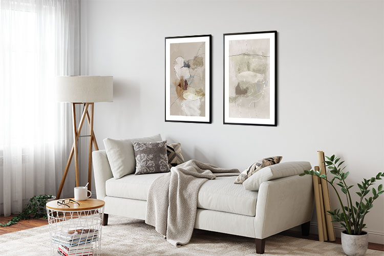
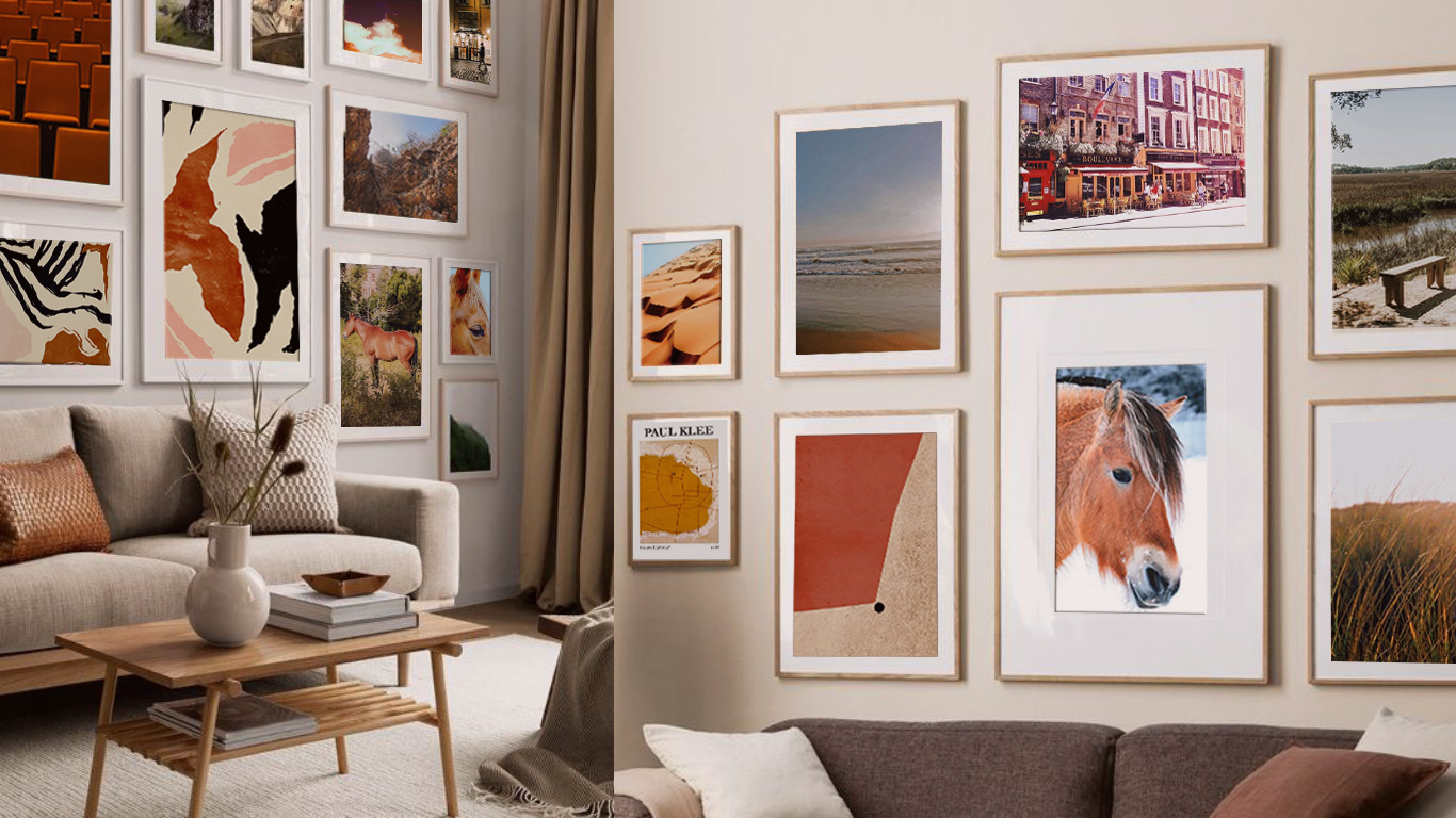
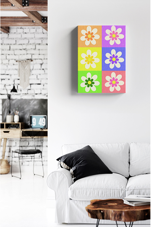
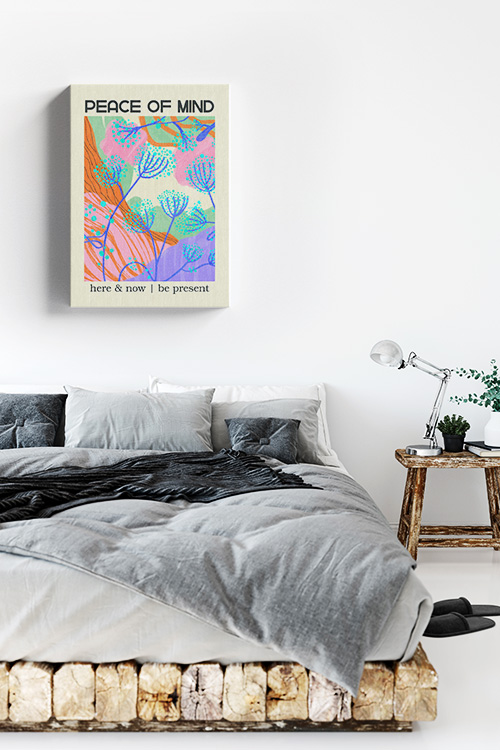
Create a Statement Wall

A statement art wall behind your bed can be a stunning focal point. Large-scale prints or a symmetrical grid of smaller ones can instantly elevate the space. Choose art that ties in with your bedroom’s color palette to maintain cohesion or contrast tones to add depth and drama.

Mix and Match Styles

Don’t hesitate to mix different art styles–combining modern abstract art with traditional landscape paintings, or photography with illustration–can create a layered, curated look. Maintaining a consistent color scheme or thematic thread to unify the pieces is key. This adds visual interest while keeping the room polished and harmonious. 

Consider Placement and Proportion

Where you place your art is just as important as the art itself. Hang prints at eye level or above furniture lines to balance the room. Oversized prints work well above headboards or dressers, while smaller prints are perfect for bedside walls or gallery-style arrangements. 

Add Depth with Lighting

Highlight your art prints with intentional lighting. Picture lights, wall sconces, or subtle spotlights can make your artwork stand out while adding a soft glow to the room. Lighting adds dimension and drama, two key elements of a luxurious design, inspiring and intriguing you with its transformative power.

Personalize with Meaningful Pieces

Luxury does not mean impersonal. Include prints that reflect your taste, travels, or passions. Whether it’s a favorite quote in elegant typography, a vintage travel poster, or an art print by a local artist, these personal touches not only elevate your bedroom but also make it uniquely yours, adding a sense of connection and individuality. 

Keep it Cohesive

Your art should complement the rest of your decor. For instance, if your bedding has a hint of blue, consider choosing art prints with similar blue tones. Luxurious bedrooms often have a sense of harmony and flow; coordinating your artwork with other decor elements helps create that seamless experience.

In a Nutshell

Art prints are a powerful way to inject luxury, personality, and sophistication into your bedroom without requiring significant renovations or extravagant budgets. With thoughtful curation, elegant framing, and intentional placement, your bedroom can feel like a private gallery that inspires, soothes, and surrounds you with beauty.

Decorating Homes with Neutrals: A Timeless and Elegant Approach

Neutral Tone paint and lines no. 1 poster in interior

Neutral colors have long been a versatile part of our homes’ interior decorations. Their timeless and sophisticated beauty suits any home style, be it modern, rustic, or classic. Decorating with neutrals allows you to create a serene and inviting atmosphere, offering a wide spectrum of possibilities. From soft whites to deep charcoals, neutral palettes provide elegance, versatility, and a sense of tranquility. Here are some ideas on how to use neutrals in your home decor, empowering you to unleash your creativity. 

Understanding the Neutral Palette

Neutrals are not only limited to white and beige. The spectrum includes a variety of shades such as grays, taupes, creams, soft browns, and even muted pastels that act as neutrals. Warm neutrals like sandy beige and soft caramels bring coziness, while cool neutrals like slate gray and crisp white provide a modern and airy feel. 

Layering Tones for Depth

Layering, a key concept when decorating with neutrals, involves the strategic use of various hues within the same palette. Instead of using a single color throughout, consider pairing light cream walls with a darker beige sofa and taupe throw pillows. This subtle contrast prevents the space from feeling flat or monotonous, and adds depth and visual interest to your decor. 

Playing with Texture

Texture is crucial when using a neutral color scheme, adding dimension and warmth. Incorporate a mix of linen, wool, wood, and stone to enhance visual interest. A knitted throw and a reclaimed wood coffee table make a neutral space feel rich and inviting. 

Adding Statement Pieces

While neutral decor is all about subtlety, adding statement pieces can elevate the overall look. A striking light fixture, a bold patterned rug, or an oversized piece of artwork in neutral tones can serve as focal points without disrupting the harmony of the space. For instance, a unique chandelier in a metallic finish can add a touch of luxury, a rug with a geometric pattern can introduce visual interest, and a large abstract painting can become a captivating focal point in a neutral room. 

Balancing Light and Dark Neutrals

For a well-balanced design, it’s important to consider mixing light and dark neutrals. A room dominated by light shades may feel too sterile, while one filled with only dark tones can be heavy. By contrast, soft ivory walls with espresso furniture or a gray-toned room with warm beige accents can maintain equilibrium, giving you the confidence to make bold design decisions.

Introducing Natural Elements

Bringing in natural elements is a key aspect of enhancing the beauty of a neutral space. Indoor plants, wooden furniture, and stone countertops not only add an organic touch but also create a soothing environment. Greenery, in particular, stands out beautifully against a neutral backdrop, adding a touch of freshness and vibrancy, and helping you feel relaxed and at peace in your home. 

Using Neutrals in Different Rooms

Neutrals are versatile and work well in every room. In the living room, neutral-toned sofas and area rugs create a cozy and inviting setting. In the bedroom, soft beige bedding and curtains exude a calming ambiance. White cabinetry paired with a gray backsplash pins the kitchen, providing a clean and timeless look.

Enhancing with Metallic Accents

Metallic finishes such as gold, brass, or silver can add a touch of luxury to neutral decor. Consider using metallic light fixtures, mirror frames, or decorative accessories to introduce a subtle shimmer and elevate the design.

In a Nutshell

Decorating with neutrals is a timeless approach that offers flexibility, elegance, and a soothing environment. You can create an inviting and effortlessly stylish space by layering shades, incorporating textures, and balancing light and dark hues.  Whether designing a modern sanctuary or a cozy retreat, a neutral palette provides the perfect foundation for any home decor style.

Designing a Relaxing Bathroom Oasis

Framed Greenery plant poster

Designing a relaxing bathroom oasis is a pursuit in creating a serene sanctuary within your home, where comfort and tranquility reign supreme. The essence of such a space lies in blending functionality with aesthetics, turning your daily routine into a rejuvenating experience. Here’s how you can achieve this.

Layout and Spatial Arrangement

Start by considering the bathroom’s layout. Optimize the use of space to create an open and airy atmosphere. A spacious feel can be achieved through minimalist design elements and strategic placement of fixtures. Consider the flow of movement and ensure ample room around key areas like the bathtub or shower.

Natural Elements

Incorporating natural elements brings a sense of calm and connection to nature. Use wood, stone, and bamboo for flooring, countertops, and accents. Natural light is crucial; maximize windows or use frosted glass to allow sunlight while maintaining privacy. 

Color Palette

Choose a soothing color palette that promotes relaxation. Soft blues, greens, earth tones, and neutrals are ideal choices. These colors evoke a sense of tranquility and create a harmonious environment. Avoid overly bright colors that can be stimulating rather than calming. 

Lighting Design

Lighting plays a vital role in setting the mood. Incorporate layered lighting, which involves using different types of lighting (such as task, ambient, and accent) to create a balanced and adjustable brightness according to your needs. Consider installing task lighting around mirrors and ambient lighting or overall illumination. 

Luxurious Fixtures and Materials

Invest in high-quality fixtures and materials that enhance comfort and aesthetics. A freestanding bathtub, rain showerhead, heated floors, and plush towels provide a luxurious experience. Choose durable materials that are easy to maintain, ensuring longevity and continued enjoyment.

Storage Solutions

Keep clutter at bay with ample storage solutions. Cabinets, shelves, and built-in niches can neatly organize toiletries and towels. Choose streamlined designs that complement the overall aesthetic without overwhelming the space.

Personal Touches and Décor

Infuse your personality into the décor with art, plants, and meaningful accents. Select artwork or sculptures that inspire serenity. Indoor plants like ferns or orchids not only add a touch of greenery but also improve air quality. Choose textiles such as rugs and curtains that are soft and inviting.

Technology Integration

Consider integrating technology for added convenience and relaxation. For instance, a smart mirror could have built-in lighting and a digital display for weather updates, while a programmable shower could allow you to set the water temperature and pressure to your liking. Sound systems for soothing music can also enhance the spa-like experience. Ensure that technology complements rather than dominates the space.

Accessibility and Safety

Prioritize accessibility and safety features to ensure a comfortable experience for everyone. Install grab bars, non-slip flooring, and accessible shower designs, which typically include a curbless entry and a bench, if needed. A well-designed bathroom should be both relaxing and functional for all users.

Maintenance and Longevity

Regular maintenance is essential to preserve the oasis-like atmosphere. Choose materials that are resistant to moisture and easy to clean. Implement a cleaning routine to keep surfaces pristine, allowing you to enjoy your relaxing retreat for years.

In a Nutshell

With these elements, you can transform your bathroom into a tranquil oasis that promotes relaxation and rejuvenation. Whether you prefer a minimalist spa retreat or a nature-inspired sanctuary, thoughtful design choices will create a space where you can unwind and recharge amidst the comforts of home.

How to Use Bold Patterns in Home Decor

Flowers pattern colors Poster

Adding bold patterns to home decor can add personality, depth, and visual interest to any space. Whether through wallpaper, furniture, rugs, or accessories, bold patterns bring energy and uniqueness to a room. However, using them effectively requires balance and thoughtful execution to avoid overwhelming the space. Here are some ideas for incorporating bold patterns into your home design quickly.

Start Small with Accents

If you’re new to using bold patterns, start with more minor elements like throw pillows, curtains, or rugs. These accents introduce a pattern without dominating the space. A geometric-print rug or floral-patterned cushions can instantly enhance a neutral room while maintaining flexibility for future changes. 

Choose a Focal Point

Bold patterns are best used as a focal point to draw attention without overpowering the space. For instance, a statement wall with patterned wallpaper, a boldly upholstered sofa, or a striking area rug can serve as the centerpiece. At the same time, the rest of the room remains relatively subdued.

Mix Patterns with Intention

Mixing different patterns can create an eclectic and dynamic look, and it’s an opportunity to unleash your creativity. Stick to a standard color palette to unify various patterns. For example, pairing stripes with florals or geometric prints with abstract designs works well when they share complementary tones. Varying pattern scales, which means combining large-scale prints with smaller ones, can create a balanced composition. For instance, a large floral print on a sofa can be balanced with smaller geometric prints on throw pillows. 

Use Neutrals to Balance Bold Patterns

To prevent bold patterns from feeling overwhelming, balance them with neutral or solid-colored elements. If you have patterned wallpaper, consider neutral-colored furniture to ground the space. Likewise, if your sofa features a bold print, opt for understated walls and flooring. The key is allowing the pattern to shine without competing with other design elements.

Consider the Mood and Style

Different patterns evoke different moods. For example, floral and botanical prints create a soft, organic feel, while geometric and abstract patterns lend a modern, energetic touch. Consider the atmosphere you want to achieve in each room. Soothing patterns like soft waves or subtle damask prints work well in a bedroom, whereas a living room may benefit from more vibrant, playful designs.

Use Patterns in Unexpected Places

Bold patterns don’t have to be limited to textiles and walls. Consider incorporating them in unexpected areas such as ceilings, stair risers, or kitchen backsplashes. A patterned tile backsplash can charm a kitchen, while a graphic ceiling design can create an unexpected wow factor. This adventurous use of patterns can truly transform a space and make it uniquely yours.

Layer with Texture for Depth

To prevent a bold pattern from feeling flat, layer it with different textures. Pair a patterned velvet chair with a linen throw, or combine a busy wallpaper with a wood or stone accent. This layering technique adds depth and prevents the space from feeling too chaotic.

In a Nutshell

Using bold patterns in home décor is an exciting way to bring personality and style to a space. You can create a stylish and well-coordinated interior by starting small, balancing with neutrals, mixing patterns carefully, and considering textures. Whether you prefer dramatic wallpaper, playful textiles, or striking tiles, bold patterns can make your home feel more dynamic and uniquely yours. The potential of bold patterns is truly thrilling, offering endless possibilities for creating a space that reflects your personality and style.

The Benefits of a Neutral-Colored Palette in Interior Design

Gallery Wall art set Neutral Tone Paint and Lines Poster- 2

A neutral color palette in interior design offers timeless elegance, versatility, and a sense of tranquility. Whether designing a home or a commercial space, neutral tones provide a sophisticated foundation that enhances a space’s overall aesthetic and functionality. 

Timeless Appeal

One of the most significant advantages of a neutral color scheme is its timeless quality. Unlike bold colors that may go out of fashion, shades like beige, gray, white, and taupe remain stylish for years. This makes neutrals a smart choice for homeowners who want a classic look without the need for frequent updates. 

Versatility and Flexibility

Neutral colors, with their versatile nature, serve as a perfect canvas for a variety of design styles, from modern minimalism to rustic charm. They allow for easy updates by simply changing accent pieces such as pillows, rugs, or artwork. Whether your preference leans towards contemporary or traditional, a neutral base opens up a world of design possibilities. 

Creates a Calming Atmosphere

Soft, muted tones create a serene and relaxing environment. Colors like warm beige or soft gray evoke a sense of comfort and tranquility, making them ideal for bedrooms, living rooms, and even office spaces. A neutral palette helps reduce visual clutter, making the mind feel more at ease and promoting a sense of calm in your home. 

Enhances Natural Light

Light-colored neutrals, such as off-white or pale gray, reflect natural light, making a room feel brighter and more spacious. This is especially beneficial in smaller spaces or rooms with limited windows, where neutral tones can create a more open and airy feel. 

Increases Home Value

Neutral-colored interiors have a broad market appeal, making homes more attractive to potential buyers. These universally appealing shades provide a neutral canvas that allows buyers to envision their decor, thereby increasing the likelihood of a successful sale and potentially boosting the home’s value. 

Easy to layer with Textures and Accents

A neutral palette does not mean a lack of character. Neutral spaces can feel rich and inviting by incorporating different textures like wood, linen, or leather. Pops of color in accessories, artwork, or furniture can be easily changed to refresh the look without a complete redesign. 

In a Nutshell

A neutral-colored palette in interior design is an excellent choice for those seeking elegance, versatility, and a soothing ambiance. It provides a timeless backdrop that adapts effortlessly to different styles, inspiring you to get creative with your design choices. Whether designing a home or a commercial space, neutral colors create an inviting, stylish, and practical environment, allowing you to express your unique style.

The Beauty of Brown Aesthetic Posters

Different designs of brown themed poster prints

Decorating with brown aesthetic posters offers a timeless and versatile way to enhance any space. Their versatility allows them to blend warmth, sophistication, and a touch of nostalgia, making them a perfect fit for various artistic styles and themes in poster form.

The key to using brown aesthetic posters effectively is understanding how they interact with different design elements and personal preferences. Whether aiming for a rustic charm, a modern elegance, or a vintage appeal, brown posters can be integrated seamlessly into your decor. Here’s how:

Embracing Warmth and Comfort

Brown posters naturally evoke feelings of warmth and comfort. They are ideal for living rooms, bedrooms, or cozy reading nooks where relaxation is paramount. To enhance this feeling, consider posters featuring nature scenes, coffee-themed art, or abstract designs with warm tones.

Balancing with Other Colors

Brown is an excellent neutral base that can anchor a room’s color palette. Pairing brown posters with complementary colors like cream, beige, deep greens, and blues can create a harmonious balance. For example, a brown poster with botanical prints can be accented with greenery in the room to bring a refreshing contrast.

Creating Contrast and Depth

In contemporary settings, brown posters can add depth and contrast against lighter walls or furniture. Opt for posters with bold typography, geometric patterns, or minimalistic designs to achieve a modern aesthetic. The contrast between the room’s brown tones and lighter elements can make the posters stand out effectively.

Evoking Nostalgia and Vintage Vibes

For those fond of vintage or retro styles, brown aesthetic posters featuring classic advertisements, sepia-toned photographs, or old-fashioned illustrations can evoke a sense of nostalgia. These posters can be framed in antique or distressed frames to enhance their vintage appeal further.

Focusing on Texture and Material

Consider the posters and frames’ visual appeal, texture, and material. Brown posters printed on textured paper or canvas can add tactile interest to your walls. Avoid placing them in direct sunlight or areas with high humidity to maintain their quality. Regularly dust them with a soft, dry cloth. Pair them with wooden frames or matte finishes to maintain a cohesive aesthetic.

Personalizing with Artistic Themes

Personalize your space with brown posters that reflect your interests and passions. Whether you love abstract art, landscapes, portraits, or cultural motifs, brown-themed posters are available to suit every taste. This personal touch can create a unique and eclectic gallery wall that tells your story.

Enhancing Professional Spaces

Brown posters can create a sophisticated ambiance in office environments or professional settings. Opt for abstract or minimalist designs that promote focus and creativity while maintaining professional decorum, adding a touch of style to your workspace.

In a Nutshell

Decorating with brown aesthetic posters allows for a blend of warmth, style, and personal expression. Whether you’re aiming for a cozy home environment or a stylish office space, integrating brown posters into your decor can elevate the atmosphere and create a visually appealing environment that resonates with your personality and taste.

Finding Your Perfect Hue: A Guide to Paint Color Selection

Pink Dusk Poster

Choosing the right paint color for your space can be exciting and overwhelming. With endless options, finding the perfect hue requires careful consideration of lighting, room function, and most importantly, your personal style. This guide will help you navigate the process and confidently select a paint color that not only enhances your space but also reflects your unique taste.

Consider the Mood

Each color evokes a specific emotion, making it essential to align your choice with the atmosphere you want to create. Soft blues and greens bring a sense of calm and relaxation, making them perfect for bedrooms and bathrooms. Warm colors like red, orange, and yellow promote energy and conversation, making them ideal for dining rooms and living spaces. Neutrals such as beige, gray, and white provide versatility and can serve as a timeless backdrop.

Assess Natural and Artificial Lighting

Lighting plays a crucial role in how a paint color appears. Natural light can make colors look brighter, while artificial lighting can alter their tone. North-facing rooms often have more extraordinary, dimmer light, making colors appear slightly muted, while south-facing rooms receive warm, bright light that enhances warm tones. Understanding these lighting dynamics is key before committing to a color, so be sure to observe how it looks in different lighting conditions throughout the day.

Test Paint Samples

What looks perfect in the store may appear entirely different in your home. Instead of relying on small swatches, buy sample-sized cans of your top choices and paint large wall sections. This lets you see how the color interacts with your furniture, flooring, and décor. Live with the samples for a few days to ensure you love the color before making a final decision.

Take Inspiration from Existing Elements

If you struggle to find a starting point, look at your furniture, artwork, or textiles for inspiration. A favorite rug or artwork can be a foundation for your color palette. Consider the undertones of these elements—warm or cool—and choose a paint color that complements them.

Understand Color Undertones

Even neutral colors have undertones that can influence a room’s overall look. For example, a gray with blue undertones will feel cooler, while a gray with brown undertones will feel warmer. To avoid surprises, compare your chosen paint color to pure white to better see its underlying tones.

Use the 60-30-10 Rule.

A well-balanced color scheme follows the 60-30-10 rule. For instance, in a living room, 60% of the room could feature a dominant color on the walls, 30% could be a secondary color in the form of furniture or textiles, and 10% could be an accent color in the decor or accessories. This method ensures harmony and prevents too many competing shades from overwhelming the space.

Don’t Be Afraid to Go Bold

While neutrals are safe, bold colors can add personality and drama to a space. Deep navy, emerald green, or rich terracotta can create a stunning focal point. If committing to a bold color on all walls feels daunting, consider an accent wall or use it in a smaller space, like a powder room or hallway.

In a Nutshell

Choosing the perfect paint color requires intuition, strategy, and experimentation. By considering mood, lighting, and existing elements, you can find a hue that enhances your space and reflects your personality. With thoughtful planning and testing, your chosen color will bring new life to your home.

Painted Palette Poster

Painted Palette Poster

Looking to add a pop of color to your space? Check out this painted palette poster print! Bursting with vibrant hues, this piece will brighten up any room. Whether you’re a fan of bold primaries or soft pastels, this print has it all. With a mix of shades and tones, it’s like having a whole rainbow at your fingertips. Hang it up in your living room, bedroom, or office for an instant mood lift.

Painted Palette Canvas

Painted Palette Canvas

Looking to add a pop of color to your space? Check out this painted palette canvas print! Bursting with vibrant hues, this piece will brighten up any room. Whether you’re a fan of bold primaries or soft pastels, this print has it all. With a mix of shades and tones, it’s like having a whole rainbow at your fingertips. Hang it up in your living room, bedroom, or office for an instant mood lift.

Mixing Patterns and Textures in Your Home

Flowers pattern colors Canvas

Mixing patterns and textures in home decor can transform a space, adding visual interest, depth, and personality. However, achieving a cohesive and aesthetically pleasing look requires thoughtful planning and a clear understanding of design principles. Following key guidelines, you can master combining patterns and textures to create a stylish and harmonious environment.

Establish a Neutral Base

The foundation of any well-designed space often begins with a neutral base. Neutral colors, such as whites, beiges, or grays, create a calm and versatile backdrop that allows patterns and textures to stand out without overwhelming the room. Use neutrals for large surfaces like walls, flooring, or significant furniture. This approach provides balance and ensures that the space remains adaptable to future updates.

Select a Cohesive Color Palette

A unified color palette is essential for successfully blending patterns and textures. To maintain harmony, choose complementary colors or stick to various shades of a single hue. For instance, pairing cool tones like blues and grays with warm accents like gold or terracotta can create a balanced and inviting atmosphere. Repeating colors across patterns and textures helps tie the design elements together.

Balance Pattern Sizes

One of the most effective ways to mix patterns is to vary their scales. Large, bold patterns work well for statement pieces, such as area rugs or accent walls, while medium-sized patterns are suitable for upholstery or curtains. Smaller patterns, like subtle prints or intricate designs, can be used for throw pillows or smaller accessories. Balancing different pattern sizes prevents the space from feeling chaotic and ensures that each element contributes to the overall design.

Incorporate a Variety of Textures

Texture plays a crucial role in adding depth and dimension to a room. Mixing soft, rough, and smooth textures creates a layered effect that interests the space visually. For example, pair a plush velvet sofa with a jute rug, a sleek glass coffee table, and a woven throw blanket. You can achieve a rich and dynamic look by blending different materials, such as wood, metal, fabric, and stone.

Anchor with Solids

Anchor your design with solid-colored elements to avoid overwhelming the space. Solids provide a visual rest and help balance the complexity of mixed patterns and textures. For example, a solid-colored bedspread can ground a bedroom filled with patterned pillows and textured throws. Similarly, a monochromatic sofa can be the perfect backdrop for various patterned cushions.

Experiment and Edit

Creativity and experimentation are essential when mixing patterns and textures. Start by gathering swatches or samples to see how different elements interact. Create a mood board or test arrangements before committing to large purchases. Editing is equally essential; if a particular element feels out of place, don’t hesitate to remove or replace it.

Reflect Your Style

Finally, the most successful designs reflect the homeowner’s personality and style. Incorporate unique pieces such as handmade ceramics, heirloom quilts, and travel souvenirs to add character and authenticity to your space. These personal touches make the room feel special and ensure it resonates with you.

By carefully combining patterns and textures, you can create a visually captivating, comfortable, and uniquely yours home. With a bit of planning and creativity, the possibilities are endless.