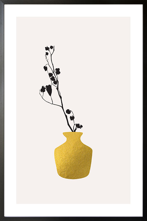
Simple and interesting poster design that will give any room a touch of nature. The display of this art is one of the coolest ways to add beauty to your walls. A wonderful art that will complete the appearance of any room.
Simple and interesting poster design that will give any room a touch of nature. The display of this art is one of the coolest ways to add beauty to your walls. A wonderful art that will complete the appearance of any room.
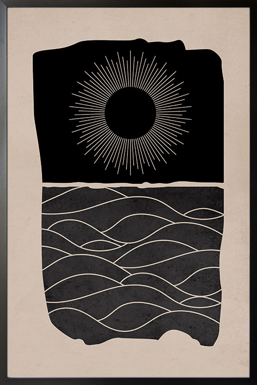
Simple yet compelling poster design of the sun and landscape. Create a cool and fantastic wall wall design with a poster from the Art Prints collection of Artdesign. This poster will instantly make your walls look impressive and captivating. With this trendy art displayed, you will have an appealing focal point that your guests will love.
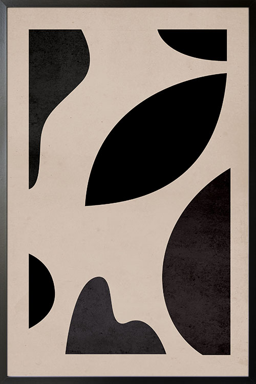
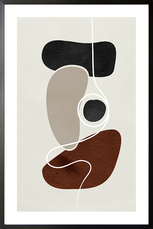
A simple yet compelling poster design that will beautify your walls. Create a modern and stylish room decor with a poster that features different shapes in abstract form. Perfect to be displayed in the bedroom or living room as this art evokes beauty that radiates through the rooms.
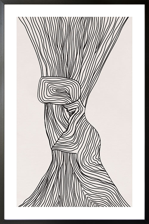
A fantastic poster art in abstract form. The line art can make an overall transformation to your walls. With neutral colors, this art can create a sophisticated and elegant room appearance. The art can likewise make a trendy and modern-looking room that will be adored by your family and friends.
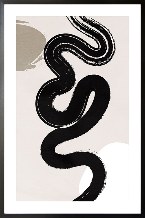
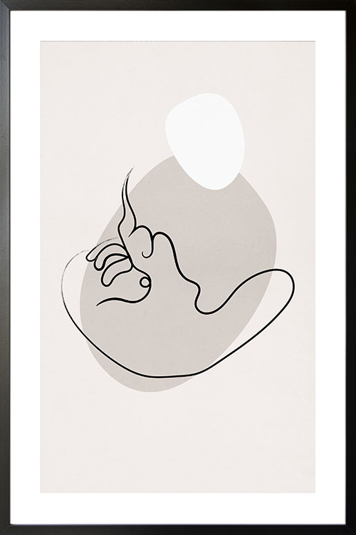
A simple looking art but enough to give your room a boost. The image features the stroke of a brush in black that can give your home a minimalist room interior. Create a wall gallery with this poster along with other abstract art and you will have a more appealing wall.
A simple looking art but enough to give your room a boost. The image features the stroke of a brush in black that can give your home a minimalist room interior. Create a wall gallery with this poster along with other abstract art and you will have a more appealing wall.
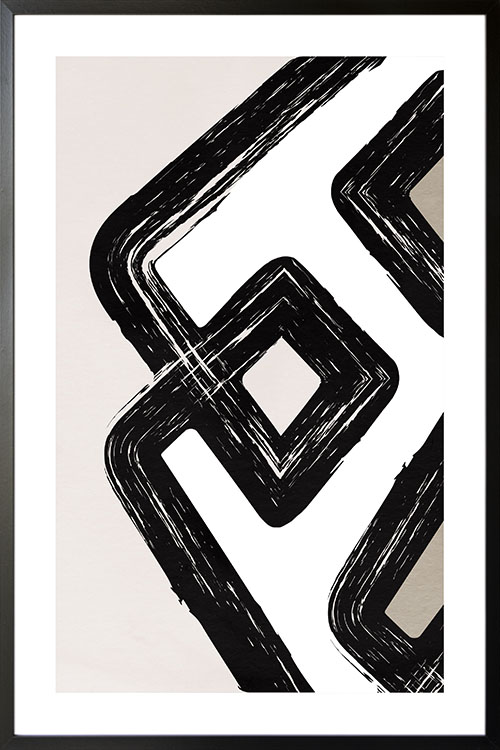
Creative and artistic. These are the words that best describe the poster art. A cool and awesome image in abstract form that will boost the appearance of your walls. Add colors to your home and create a relaxing vibe that you will truly enjoy.
Trendy and stylish poster design that will spice up the wall of your living room, bedroom, or dining room. The neutral and subtle colors can make your home look spectacular. In abstract form, you will be able to add mystery as well as awesomeness to your wall. A perfect art that can perfectly blend to any room decor and design that you have.
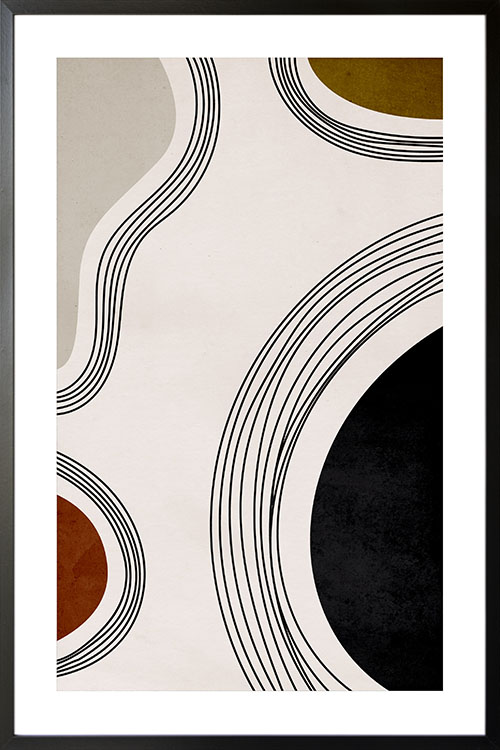
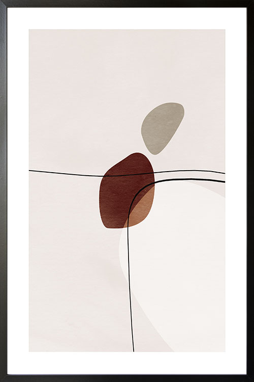
Simple and awesome poster art that will level up your room. Art in abstract form that features lines and shapes with neutral colors. The display of this poster can create a modern-looking room that is perfect for the family. This poster can likewise blend well to any color of the wall as well as various interior decorations.
Fantastic poster art that will make any room in your space look cool and interesting. The art features lines and shapes in neutral colors that can instantly and conveniently make the wall of your home appear modern and stylish. A beautiful poster design that can be the focal point of your living room or bedroom.


