Minimalist Bedroom Designs and the Art of a Thoughtful Wall

Texture line abstract Black and white No1 canvas

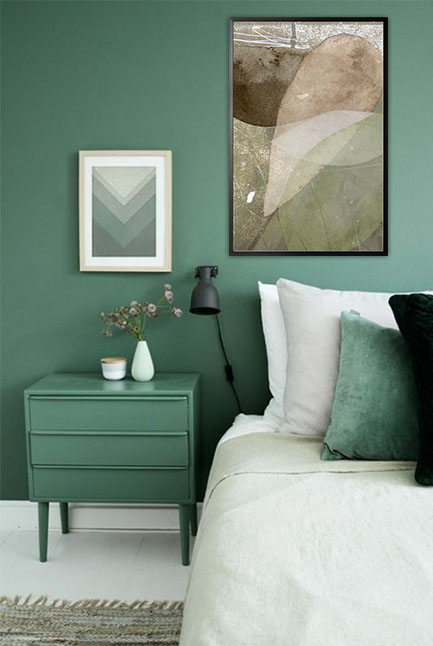
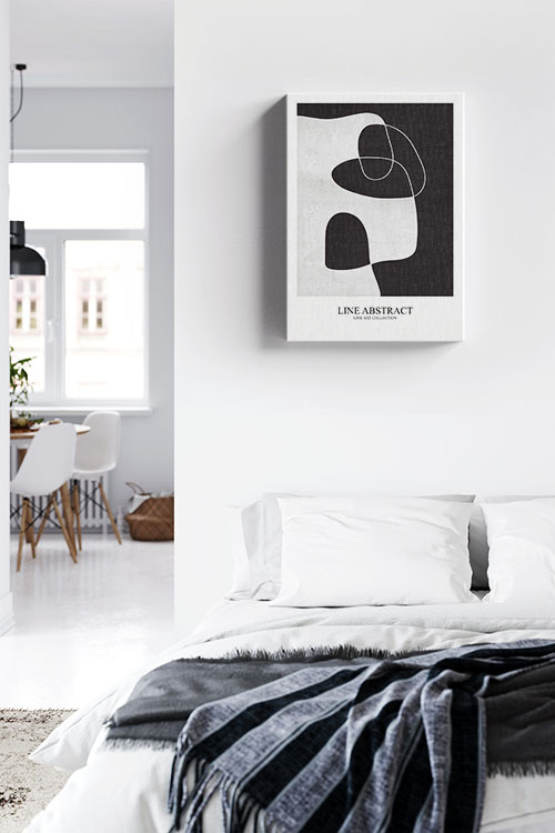
Minimalist bedroom design is more than just a trend; it’s a lifestyle. It’s a lifestyle choice that embraces simplicity, calm, and clarity. By stripping away the excess, you create a restful sanctuary that encourages relaxation and mindfulness. The tranquility of a minimalist bedroom can bring a sense of calm and peace to your daily life. But minimal does not mean boring. With the correct design elements and a carefully curated art wall, your minimalist bedroom can be both stylish and personal. 

Clean Lines and Neutral Colors

The foundation of any minimalist bedroom lies in its simplicity. Stick to clean, straight lines for your furniture and keep your color palette neutral. Think whites, soft grays, beige, or earthy tones. These colors create a serene environment, making your space feel more open and airy. Keep furniture functional and uncluttered, with only essential items, such as a bed, a side table, and perhaps a small dresser or chair.

Quality Over Quantity

Minimalism is all about choosing fewer but better things. Invest in high-quality bedding, a sturdy bed frame, and timeless decor pieces such as a simple vase, a classic lamp, or a well-crafted mirror that will stand the test of time. Keep surfaces clear and store personal items out of sight to maintain a clean and peaceful atmosphere. 

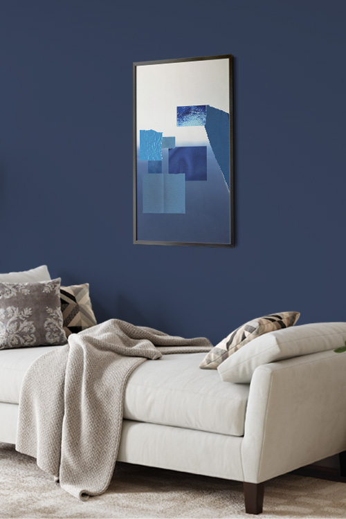
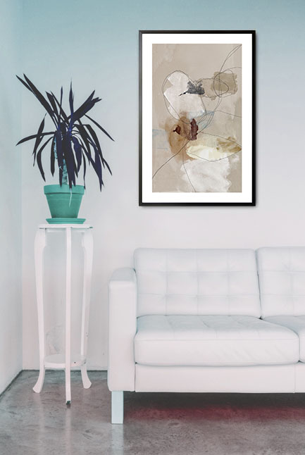
The Art Wall: A Personal Statement

Even in a minimalist space, art can play a decisive role. A thoughtfully designed art wall adds character and personality without overwhelming the space. Here’s how to do it right:

  • Choose with Intention – select a few pieces of art that genuinely resonate with you. This personal touch in choosing art can make your minimalist bedroom feel more connected and engaging. Stick to a consistent theme–whether that’s black-and-white photography, abstract shapes, or nature-inspired prints.
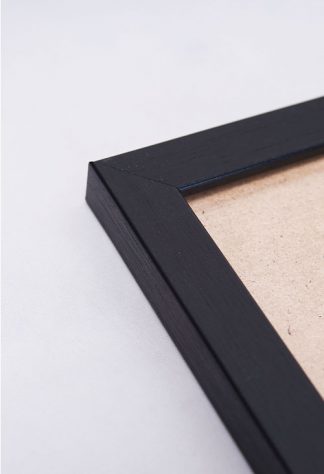
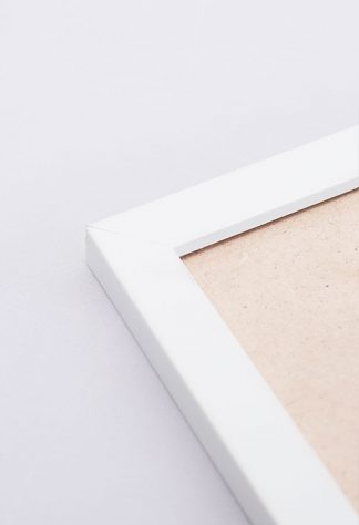
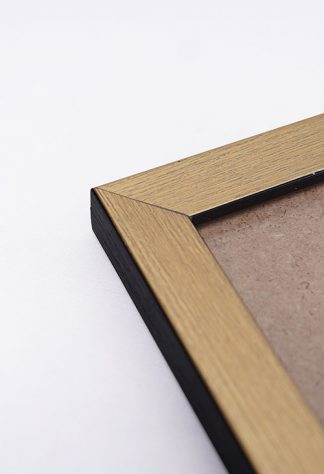
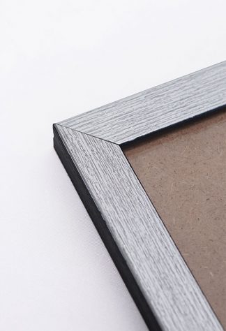
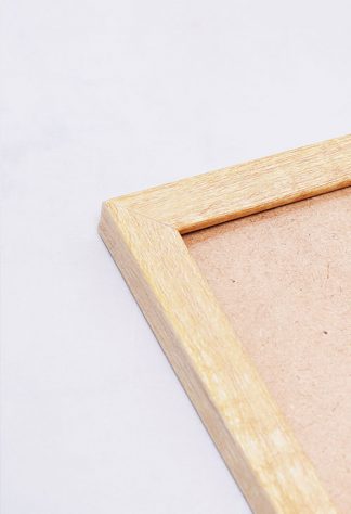
  • Keep It Balanced – in a minimalist room, the art wall should feel integrated, not overpowering. Limit the number of pieces and use matching or complementary frames to keep a sense of cohesion. 
  • Placement Matters – position the art above the bed or on a focal wall. Center the arrangement to draw the eye and enhance the room’s symmetry.
  • Negative Space is Key – don’t be afraid to leave space around your artwork. The freedom and openness of negative space are key elements in minimalist design. It allows your art to breathe and your room to feel more spacious.

In a Nutshell

A minimalist bedroom can be both beautiful and functional when the right balance of design and decor is achieved. By keeping your space simple and adding a carefully curated art wall, you can create a calm and stylish retreat that reflects your personality without clutter.

Reflecting Style: The Use of Mirrors in Interior Decoration

Texture stone shapes turquoise green and earth tone no. 1 Poster

Mirrors, a timeless staple in interior decoration, possess a transformative power that goes beyond their practical use. When used thoughtfully, they can amplify natural light, create the illusion of space, and add a touch of elegance or drama to any room. This transformative power is what makes mirrors such an intriguing and essential element in interior design, encouraging homeowners and decorators to experiment and push the boundaries of their creativity. 

Creating the Illusion of Space

One of the most popular reasons for incorporating mirrors into interior design is their ability to make a space feel larger. In smaller rooms, such as powder rooms or hallways, a strategically placed mirror can visually double the space’s size. By reflecting the surrounding space, mirrors trick the eye into perceiving greater depth, making tight spaces feel more spacious and inviting. Large wall mirrors or mirrored furniture can be particularly effective in apartments or compact living spaces where maximizing every square foot is crucial. 

Enhancing Natural Light

Mirrors are excellent tools for amplifying natural light within a space. When placed opposite or adjacent to windows, they reflect sunlight, brightening up rooms and reducing the need for artificial lighting during the day. This not only creates a warm and inviting atmosphere but also contributes to energy efficiency. Even in darker spaces, mirrors can bounce light from lamps or ceiling fixtures, helping to distribute illumination more evenly throughout a room. 

Adding Visual Interest and Style

Beyond their functional purpose, mirrors are a powerful decorative element. They come in a wide variety of shapes, sizes, and frames, ranging from sleek and modern to ornate and vintage, allowing them to complement any interior style. A statement mirror can serve as a focal point above a fireplace or in any entryway, while a gallery wall of smaller mirrors can add texture and intrigue to an otherwise plain wall. Frameless mirrors offer a minimalist touch, whereas gold or wood-framed options bring warmth and character.

Balancing and Harmonizing Spaces

Mirrors also play a role in creating symmetry and balance in a room. In traditional interior design, they are often used to align visual weight and establish harmony. For example, placing matching mirrors on either side of a fireplace or behind bedside tables can enhance balance and cohesion in a space. 

Reflecting Personality and Artistry

Decorative mirrors can reflect more than just images. They reflect personal style. Whether it’s a bold, geometric design or a delicate antique piece, mirrors contribute to the storytelling of a space. They can also reflect beautiful elements within a room, such as a piece of art, an architectural feature, or an eye-catching light fixture, drawing attention to what matters most. 

In a Nutshell

Mirrors, far from being just functional accessories, are dynamic tools that can deeply connect with the emotions of a space. By reflecting light, expanding space, and adding style, mirrors have the unique ability to transform a room both visually and emotionally. Thoughtful placement and design can engage the audience, proving that sometimes, the best way to see your home in a new light is through a mirror.

How to Decorate Small Spaces with Art Prints

Faces of Destiny 2 Poster in black frame

Living in a small space doesn’t mean you have to sacrifice style. Small homes offer the perfect canvas to get creative with decor, especially when decorating with art prints. Whether working with a studio apartment, a cozy bedroom, or a compact living room, the right art can completely transform your space. 

Choose Prints That Reflect Your Style

When selecting art prints, the world is your oyster. Start with what speaks to you. Think about your taste and how it can shine through your space. Do you love abstract designs, minimalist line drawings, vintage posters, or botanical illustrations? Whatever your vibe, make sure your prints complement your existing color palette. Bright artwork can liven up neutral spaces, while softer tones can calm a bolder color scheme. The power is in your hands to create a space that truly reflects you. 

Scale Matters

In a small space, it’s essential to pay attention to scale. Large, oversized art can dominate a room and make it feel cramped. Instead, opt for smaller or medium-sized prints that match your wall dimensions. Want to make a bigger impact? Try creating a gallery wall with a mix of small prints. It adds personality without overwhelming the space. 

Be Strategic About Placement

One of the best ways to make a small space feel bigger is to draw the eye upward. Hanging art above furniture or along vertical spaces can help give the illusion of height. Don’t be afraid to get creative. Try placing art above doorways, on narrow walls, or in unexpected places like kitchen backsplashes or bathroom nooks. 

Pick the Right Frames

Frames can elevate the look of your prints and tie them into your overall decor. Sleek black or white frames work well in modern settings, while wood or vintage-style frames add warmth and charm. For a minimalist feel, consider frameless prints or canvas wraps. If you’re mixing different art styles, try to maintain a cohesive look by choosing frames that share a common element, such as color or material. Mix and match styles for a more eclectic, curated look. 

Create Visual Balance

As you decorate, consider the room’s overall balance. Avoid clustering all your art on one wall. Instead, distribute prints evenly throughout your space to create flow and harmony. Lay your arrangement on the floor first, or use painter’s tape to map it out before committing to nails. 

Light It Up

Good lighting can make your art prints come alive. Use wall sconces, table lamps, or string lights to highlight your favorite piece. The right lighting can transform the mood of your room and draw attention to different prints at different times, unlocking the full potential of your space. 

Don’t Forget Unusual Spots

Small spaces often come with quirky corners. Use those little spots above the toilet, closet doors, or inside open shelving to show off prints that make you smile. In functional spaces like the kitchen or bathroom, consider using art prints on the backsplash, inside cabinet doors, or on the walls above the sink. Every corner is an opportunity to add charm and personality. 

In a Nutshell

Art prints are a simple, affordable way to bring life, color, and personality into even the smallest spaces. With careful selection, clever placement, and a little creativity, you can make your home feel unique. So go ahead, start decorating, and let your walls tell your story.

Color Splash in Art Prints: A Bold Statement in Modern Decor

The Shots Inspired Canvas

Few interior design and visual art techniques have as striking an impact as the “color splash.” This art style, which typically involves a predominantly black-and-white image with a vivid burst of color in one area, has become a popular choice in contemporary art prints. Whether used in photography, abstract pieces, or graphic design, the color splash effect draws attention, tells a story, and adds personality to any space. 

What Is Color Splash?

Color splash, also known as selective color, is a creative technique in which one element of an image is highlighted in color while the rest remains monochrome. This approach emphasizes a particular subject or area of interest, creating a dramatic contrast that immediately captures the viewer’s eye. It can be subtle, like a single red umbrella in a grayscale city scene, or bold, like a vibrant flower blooming in a black-and-white field. 

Emotional and Visual Impact

Color splash is mighty because it evokes emotion and guides the viewer’s focus. Artists can highlight themes like passion, isolation, nostalgia, or vibrancy by isolating color. The technique encourages deeper engagement with the piece, prompting viewers to ask: “Why this color?” or “Why this object?” It turns the ordinary into something symbolic and thought-provoking.

From a visual perspective, the contrast between grayscale and color creates a striking dynamic. The color element pops off the canvas or print, making it an excellent choice for a room’s feature walls or focal points. It’s an eye-catching addition that doesn’t overwhelm a space but rather enhances it with intentional flair.

Versatility Across Styles

One of the most inspiring aspects of color splash in art prints is its versatility. It seamlessly fits into various genres, from fashion photography to urban landscapes, abstract patterns, and portraiture. The neutral background of these prints allows them to blend effortlessly into different design styles, including modern, industrial, minimalist, and even traditional interiors. This versatility can inspire you to experiment and create unique decor styles. 

Art lovers who prefer a more subdued color palette in their decor can use color splash prints to introduce just the right amount of energy and visual interest without committing to bold, full-color artwork. It’s an ideal middle ground for those who want personality and vibrancy in a refined, elegant way.

Making a Personal Statement

Many people are drawn to color splash art because of the personal stories it can tell. A black-and-white photograph of a meaningful place with just one colorful detail—a red door, a yellow taxi, or a blue dress—can capture a memory or emotion in a way that feels intimate and unique. These prints often become more than just decor; they become conversation starters and cherished pieces within a home, fostering a sense of connection and engagement. 

In a Nutshell

Color splash art prints are more than just visually appealing. They are expressive, modern, and deeply personal. They can highlight emotion, create visual contrast, and complement a wide range of interior styles, making a bold statement without overpowering a room. Whether you’re decorating a living room, office, or bedroom, a well-placed color splash print can transform your space and leave a lasting impression, empowering you to make confident and impactful design choices.

How to Create a Wall Gallery with Art Prints

Different designs of brown themed poster prints

Looking to add a touch of your unique personality and style to your home? A gallery wall is not just a decorative element but a transformative tool that can breathe life into any space, whether a blank hallway or a statement in your living room. A carefully curated wall of art prints can completely revolutionize your living space. Here’s how to create your gallery wall.

Pick a Theme or Style

Before collecting prints, think about what you want your gallery to say. Are you drawn to minimalist black-and-white? Do you love colorful abstract art? Consider a collection of travel prints or motivational quotes. Choosing a cohesive theme or style will help your gallery feel unified, even if the individual pieces are varied. 

Choose the Right Wall

Not all walls are created equal. Find a spot that could use some visual interest. Probably above the sofa, along a staircase, or in your home office. Good lighting is key, so pick a wall that gets natural light or can be easily lit with lamps or picture lights. 

Select and Frame Your Art Prints

Gather your art! Mix up sizes and shapes to add dimension, and don’t be afraid to combine different media, such as photos, illustrations, or typography. When it comes to frames, consider the style and color of your prints. Choosing the right frames is also essential. Stick with one finish for a clean, modern look, or mix frame styles for an eclectic vibe. Adding mats can give your prints a more polished feel. 

Plan Your Layout First

Before you start hanging, plan your layout. Lay the frames out on the floor or use paper templates taped to the wall to try different arrangements. Keep spacing consistent (around 2-3 inches between spaces), and aim for a balanced composition.

Hang it Up

Once you’re happy with the layout, start hanging your prints–center first, then work your way out. Use a level to keep everything straight. Picture-hanging strips, a hammer, nails, and a measuring tape are great tools. Picture-hanging strips are a great alternative if you are worried about putting holes in the wall.

Personalize It

Don’t be afraid to mix personal items like postcards, textiles, or small 3D objects to make the gallery more unique. For instance, you can add a postcard from your favorite travel destination, a piece of fabric that holds sentimental value, or a small sculpture that you love. This adds layers of interest and reflects your personality.

Refresh Periodically

Your wall gallery doesn’t have to be permanent. Feel free to update it with new prints or rearrange it as your style evolves. Keeping it dynamic helps maintain visual freshness and engagement. 

In a Nutshell

A well-planned and executed gallery wall can be a focal point and conversation starter, making your home feel more curated, expressive, and alive.

How to Use Color Blocking in Home Decor

Fragment of Blue 3 Poster in a black frame

Color blocking, a trend that originated in fashion, has boldly and stylishly transitioned into home decor. This versatile method involves pairing two or more solid, contrasting colors in defined areas. Whether you’re aiming to energize a room or create a visual structure, color blocking empowers you to transform any space in a creative and accessible way.

Start with a Color Palette

The key to successful color blocking is choosing a palette that balances boldness with harmony. For instance, a palette of complementary colors like blue and orange, or analogous tones like pink and red, can create a striking effect. You can also opt for high-contrast neutrals like black and white for a more understated look. Limit your palette to two or three main shades to keep the appearance cohesive.

Use Walls as a Canvas

One of the most popular ways to introduce color blocking is through painted walls. Try painting half a wall in one color and the other in a different shade, horizontally or vertically. You can also create geometric shapes, arches, or color “zones” that define different functions in an open-plan space. Painter’s tape and a level will help you achieve crisp, clean lines.

Incorporate Color Blocking Through Furniture

If painting walls feels too much of a commitment, you can use furniture and accessories to achieve the same effect. Look for pieces that are in solid, contrasting colors, such as a bright sofa with a contrasting rug or two boldly colored chairs side by side. You can even choose a focal point for cabinetry or shelving in contrasting colors for a kitchen or living room.

Don’t Forget Textiles and Accessories

Cushions, curtains, bedding, and artwork are great ways to add color blocking without permanence. For example, throw pillows in solid, saturated colors arranged in contrasting patterns can instantly liven up a neutral couch. Layering rugs in complementary shades also adds visual depth and texture. 

Keep Balance in Mind

While color blocking is about making bold choices, balance is the key to a harmonious space. Ground vibrant colors with neutrals like white, gray, or wood tones to prevent the space from feeling overwhelming. Use color sparingly in smaller rooms, and reserve high-contrast designs for larger, open areas. This emphasis on balance will reassure you that your color blocking efforts will result in a harmonious and inviting space.

In a Nutshell

Color blocking is an expressive and modern design technique that lets you infuse your personality into your home. With some planning and creativity, you can create a fresh, dynamic, and uniquely yours space. This creative freedom is what makes color blocking an inspiring way to enhance your living space.

How to Decorate with Canvas Prints

Life Happens Coffee Helps Canvas

Canvas prints are a versatile and stylish way to add personality and warmth to any space. They are more than just decorative pieces. They reflect your unique style and taste, whether showcasing personal photography, abstract art, or classic paintings. This personal touch can instantly elevate your interior design, making your living space truly yours. Here’s how to do it effectively. 

Choose the Right Subject Matter

Start by selecting artwork that resonates with you and complements the room’s overall theme. Family portraits, travel photography, landscapes, and abstract art are popular choices. For a cohesive look, ensure the colors and style of the print coordinate with your existing decor. 

Consider Size and Placement

The size of your canvas print should be proportionate to the wall space. Large canvases make striking focal points, especially above sofas and beds. For smaller walls or cozy nooks, opt for smaller prints or create a gallery wall by grouping multiple canvases. 

Create a Wall Gallery

A gallery wall, a collection of several canvas prints arranged in a visually appealing manner, can add visual interest and tell a story. Mix different sizes, but maintain balance by aligning frames along a central line or within a defined area. Stick to a consistent theme, such as a color scheme or subject matter, for a polished appearance.

Play with Layouts

Experiment with different layouts before hanging your canvases. Lay them on the floor or use paper templates taped to the wall to visualize the arrangement. Symmetrical layouts offer a formal, classic look, while asymmetrical layouts feel modern and dynamic. 

Focus on Color Harmony

Coordinate your canvas prints with the room’s color palette. Choose artwork featuring shades in your furniture, rugs, or accent pieces. This creates a harmonious and cohesive design, making the artwork feel like an intentional part of the space. This confidence in your decorating choices can enhance the overall aesthetic of your home. 

Mix with Other Decor

Canvas prints blend beautifully with other decorative elements like mirrors, shelves, and wall sculptures. For instance, you can pair a canvas print with a textured wall sculpture or a sleek mirror. Layering different textures and materials adds depth and interest to your walls. 

Mind the Height

Hang canvas prints at eye level to create the most comfortable viewing experience. Generally, the artwork’s center should be about 57 to 60 inches from the floor, depending on ceiling height and furniture placement. 

Lighting Matters

Good lighting can significantly enhance the colors and details of your canvas prints, making them more vibrant and engaging. Position them where they can benefit from natural light or use spotlights and picture lights to highlight the artwork. This awareness of the impact of lighting can help you create a more visually appealing living space. 

In a Nutshell

Thoughtfully selecting and arranging canvas prints can personalize your space. Canvas prints can showcase your style and create an inviting atmosphere that feels uniquely yours. 

Creative Ways to Personalize Your Wall Gallery

Beige wall art wall

Creating a personalized wall gallery is one lovely way to infuse your living space with personality, style, and meaningful memories. Whether starting from scratch or updating an existing display, crafting a wall gallery involves creativity, planning, and a touch of aesthetic finesse.

Plan Your Gallery

Begin by choosing the theme or mood you want to convey. Are you aiming for a cohesive look with a specific color scheme or a diverse mix of artwork and photographs? Consider the overall style of your home to ensure harmony between the gallery and its surroundings.

Choose Artwork and Photographs

Choose artwork and photographs that resonate with you. Take joy in selecting pieces that truly speak to you. Whether it’s a cherished family photo, a snapshot from your travels, an original artwork, a print of a famous painting, or a decorative item like a mirror or sculpture, each piece should evoke a memory, an emotion, or an aesthetic preference.

Arrange the Layout

Before hanging anything, plan the arrangement on the floor first. This allows you to experiment with different layouts until you find one that balances visual appeal and coherence. Depending on your taste, options include symmetrical grids, eclectic clusters, or linear arrangements.

Find the Right Frames

Frames play a crucial role in unifying your gallery. When choosing frames, consider the color, material, and style complement each other and the artwork while enhancing the overall aesthetic. For instance, mixing frame styles (like black-and-white or wood finish) can add depth and visual interest to your display.

Hanging Your Gallery

When it comes to hanging, precision is key. Use a level, measuring tape, and pencil to mark where each piece will go before committing to nails or hooks. Consider the height at which each piece will be viewed to ensure optimal visibility and balance within the gallery.

Add Personal Touches

Personalize Your Gallery with Unique Touches. Go beyond the ordinary and add personal touches that make your gallery uniquely yours. Consider incorporating small shelves for displaying mementos, LED lighting to highlight certain pieces, or wall decals and quotes that resonate with your theme. These elements can transform your gallery from a mere collection to a personalized narrative, inspiring you to share your story with others. 

Maintenance and Care

Ensure your gallery remains in top condition by regularly dusting frames and cleaning glass surfaces. Avoid direct sunlight to prevent fading, and consider using good-quality acrylic, especially for delicate pieces. These simple maintenance steps will help preserve the beauty of your gallery for years to come. 

Share Your Story

Share the Stories Behind Your Gallery Don’t miss the opportunity to share the stories behind your gallery with your visitors. Each piece holds a memory or sentiment that enriches the ambiance of your home and invites others to connect with your journey through art and photography. Sharing these stories can create a deeper connection and engagement with your guests.

In a Nutshell

Creating a personalized wall gallery is more than decorating. It is about curating a space that reflects your individuality and enriches your daily life with beauty and meaning. Following these steps and infusing your unique style can help you transform any wall into a captivating showcase of your personality and style. 

Decorate a Rental Without Making Permanent Changes

My Heart Speaks Canvas in a bedroom with a white wall and a big bed

Decorating a rental can be tricky! You want to make it feel like home without breaking your lease or losing your security deposit. The good news is, there are plenty of creative and stylish ways to personalize your space without making any permanent changes. Here are some renter-friendly decorating tips to transform your rental into a cozy, personalized haven.

Start with Removable Solutions

Peel-and-stick wallpaper is a game-changer for renters. It allows you to add color, pattern, or texture to your walls without the commitment. Similarly, removable backsplash tiles can refresh your kitchen or bathroom without glue. These products are easy to apply and just as easy to remove when it’s time to move out. 

Upgrade with Lighting

Many rentals come with basic lighting. Swap out outdated light fixtures with plug-in pendant or stylish floor lamps that reflect your style. Battery-operated sconces are also great for adding ambient lighting without hardwiring anything.

Embrace Rugs and Textiles

Rugs are a simple yet powerful way to define spaces, cover worn-out flooring, and introduce color or pattern. Layer rugs for added texture or use larger ones to create a cohesive look. Curtains are another easy upgrade. Use tension rods if you can’t drill holes, and go for patterns or materials that enhance your decor style. 

Add Personality with Art and Decor

Instead of nails and hooks, use adhesive strips and hooks to hang art, mirrors, and shelves. Create a gallery wall with framed prints or photos to bring personality and charm to blank walls. Decorative items like plants, vases, and books also make a significant visual impact and are easy to take when you move. 

Miximize Storage Creatively

Use stylish storage solutions like decorative baskets, cube organizers, or freestanding shelves to keep things tidy and add character. Furniture that doubles as storage, like ottomans or bed frames with drawers, can help you make the most of your space without installing anything. 

Bring in Temporary Furniture Updates

If your rental came furnished or you’re stuck with pieces you don’t love, try using slipcovers, contact paper, or decorative knobs to give them a fresh new look, Even small changes these can dramatically alter a room’s vibe. 

In a Nutshell

With creativity and the right tools, you can personalize your rental space in stylish and impactful ways while keeping your lease and security deposit intact. 

Decorating Homes with Neutrals: A Timeless and Elegant Approach

Neutral Tone paint and lines no. 1 poster in interior

Neutral colors have long been a versatile part of our homes’ interior decorations. Their timeless and sophisticated beauty suits any home style, be it modern, rustic, or classic. Decorating with neutrals allows you to create a serene and inviting atmosphere, offering a wide spectrum of possibilities. From soft whites to deep charcoals, neutral palettes provide elegance, versatility, and a sense of tranquility. Here are some ideas on how to use neutrals in your home decor, empowering you to unleash your creativity. 

Understanding the Neutral Palette

Neutrals are not only limited to white and beige. The spectrum includes a variety of shades such as grays, taupes, creams, soft browns, and even muted pastels that act as neutrals. Warm neutrals like sandy beige and soft caramels bring coziness, while cool neutrals like slate gray and crisp white provide a modern and airy feel. 

Layering Tones for Depth

Layering, a key concept when decorating with neutrals, involves the strategic use of various hues within the same palette. Instead of using a single color throughout, consider pairing light cream walls with a darker beige sofa and taupe throw pillows. This subtle contrast prevents the space from feeling flat or monotonous, and adds depth and visual interest to your decor. 

Playing with Texture

Texture is crucial when using a neutral color scheme, adding dimension and warmth. Incorporate a mix of linen, wool, wood, and stone to enhance visual interest. A knitted throw and a reclaimed wood coffee table make a neutral space feel rich and inviting. 

Adding Statement Pieces

While neutral decor is all about subtlety, adding statement pieces can elevate the overall look. A striking light fixture, a bold patterned rug, or an oversized piece of artwork in neutral tones can serve as focal points without disrupting the harmony of the space. For instance, a unique chandelier in a metallic finish can add a touch of luxury, a rug with a geometric pattern can introduce visual interest, and a large abstract painting can become a captivating focal point in a neutral room. 

Balancing Light and Dark Neutrals

For a well-balanced design, it’s important to consider mixing light and dark neutrals. A room dominated by light shades may feel too sterile, while one filled with only dark tones can be heavy. By contrast, soft ivory walls with espresso furniture or a gray-toned room with warm beige accents can maintain equilibrium, giving you the confidence to make bold design decisions.

Introducing Natural Elements

Bringing in natural elements is a key aspect of enhancing the beauty of a neutral space. Indoor plants, wooden furniture, and stone countertops not only add an organic touch but also create a soothing environment. Greenery, in particular, stands out beautifully against a neutral backdrop, adding a touch of freshness and vibrancy, and helping you feel relaxed and at peace in your home. 

Using Neutrals in Different Rooms

Neutrals are versatile and work well in every room. In the living room, neutral-toned sofas and area rugs create a cozy and inviting setting. In the bedroom, soft beige bedding and curtains exude a calming ambiance. White cabinetry paired with a gray backsplash pins the kitchen, providing a clean and timeless look.

Enhancing with Metallic Accents

Metallic finishes such as gold, brass, or silver can add a touch of luxury to neutral decor. Consider using metallic light fixtures, mirror frames, or decorative accessories to introduce a subtle shimmer and elevate the design.

In a Nutshell

Decorating with neutrals is a timeless approach that offers flexibility, elegance, and a soothing environment. You can create an inviting and effortlessly stylish space by layering shades, incorporating textures, and balancing light and dark hues.  Whether designing a modern sanctuary or a cozy retreat, a neutral palette provides the perfect foundation for any home decor style.