How to Decorate Small Spaces with Art Prints

Faces of Destiny 2 Poster in black frame

Living in a small space doesn’t mean you have to sacrifice style. Small homes offer the perfect canvas to get creative with decor, especially when decorating with art prints. Whether working with a studio apartment, a cozy bedroom, or a compact living room, the right art can completely transform your space. 

Choose Prints That Reflect Your Style

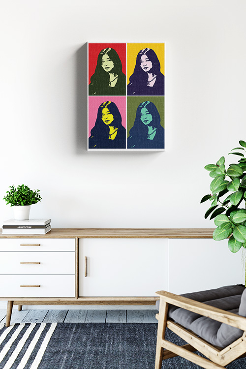
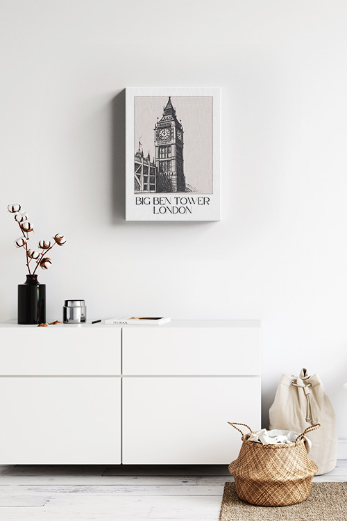
When selecting art prints, the world is your oyster. Start with what speaks to you. Think about your taste and how it can shine through your space. Do you love abstract designs, minimalist line drawings, vintage posters, or botanical illustrations? Whatever your vibe, make sure your prints complement your existing color palette. Bright artwork can liven up neutral spaces, while softer tones can calm a bolder color scheme. The power is in your hands to create a space that truly reflects you. 
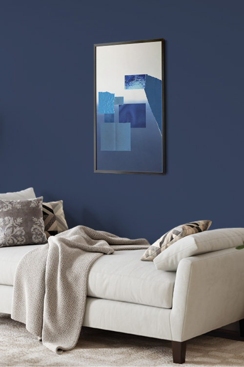
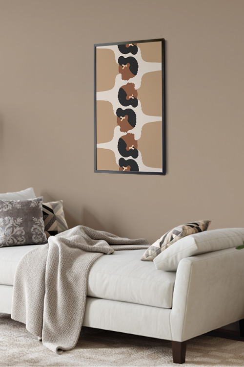
Scale Matters

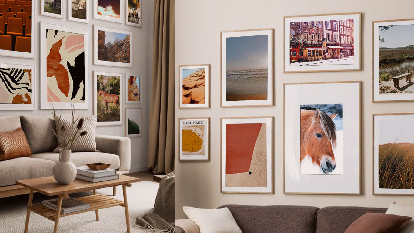
In a small space, it’s essential to pay attention to scale. Large, oversized art can dominate a room and make it feel cramped. Instead, opt for smaller or medium-sized prints that match your wall dimensions. Want to make a bigger impact? Try creating a gallery wall with a mix of small prints. It adds personality without overwhelming the space. 

Be Strategic About Placement

One of the best ways to make a small space feel bigger is to draw the eye upward. Hanging art above furniture or along vertical spaces can help give the illusion of height. Don’t be afraid to get creative. Try placing art above doorways, on narrow walls, or in unexpected places like kitchen backsplashes or bathroom nooks. 

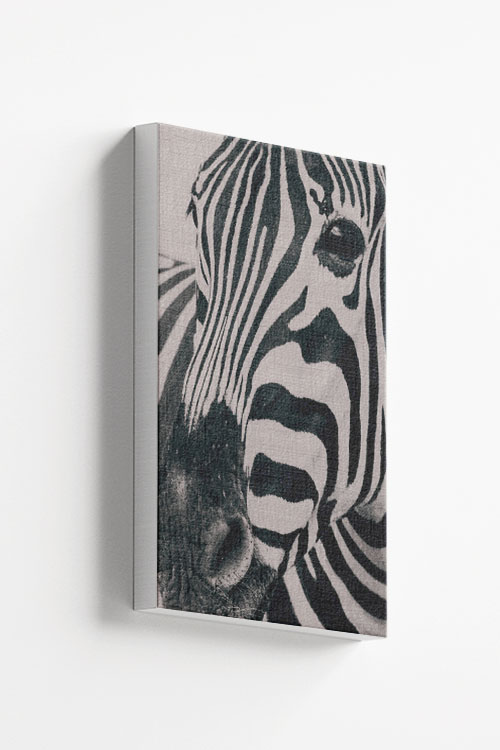
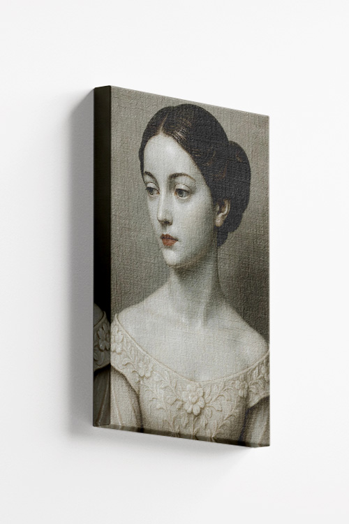
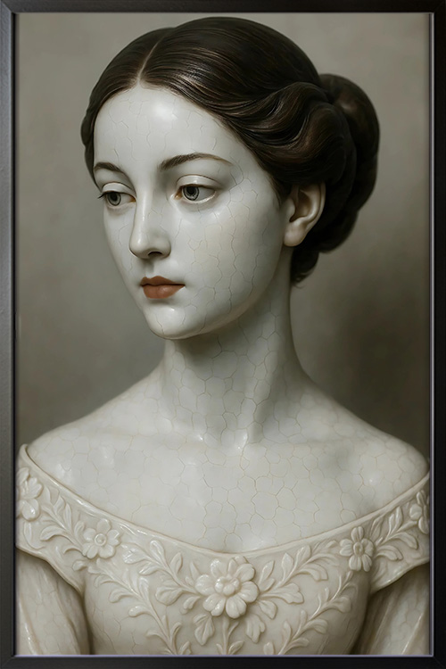
Pick the Right Frames

Frames can elevate the look of your prints and tie them into your overall decor. Sleek black or white frames work well in modern settings, while wood or vintage-style frames add warmth and charm. For a minimalist feel, consider frameless prints or canvas wraps. If you’re mixing different art styles, try to maintain a cohesive look by choosing frames that share a common element, such as color or material. Mix and match styles for a more eclectic, curated look. 

Create Visual Balance

As you decorate, consider the room’s overall balance. Avoid clustering all your art on one wall. Instead, distribute prints evenly throughout your space to create flow and harmony. Lay your arrangement on the floor first, or use painter’s tape to map it out before committing to nails. 

Light It Up

Good lighting can make your art prints come alive. Use wall sconces, table lamps, or string lights to highlight your favorite piece. The right lighting can transform the mood of your room and draw attention to different prints at different times, unlocking the full potential of your space. 

Don’t Forget Unusual Spots

Small spaces often come with quirky corners. Use those little spots above the toilet, closet doors, or inside open shelving to show off prints that make you smile. In functional spaces like the kitchen or bathroom, consider using art prints on the backsplash, inside cabinet doors, or on the walls above the sink. Every corner is an opportunity to add charm and personality. 

In a Nutshell

Art prints are a simple, affordable way to bring life, color, and personality into even the smallest spaces. With careful selection, clever placement, and a little creativity, you can make your home feel unique. So go ahead, start decorating, and let your walls tell your story.

Zebra in gray tone canvas

Zebra in gray tone canvas

Zebras are another gentle animal and one of the common animals seen in the savannah. Identified for their black and white stripes, the zebras can evade their enemies with their speed and cunning. Get the chance to bring the wild to your home with a wonderful poster. This print will instantly add beauty to your homes and can help in creating an impressive wall gallery.

Color Splash in Art Prints: A Bold Statement in Modern Decor

The Shots Inspired Canvas

Few interior design and visual art techniques have as striking an impact as the “color splash.” This art style, which typically involves a predominantly black-and-white image with a vivid burst of color in one area, has become a popular choice in contemporary art prints. Whether used in photography, abstract pieces, or graphic design, the color splash effect draws attention, tells a story, and adds personality to any space. 

What Is Color Splash?

Color splash, also known as selective color, is a creative technique in which one element of an image is highlighted in color while the rest remains monochrome. This approach emphasizes a particular subject or area of interest, creating a dramatic contrast that immediately captures the viewer’s eye. It can be subtle, like a single red umbrella in a grayscale city scene, or bold, like a vibrant flower blooming in a black-and-white field. 

Emotional and Visual Impact

Color splash is mighty because it evokes emotion and guides the viewer’s focus. Artists can highlight themes like passion, isolation, nostalgia, or vibrancy by isolating color. The technique encourages deeper engagement with the piece, prompting viewers to ask: “Why this color?” or “Why this object?” It turns the ordinary into something symbolic and thought-provoking.

From a visual perspective, the contrast between grayscale and color creates a striking dynamic. The color element pops off the canvas or print, making it an excellent choice for a room’s feature walls or focal points. It’s an eye-catching addition that doesn’t overwhelm a space but rather enhances it with intentional flair.

Versatility Across Styles

One of the most inspiring aspects of color splash in art prints is its versatility. It seamlessly fits into various genres, from fashion photography to urban landscapes, abstract patterns, and portraiture. The neutral background of these prints allows them to blend effortlessly into different design styles, including modern, industrial, minimalist, and even traditional interiors. This versatility can inspire you to experiment and create unique decor styles. 

Art lovers who prefer a more subdued color palette in their decor can use color splash prints to introduce just the right amount of energy and visual interest without committing to bold, full-color artwork. It’s an ideal middle ground for those who want personality and vibrancy in a refined, elegant way.

Making a Personal Statement

Many people are drawn to color splash art because of the personal stories it can tell. A black-and-white photograph of a meaningful place with just one colorful detail—a red door, a yellow taxi, or a blue dress—can capture a memory or emotion in a way that feels intimate and unique. These prints often become more than just decor; they become conversation starters and cherished pieces within a home, fostering a sense of connection and engagement. 

In a Nutshell

Color splash art prints are more than just visually appealing. They are expressive, modern, and deeply personal. They can highlight emotion, create visual contrast, and complement a wide range of interior styles, making a bold statement without overpowering a room. Whether you’re decorating a living room, office, or bedroom, a well-placed color splash print can transform your space and leave a lasting impression, empowering you to make confident and impactful design choices.

The Benefits of a Neutral Color Palette in Interior Design

Big Ben Tower London Sketch Canvas in a white room with white drawers and native weave basket

When designing a timeless, elegant, and effortlessly stylish home, neutral colors are hard to beat. From warm beiges and soft whites to calming grays and subtle pastels, a neutral palette offers possibilities for creating beautiful, livable spaces. 

Let’s explore why neutral colors continue to be favorites among designers and homeowners alike and how they can transform interiors. 

Create a Sense of Space and Light

Neutral tones, especially lighter shades like white, ivory, and pale gray, reflect natural light and make any room more open and airy. If you’re working with a small space or rooms that don’t get much sunlight, neutrals can instantly brighten things up and give the illusion of more space. 

Timeless Style That Never Goes Out of Fashion

Design trends come and go, but neutral colors are always in. Their classic appeal makes them a safe and smart choice if you want to design a home that feels fresh today and for the future. This timeless appeal provides a sense of security in your design choices. Starting with a neutral base, you can easily swap out accessories or accents as trends evolve without overhauling your entire space. 

A Calm, Relaxing Environment

One of the most significant advantages of neutral colors is the peaceful atmosphere they create. Soft, muted tones naturally evoke a sense of calm, making them ideal for bedrooms, living areas, and any space where you want to relax and unwind after a busy day.

Versatility That Works With Any Style

Neutral colors are the chameleons of interior design, seamlessly blending with any style. Whether your taste is modern, traditional, rustic, or eclectic, a neutral palette complements everything. These tones pair beautifully with different textures, patterns, and materials, allowing you to play with your decor while maintaining a cohesive look. This versatility empowers you to be creative and confident in your design choices. 

Easy to Maintain and Decorate Around

Neutral shades are not just aesthetically pleasing, they are also surprisingly practical. Compared to darker or more saturated colors, they tend to show less dust and wear. This practicality reassures you about the longevity of your design. Plus, they provide the perfect backdrop for bold accents, colorful art, and statement furniture, making it easy to refresh your space without repainting whenever your style evolves. 

In a Nutshell

If you plan a home makeover or simply want to refresh a room, consider starting with a neutral color palette. Not only does it offer timeless beauty and flexibility, but it also lays the foundation for a peaceful, polished, and perfectly personalized space.

How to Create a Wall Gallery with Art Prints

Different designs of brown themed poster prints

Looking to add a touch of your unique personality and style to your home? A gallery wall is not just a decorative element but a transformative tool that can breathe life into any space, whether a blank hallway or a statement in your living room. A carefully curated wall of art prints can completely revolutionize your living space. Here’s how to create your gallery wall.

Pick a Theme or Style

Before collecting prints, think about what you want your gallery to say. Are you drawn to minimalist black-and-white? Do you love colorful abstract art? Consider a collection of travel prints or motivational quotes. Choosing a cohesive theme or style will help your gallery feel unified, even if the individual pieces are varied. 

Choose the Right Wall

Not all walls are created equal. Find a spot that could use some visual interest. Probably above the sofa, along a staircase, or in your home office. Good lighting is key, so pick a wall that gets natural light or can be easily lit with lamps or picture lights. 

Select and Frame Your Art Prints

Gather your art! Mix up sizes and shapes to add dimension, and don’t be afraid to combine different media, such as photos, illustrations, or typography. When it comes to frames, consider the style and color of your prints. Choosing the right frames is also essential. Stick with one finish for a clean, modern look, or mix frame styles for an eclectic vibe. Adding mats can give your prints a more polished feel. 

Plan Your Layout First

Before you start hanging, plan your layout. Lay the frames out on the floor or use paper templates taped to the wall to try different arrangements. Keep spacing consistent (around 2-3 inches between spaces), and aim for a balanced composition.

Hang it Up

Once you’re happy with the layout, start hanging your prints–center first, then work your way out. Use a level to keep everything straight. Picture-hanging strips, a hammer, nails, and a measuring tape are great tools. Picture-hanging strips are a great alternative if you are worried about putting holes in the wall.

Personalize It

Don’t be afraid to mix personal items like postcards, textiles, or small 3D objects to make the gallery more unique. For instance, you can add a postcard from your favorite travel destination, a piece of fabric that holds sentimental value, or a small sculpture that you love. This adds layers of interest and reflects your personality.

Refresh Periodically

Your wall gallery doesn’t have to be permanent. Feel free to update it with new prints or rearrange it as your style evolves. Keeping it dynamic helps maintain visual freshness and engagement. 

In a Nutshell

A well-planned and executed gallery wall can be a focal point and conversation starter, making your home feel more curated, expressive, and alive.

Porcelain Maiden Canvas

Porcelain Maiden Canvas

Porcelain Maiden is a stunning piece of art that captures the essence of classical beauty in a black-and-white composition. This elegant portrayal of a lady exudes grace and sophistication, making it a timeless addition to any home decor. The intricate details and delicate features of the maiden bring a sense of serenity and charm to any space.

Porcelain Maiden Poster

Porcelain Maiden Poster

Porcelain Maiden is a stunning piece of art that captures the essence of classical beauty in a black-and-white composition. This elegant portrayal of a lady exudes grace and sophistication, making it a timeless addition to any home decor. The intricate details and delicate features of the maiden bring a sense of serenity and charm to any space.

How to Use Color Blocking in Home Decor

Fragment of Blue 3 Poster in a black frame

Color blocking, a trend that originated in fashion, has boldly and stylishly transitioned into home decor. This versatile method involves pairing two or more solid, contrasting colors in defined areas. Whether you’re aiming to energize a room or create a visual structure, color blocking empowers you to transform any space in a creative and accessible way.

Start with a Color Palette

The key to successful color blocking is choosing a palette that balances boldness with harmony. For instance, a palette of complementary colors like blue and orange, or analogous tones like pink and red, can create a striking effect. You can also opt for high-contrast neutrals like black and white for a more understated look. Limit your palette to two or three main shades to keep the appearance cohesive.

Use Walls as a Canvas

One of the most popular ways to introduce color blocking is through painted walls. Try painting half a wall in one color and the other in a different shade, horizontally or vertically. You can also create geometric shapes, arches, or color “zones” that define different functions in an open-plan space. Painter’s tape and a level will help you achieve crisp, clean lines.

Incorporate Color Blocking Through Furniture

If painting walls feels too much of a commitment, you can use furniture and accessories to achieve the same effect. Look for pieces that are in solid, contrasting colors, such as a bright sofa with a contrasting rug or two boldly colored chairs side by side. You can even choose a focal point for cabinetry or shelving in contrasting colors for a kitchen or living room.

Don’t Forget Textiles and Accessories

Cushions, curtains, bedding, and artwork are great ways to add color blocking without permanence. For example, throw pillows in solid, saturated colors arranged in contrasting patterns can instantly liven up a neutral couch. Layering rugs in complementary shades also adds visual depth and texture. 

Keep Balance in Mind

While color blocking is about making bold choices, balance is the key to a harmonious space. Ground vibrant colors with neutrals like white, gray, or wood tones to prevent the space from feeling overwhelming. Use color sparingly in smaller rooms, and reserve high-contrast designs for larger, open areas. This emphasis on balance will reassure you that your color blocking efforts will result in a harmonious and inviting space.

In a Nutshell

Color blocking is an expressive and modern design technique that lets you infuse your personality into your home. With some planning and creativity, you can create a fresh, dynamic, and uniquely yours space. This creative freedom is what makes color blocking an inspiring way to enhance your living space.

Creating a Calming Environment for Inner Peace

In today’s fast-paced world, finding a moment of peace can be a challenge. That’s why having a dedicated space for meditation and mindfulness at home is becoming increasingly essential. Whether it’s a quiet corner or an entire room, designing a space that promotes calm and focus can greatly enhance your mental well-being. Here’s how to create a simple yet powerful meditation space that will inspire and motivate you on your mindfulness journey. 

Choose the Right Location

Start by selecting a quiet, low-traffic area in your home. This could be a spare room, a corner in your bedroom, a section of your living room, or even a balcony or patio. Ideally, it should have minimal distractions so that you won’t be disturbed. Natural light is a bonus, as it can uplift your mood and energy. 

Keep it Minimal and Clean

A clutter-free space helps clear the mind. Use minimal furniture and keep decorations simple. A yoga mat, cushion, or meditation bench is often all you need for seating. Avoid bright colors and busy patterns; instead, opt for soft, neutral tones to evoke a sense of tranquility.

Incorporate Natural Elements

Bringing nature into your meditation area helps ground your practice. Consider adding plants, stones, or a minor water feature to connect with the earth. Even a single potted plant or a bowl of smooth river stones can create a calming effect. 

Use Soothing Scents and Sounds

Aromatherapy can enhance mindfulness. Essential oils like lavender, sandalwood, or eucalyptus can calm the mind and body. Use a diffuser, incense, or a scented candle to create a relaxing atmosphere. You may also play soft instrumental music, nature sounds, or white noise to set the mood further.

Add Personal Touches

Make the space your own by including meaningful items, such as a journal, a spiritual symbol, or an inspirational quote. These personal touches can help you feel connected and grounded during your practice, fostering a sense of belonging and comfort. 

Keep It a Sacred Space

Lastly, treat your meditation area with respect. Avoid using it for work or casual lounging. When you enter, allow yourself to shift into a mindful state entirely. Over time, this consistency helps build a strong mental association with peace and presence. 

In a Nutshell

By thoughtfully designing a space dedicated to stillness, you create a sanctuary not just for your body but also for your mind and spirit.

The Role of Color Psychology in Interior Design

A vibrant and colorful canvas print in brushes

Color is one of the most powerful tools in interior design. It profoundly impacts mood, emotions, and behavior. The study of color psychology, which focuses on how colors influence human feelings and actions, is instrumental in creating spaces that are harmonious, energizing, or calming, depending on their intended use.

Each color evokes a different emotional response. For instance, blue is often associated with calmness, stability, and serenity. It is frequently used in bedrooms and bathrooms to promote relaxation. Green, symbolizing nature and renewal, brings a refreshing, tranquil energy, making it an excellent choice for living rooms and home offices. Meanwhile, yellow radiates warmth and optimism, ideal for kitchens and dining areas where social gatherings occur.

On the other hand, red is a stimulating color that can increase energy levels and appetite, making it a popular choice for dining rooms and entertainment spaces. However, it can also feel overwhelming in large doses, so it’s often best used as an accent. Historically linked to luxury and creativity, purple can add a sense of sophistication to a space, while orange brings vibrancy and enthusiasm, suitable for workout rooms or creative studios.

Neutral colors like white, gray, beige, and black also have potent psychological effects. White suggests cleanliness and simplicity, making rooms feel more spacious. Gray offers balance and can create a sophisticated, modern atmosphere, while beige brings warmth and comfort. Black, used carefully, can add drama, depth, and elegance to a space.

The emotional impact of color also depends on factors such as tone, saturation, and lighting. Soft, muted shades generally have a calming effect, while bright, saturated hues can energize and excite. Natural and artificial lighting significantly alter the colors’ appearance and influence their psychological impact.

Successful interior design carefully considers these psychological effects to align with each space’s purpose. For example, a restful bedroom might feature cool tones and soft textures, while a lively family room could incorporate warmer hues and bold patterns.

Ultimately, the understanding and application of color psychology empowers designers to create environments that are not only visually appealing but also supportive of the well-being and activities of the people who use them. Thoughtful color choices can transform a house into a welcoming home or a workspace into a hub of productivity and creativity.