Fun and Exciting Appearance of Modern Retro Design

Neon hello good times poster

Modern Retro is one of the classic styles that is again gaining popularity these days. Every decade has its own trend when it comes to fashion and design. There are also significant changes to the culture and practices. For instance, during the 70s, different events occurred such as women’s liberation, atomic awareness, environmental awareness, and music. Loud colors were also popular during the 70s as can be seen in clothing and interior decorations. 

Modern Retro design style is a combination of the trends in the 70s, 80s, and 90s. A design style that offers a nostalgic atmosphere. One of the cool design styles that features a fun and exciting room appearance that is adored by people of all ages. In addition to these, the design style also highlights having a light feeling.

Features of Modern Retro Design Style

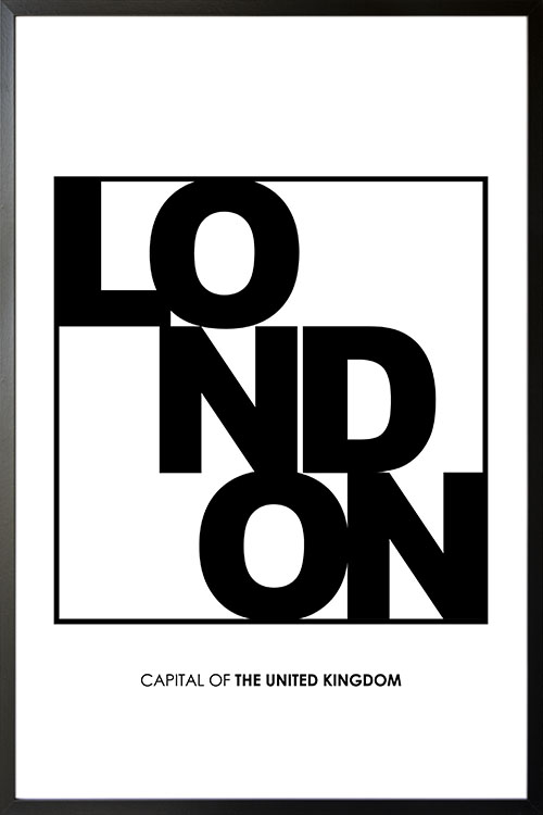
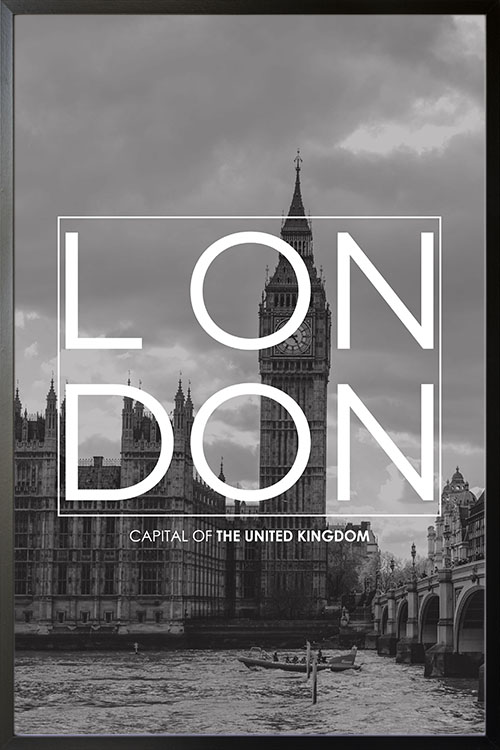
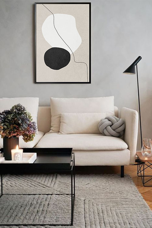
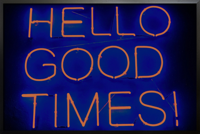
With the combination of the style from the past and the minimal appearance of the present, modern retro design style is gaining popularity. Many are impressed with the effects and beauty that the style gives any home. Here are some ideas that you can add to your home to achieve the design style: rich color palette with warm hues like red and yellow; neon colors and lights; flat elements from shapes to lines and icons; squiggles and line art with vibrant colors; music-themed items like cassette tapes and turntables. 

What’s good about the design style

Modern retro design is a fun and interesting style. With shapes and bright colors, you can create a nostalgic atmosphere that will captivate the attention of your family and friends. This style can be considered to be the link between the past and present as it features styles and appearances of the different decades. 

Though modern design style has its ups, there are still those who are not into the retro style it encompasses. Just like in any style, modern retro is not for all. It has unique features that appear unorganized as seen in the colors and shapes. 

The digital influences

The decades from the 70s to the 90s may be considered to be the digital era. A period of the boom of computers, computing, gaming, and computer graphics. These are seen in movies, television shows, and computer games. 

These styles evoke a nostalgic effect on the interior. Though the graphics are not that good, they have maintained that way to keep the authenticity of the period. These features are then used to create designs that will bring back the good old times. 

This style reflects the designers who grew up loving retro graphic appearances. As such, many individuals feel comfortable seeing them as compared with the more advanced digital graphics that we know these days. Though the design may be simple and laid back, it adds style and can personalize the rooms of your home. 

Final thoughts

Modern Retro is a fascinating design style that encompasses a lot of styles. This could truly create a nostalgic atmosphere. Combined with modern features, your home will have a unique and spectacular view that will be loved by anyone. 

London Typo Poster

London Typo poster

London is a vibrant and multicultural city of England. It is the largest city in Western Europe and considered to be one of the world’s leading global cities. The city is still considered to be the world’s center for culture, music, education, fashion, politics, finance, and trade.

London B&W Typo poster

London B&W Typo

London is a vibrant and multicultural city of England. It is the largest city in Western Europe and considered to be one of the world’s leading global cities. The city is still considered to be the world’s center for culture, music, education, fashion, politics, finance, and trade.

Sydney B&W Typo Poster

Sydney B&W Typo poster

Sydney is internationally known as the Harbour City. The largest and oldest city in Australia and considered to be the most beautiful and wonderful city of the country. Sydney is also the home of the Sydney Opera House and the Sydney Harbour Bridge.

Moscow B&W Typo Poster

Moscow B&W Typo poster

Moscow is the capital of Russia and one of the oldest cities of the country. An iconic city and considered to be the largest metropolis in Europe. It is filled with impressive architecture that reflects the country’s past and present. These days, Moscow is one of the most modern cities in Europe.

Zodiac sign Leo personal poster

Personalized Zodiac Leo poster

A personalized poster art of the zodiac symbol, Leo. The zodiac sign of Leo symbolizes many things. Examples of which are creativity, passionate, humor, stubbornness, and generosity. People who are born under Leo are said to be natural leaders. Be inspired and display this poster art to be the best of who you are.

Zodiac sign Gemini personal poster

Personalized Zodiac Gemini poster

A personalized poster art of the zodiac sign Gemini in an attractive simplified appearance. Be inspired with what the stars have to say. Gemini individuals are known to be expressive and quick-witted. They are also known to be sociable and fun to be with. Get the chance to inspire others with this poster art and teach them why the constellation is interesting.

Zodiac sign Virgo personal poster

Personalized Zodiac Virgo poster

A personalized poster of Zodiac sign, Virgo. Virgos are known for being keen in details and with a sense of humanity. A poster print with a zodiac sign is one of the interesting decor that can add a little accent to your wall. A simple looking yet a compelling wall decor that will adored by your friends.

Shades of Green and the Beauty they Emit

Bright green leaves Poster

Many people consider the different shades of green to be the most natural colors on the planet. They evoke a soothing and calming effect that is perfect for relaxation. Green is the most familiar color to the sense of vision and the different shades can be used to decorate your home. You can use different shades of green to paint your walls, choice of poster designs, the addition of indoor plants and flowers, fabric, and cushions. The shades of green appear spectacular in homes along with accents and textures to enhance the color. 

Different shades of green for your home

Though there are different shades of green, not all can be used to decorate your home. There are particular shades that are recommended by many designers and homeowners. These shades can help create a room atmosphere that is calming and relaxing. Below are some examples that you can add to your home interior. 

Sage

The shade of green tends to approach the color gray. This can create a washed-out and dry appearance in the room.

Lime

A shade of green that is considered to be lively and dynamic. This shade can give a summer look to your home. It is practically a combination of yellow and green that evokes a refreshing vibe.

Olive

The dull shade of green emits antiquity and a formal look. This shade is geared towards gray and brown.

Emerald

A luxurious shade that offers a sophisticated and elegant appeal.

Shamrock

Dark and matte color that offers a discreet and muted room appearance. 

Different ways to use the shades of green

Green gives any room a touch of nature. However, just like any color, excessive use of green may be an eyesore. The combination of different shades can create impressive effects in a room. They offer a fresh and natural atmosphere when added to your home. 

Green can be used in any room and there are actually no restrictions. The color may be used to add accent on walls, choice of furniture pieces, the color of throws, rugs, accessories, poster designs, and others

The color promotes an environment of peace and tranquility. As such it is recommended to use the color in rooms where you want to have peace of mind and body. Examples are the bedroom and the living room. Together with shades of blue, they can promote certain health benefits.

Shades of green can also stimulate appetite and can be used in the dining room and kitchen. Combine green with red, orange, and yellow to have a dynamic and awesome effect. 

Final thoughts

Green is a very special color as it represents nature. This is probably why many homeowners and designers prefer to add color to their rooms to give them a refreshing vibe. Imagine yourself walking in a forest to boost your health. This may also have the same effect when the color is added to your home. 

Indoor plants provide great benefits to mental and physical health. This is why the incorporation of plants and florals is important to successfully achieve a room that is attractive and beneficial. Shades of green are also easy to use and can give you the freedom to decorate your rooms.

Proportion and Balance in Interior Decorating

Rustic hues poster no. 2 poster interior

Proportion and balance in decorating any home are vital to creating an interior that is visually appealing. These can be achieved in different ways and the most common is through trial and error. This is to determine what suits best for your home as well as the taste of homeowners and designers. 

What is a proportion in interior decoration?

Proportion is the balance among the design elements such as shape, color, and texture. This element is often associated with scaling where sizes are compared between objects. Proportion is the smart judgment of whether the arrangement is right or wrong. Many successfully achieve the right proportion through trial and error. Experienced designers and homeowners usually achieve this in a shorter period of time. The right proportion can be achieved by repeating various elements like shapes, colors, and texture. 

Color proportion

This can be attained by repeating colors in different areas of the house or room. For example, shades of blue can be seen on a poster displayed on a wall, fabric and cushions, rugs, and other decorative items. In this way, you will have a harmonious blend of colors in the room.

Space proportion

This is the placement of objects within a space. This is when scaling comes in. The addition of chairs and furniture pieces needs scaling so that the pieces can blend with each other. A sofa that is too big may seem a little awkward when placed beside small furniture pieces. 

Proportion of light

Having the right design of light source is one of the critical ways to achieve harmony in your room. Light has a lot of effects and significance in a room. It affects how an individual perceives the overall appearance of the room. The exact amount of light can make any room look appealing in contrast with dim lights. Focus lights or pin lights may also be used to feature artwork in a room. This can therefore be the focal point of the room. 

Proportion is shape

Repetition of shapes in the room can provide harmony. For instance, quadrilateral decorative items can be placed in different areas of the room for a more impressive room appearance. 

Texture proportion

Texture can make any interior look rich. Paint and the display of posters add texture to the walls. Posters and other artworks can create a captivating focal point. You can also add carpets or rugs to add texture to a room. 

Balance in the interior

Balance keeps everything in place. The absence of it may put everything in chaos. In interior decoration, balance refers to visual balance to make the room appear comfortable and appealing. 

Symmetrical balance

This can be achieved if the decorative items are repeated along a central axis. This offers a feeling of stability and calmness and can be achieved through the proper arrangement of furniture pieces.

Radial balance

This type of balance refers to anything round or circular. Decorative items that are properly distributed along the central axis are one example. For instance, the arrangement of chairs around the dining table is important to achieve the desired look in the room. 

Asymmetrical balance

This is the visual weight of the different objects placed in the room. The use of different elements with the same weight added on the opposing axis can give the said type of balance.