Colors and Mood: Their Effects On Your Home

Art wall 106

Color psychology teaches us that different colors have relevant effects on mood. In fact, colors and mood are closely linked with each other. Warm colors evoke different emotions and bright colors even create different feelings. Colors either make us happy or sad and among other reactions of the body. Studies have shown that colors affect the psychological and physical aspects of the body. 

Colors and mood

The effects of colors on mood greatly depend on different factors. Examples are brightness, shade, tint, and tone. In general, colors are divided into two categories: warm and cool colors. 

Warm colors

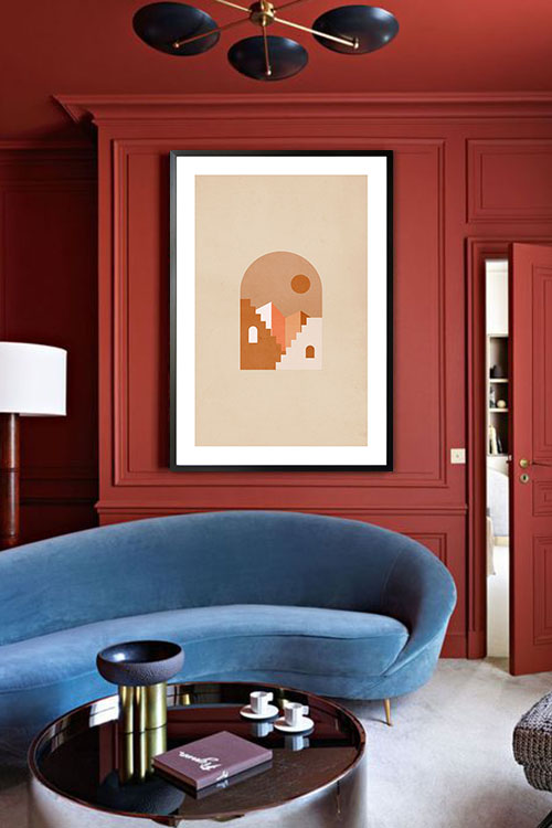
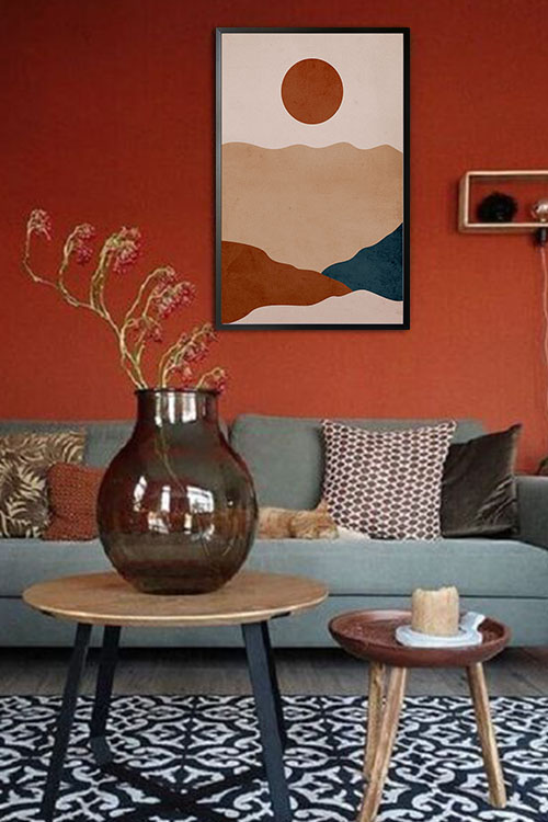
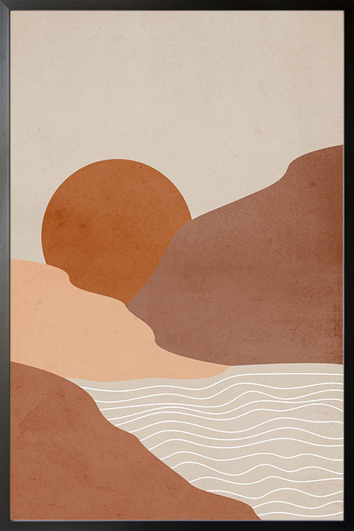
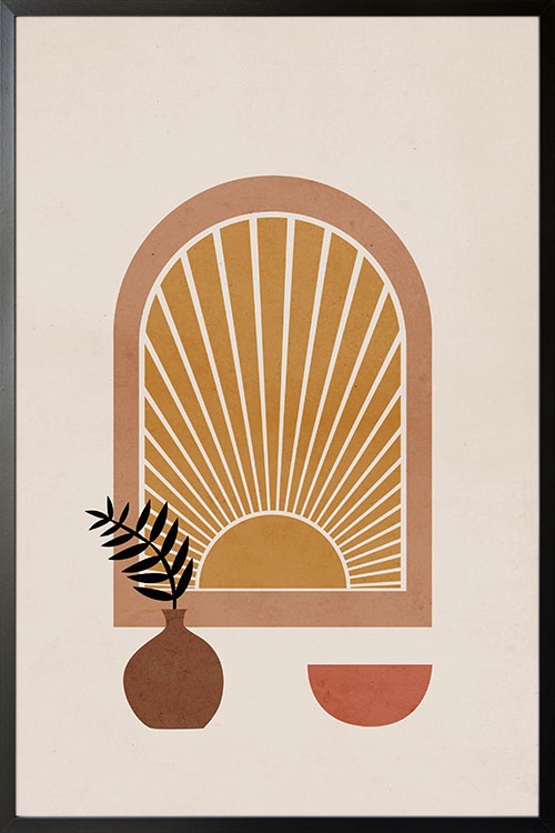
Warm colors, such as red, orange, and yellow evoke feelings of happiness, optimism, and energy. They can also catch the attention of anyone. What makes red extra special is that it can increase the appetite of an individual. This is the reason why many restaurants incorporate the color red in their interior. 

Cool colors

Green, blue, and purple are examples of cool colors. These colors evoke a calming and relaxing vibe. On the negative side, cool colors, express sadness. If you want to be creative, it is recommended to use purple in the room. 

Cheerful colors

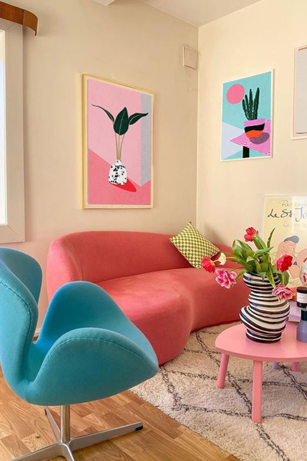
Bright and warm colors are known to uplift the mood. This is also true with pastel colors, such as peach, light pink, or lilac. It has been observed the brighter and lighter the color is, the happier the emotion is. Experts also recommend combining pops of colors for happier and youthful effects. 

Gloomy colors

Dark and muted colors are considered to be sad or gloomy colors. Examples are blue, green, brown, and beige. Some countries and cultures also use these colors for mourning. 

Calming colors

Blue, green, and their pastel counterparts are known to have calming and relaxing effects. This is also true with neutral colors, such as beige and gray. It is also recommended to use only a few colors when combining them. The principle is, the more simple, the more calming and relaxing they are.

Energizing colors

Bright colors, strong colors, and neon colors can feel energizing and make you feel active. These colors are attention-grabbing and can stand out in any environment. They also have stimulating effects and likewise, evoke refreshed and energized. 

Final Thoughts

Colors are very important when designing or decorating the interior. You need to consider what a person will feel when exposed to a particular color. The effects of color can almost always be agreed upon universally. Colors and mood are related to each other. With these, you can now freely choose the colors to incorporate in your home and see remarkable results. 

Moreover, it is recommended to think of the right colors to use in a room. For instance, eating areas need colors that can stimulate appetite like red and orange. Offices or study areas need green and pops of purple to keep everyone in the room focused on accomplishing their tasks. Try these in your homes or any other living spaces

Choose The Right Colors For Your Red Interior

Window with a view of structure poster in interior

Colors are identified through wavelengths and this includes the color red. As one of the primary colors, the color red is used for many reasons. It also occurs naturally such as the color of many flowers. The color is also one of the warm colors associated with our physical needs and the will to survive. Red also represents many human traits, like masculinity, leadership quality, determination, and ambition, and is strong-willed.

It is a powerful color that many brands prefer to use in their products. In interior design and decoration, the color can blend well with many design styles from eclectic to traditional. Too much of the color may also be an eyesore that is why it is recommended to blend the color red with the right colors. Read on to learn more about the perfect colors that will go well with the color red. 

Midnight

Black and red are some of the favorite color combinations of many designers and homeowners. This color combo adds drama to your rooms and likewise makes them appear vibrant and lively. These colors also help in making the rooms look bold, striking, and stylish.

Navy

As a strong color, red needs to be neutralized to mellow down the overall appearance of the rooms. Navy can do the job by balancing and mellowing the color red. As a result, any room can have a stylish and chic look. 

Sunflower yellow

Sunflower yellow blends well in any interior with the color red. The combination of these colors evokes a fun and exciting room vibe. They also help in creating a bold, striking, and stylish room atmosphere and appearance. 

Red interior and Fuchsia

This color may appear similar to the color red, but they do differ when it comes to shades. The combination of these colors offers a monochromatic look but with layers. As such a room with these colors evokes a classy and sophisticated appearance. 

Cream your red interior 

Just like any contrasting color, the cream can also balance the color red. When red is painted on the walls, creamy white can create an elegant and sophisticated room appearance. 

Green

Red interior, especially cherry red can be paired with grassy green to evoke a trendy and stylish room. Green can also give your room a fresh and rejuvenating room vibe that will be loved by anyone. This color combination also offers a calm and relaxing room atmosphere. 

Chocolate brown with red interior 

Chocolate brown and red may not look perfect with each other but this color combination can give any room a touch of feminine. These colors can be a perfect backdrop for floral posters or prints that feature women. 

Turquoise

Combine this color with your red interior and you will have a room that is vibrant and lively. 

Almond

Almonds have been commonly used in many rooms over the years. Combine this color with a red interior and you will have a unique and interesting room appearance that is perfect for the whole family. This color combination can also evoke a welcoming and relaxing vibe that will be enjoyed by your family and friends. 

Bubblegum pink paired with red interior

This shade of pink is perfect to be paired with any color. But when paired with a red interior, the colors will have a color scheme that goes well with the kids’ room, playroom, or nursery. 

Gold

Red and gold evoke grandeur and luxury. These colors are perfect in the dining room and other formal areas as the color project a classic and timeless appeal. 

Cheerful Homes With Warm Colors

Modern textured Prints no. 4 poster in interior

Over the years, experts believe that colors have significant effects on the behavior of many individuals. In general, warm colors can evoke a fun and exciting atmosphere in any room. Moreover, colors like red, orange, and yellow, were known for bringing out the positive aspect of life. 

Colors and human behavior

Science describes colors as visual perception and they are categorized in different categories. Studies have shown that when eyes connect with colors, various chemicals are released from the brain. These chemicals have particular effects on the physical and emotional levels of humans. 

These are the reasons why in the world of advertising and marketing, certain colors are used to highlight the different products. Different color palettes have been used by companies in the packaging of their products and also in promotional materials. The color orange, for instance, is usually seen in restaurants due to the fact that the color stimulates appetite. Red, on the other hand, brings out masculinity. Many products for men use the color to encourage men in purchasing them.

Colors are also important in interior design. The use of colors is one of the important factors in creating the right atmosphere in a room. In many instances, home interiors are seen in neutral colors like black, blue, gray, and white. Unfortunately, these colors do not provide any health benefits as compared with warm colors.

The effects of warm colors

Warm colors are those that are in the red area of the color spectrum. In human health, warm colors are known to have positive effects. These colors evoke emotions that range from warmth and comfort to anger and hostility. These colors stimulate the body that creates a happy emotion.

On the other hand, cool colors are those that are in the blue side of the color spectrum. Examples are blue, purple, and green. These colors are calming and relaxing. However, they also evoke a feeling of sadness. 

Red

The color with the longest wavelength and considered to be powerful. It can catch attention as compared with other colors. These are some of the reasons why red is used in traffic lights as it evokes physical and psychological responses. 

The positive traits of red are courage, strength, warmth, energy, stimulation, and excitement. It was also observed that the color can stimulate circulation, thus increasing the circulation of blood and oxygen.

Yellow

The color with a relatively long and stimulating wavelength. In color psychology, yellow is considered to be a strong color. The right shade of yellow can uplift the spirit and boost self esteem as well as self-confidence and optimism. On the contrary, yellow can promote the feeling of irrationality, fear, depression, and anxiety.

Orange

The color that results from the combination of red and yellow. This is another stimulating color that has effects on the mind. Orange also represents human needs, such as, food, warmth, shelter, and sensuality. 

Final thoughts

Warm colors are considered to be stimulating colors as they help activate mind and body. As such, blood circulation is increased to help the cells receive more oxygen. This in effect promotes cell growth and organ function. In addition to these, the immune system is also stimulated to fight disease causing microorganisms. The brain is also well oxygenated making the mind sharp and focused.

Neutral Boho Illustration 3 Poster

Neutral Boho Illustration 3 Poster

Poster print of a plant and a woman in neutral colors. The display of this art is one of the simple and interesting ways to make your room look lovely. The shades of brown used make the room look more airy and cozy. A fantastic poster design to make any home look cool and inviting.

Neutral Boho 4 Poster

Neutral Boho 4 Poster

Bohemian-styled poster art that will add beauty to your rooms. The display of this poster is one of the fastest and easiest ways to make your room attractive and interesting. The earthy colors help create a room atmosphere that is comfortable and relaxing. This art is also one of the ways to boost the wall design to add value to your home.

Neutral Boho 5 Poster

Neutral Boho 5 Poster

Bohemian-styled poster art that will add beauty to your rooms. The display of this poster is one of the fastest and easiest ways to make your room attractive and interesting. The earthy colors help create a room atmosphere that is comfortable and relaxing. This art is also one of the ways to boost the wall design to add value to your home.

Neutral Boho Illustration 2 Poster

Neutral Boho Illustration 2 Poster

Bohemian-styled poster art that will add beauty to your rooms. The display of this poster is one of the fastest and easiest ways to make your room attractive and interesting. The earthy colors help create a room atmosphere that is comfortable and relaxing. This art is also one of the ways to give your home a touch of nature.

Neutral Boho Illustration 1 Poster

Neutral Boho Illustration 1 Poster

Poster print of a plant in neutral colors. The display of this art is one of the simple and interesting ways to make your room look lovely. The shades of brown used make the room look more airy and cozy. A fantastic poster design to make any home look cool and inviting.

Create A Vibrant Environment With Warm Colors

Many studies have shown that colors significantly impact the behavior of most individuals. In general, there are two types of colors: warm and cool colors. These have been found to affect mood and behavior. It is just right to learn more about colors and color combinations so you can create a vibrant room environment.

A welcoming home with bright and warm colors

Whenever you decorate your home, you often think about the color scheme to use, especially on the walls. Colors are one of the most important elements in interior decorating. They are known to help set the mood in a room. 

Colors are generally divided into warm and cool colors. Warm colors like red, orange, and yellow are known to be comfortable and inviting. They are commonly used in rooms where guests are usually received and where numerous activities are usually done. The living room, for example, is one of the rooms that need warm colors so that they may appear welcoming and cozier.

Decorating the living room with warm colors

The living room is one of the busiest rooms in the house. It is where we receive our guests, do bonding activities with the family, watch television shows, work, study, and relax. Incorporating warm colors can make the living room look more comfortable and relaxing. A perfect place to stay and rest after work or school. 

Therefore, it is important to decorate the living room that combines your style and personality. The first thing that comes to mind whenever we talk about a home makeover is the color of the paint to use. Bright and neutral colors are commonly used in the living room. These colors are easy to use as they blend with other decorative elements quickly. 

Warm colors in the bedroom

Bedroom walls are often seen in cool colors. Cool colors like blue are known to help promote good sleeping habits. However, experts also believe that the addition of warm and bright colors with more soothing tones will create a room that pops with colors while encouraging relaxation. 

The kids’ playroom

The playroom is where all the fun and excitement happens. It is a room where you can share quality time with your little ones for learning and playing. Add colors that can energize and excite their minds. However, be careful with your color choices, as they depend on your child’s personality. For hyperactive kids, adding anything with shades of red is not recommended. Red is known to promote activity, thus increasing heart and respiratory rates. 

Decorating with trendy posters

It is also common to see rooms with only posters on the walls. Treat these walls as big canvases on which you can design and display your art. This is a great opportunity to create impressive wall art that can be the focal point of the room. 

Numerous designs of posters are available that can add colors to your rooms. Bohemian-inspired prints are perfect for making any room look vibrant. These posters can easily add style and a statement to your rooms. Posters that feature abstract art are likewise great examples of prints that can make any room appear lively. 

In artdesign, we have a wide range of poster print collections that can easily help you complete the interior decorating project. The prints are also affordable, so you can still decorate your rooms even if you are tight on the budget. 

Bedroom Colors and Sleep

Pine tree and mountain no. 2 photography poster in an interior

Every home is incomplete without a bedroom. Therefore, it is important to design it properly to help you fall asleep. The appearance of the room’s interior can influence mood and sleeping habits. Several studies have shown that there are various reasons why people experience sleepless nights, and the color scheme of the room plays an important role in helping you sleep.

Room colors and sleeping

Many experts believe that the colors of the room greatly influence sleeping habits. Several studies have determined the relationship between colors and sleeping behaviors, helping home improvement experts and homeowners determine the right color for the bedroom. 

Bedrooms dominated by the color blue have been found to sleep longer than those with different colors. Blue is considered to be one of the cool colors. It is associated with calmness and helps reduce blood pressure and heart rate. 

Shades of blue stimulate the receptor cells in the retina that are sensitive to color and are likewise responsible for sending information to the brain, thus controlling the body’s rhythm and activities. 

Other colors also contribute to good sleeping habits, but the average number of hours is shorter in a room with blue tones. For instance, shades of yellow can promote 7 hours and 40 minutes of sleep, green for 7 hours and 36 minutes, and orange for 7 hours and 28 minutes. On the other hand, the colors purple, gray, and brown are the least favorites as they promote fewer hours of sleep. 

Of course, some individuals are not in favor of shades of blue. Other colors, such as neutrals, gray, and silver, promote good sleeping habits. They also help lower blood pressure and heart rate. 

How to develop good sleeping habits

Sleep is described as a naturally recurring state of the mind and body that has altered consciousness and reduced the ability to respond to stimuli. It is of the utmost importance for humans to have ample time to sleep, as this is vital to health and wellness. Sleep helps promote healing and repair of the circulatory system and offers other physiological and psychological benefits. 

It is also important to note that different age groups have their respective number of hours of sleep requirements. Other recommendations will help promote good sleeping habits other than the colors used in the bedroom. These include the following:

  • Light exercise like yoga before sleeping to calm the mind and body
  • Avoidance of food and drink that can keep you awake, like drinking caffeinated drinks before bedtime
  • Avoid watching television shows or reading in bed
  • Stressing yourself about the difficulty in sleeping

Final thoughts

Colors are important aesthetically, but they are also vital in promoting health and wellness. The incorporation of appropriate colors in the bedroom can help promote good sleeping patterns and likewise make the body healthy. The proper amount of sleep is important to keep the mind and body well so that we can accomplish the tasks that we need to.