Colors and your Interior

colors and your interior article image by artdesign

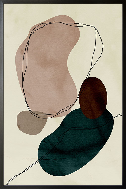
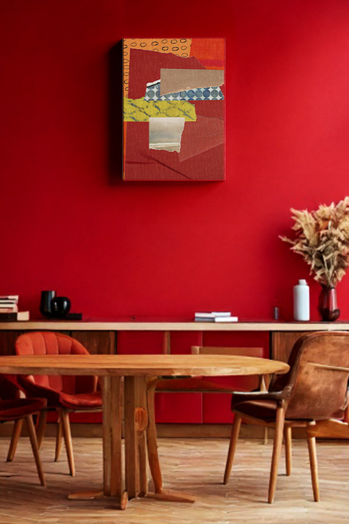
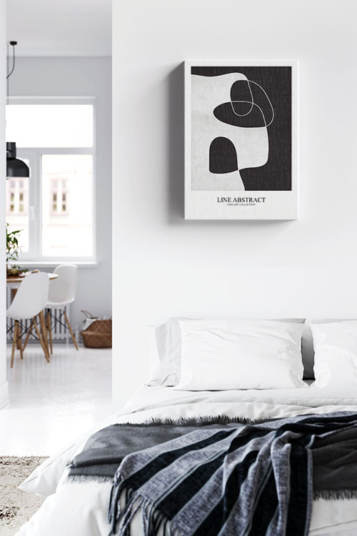
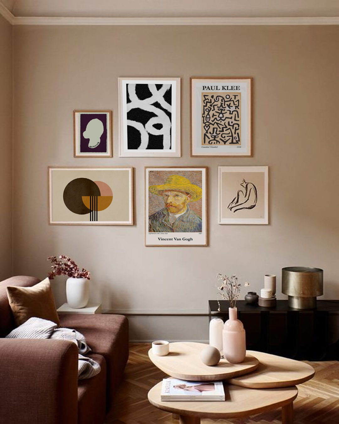
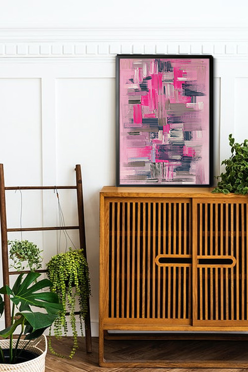
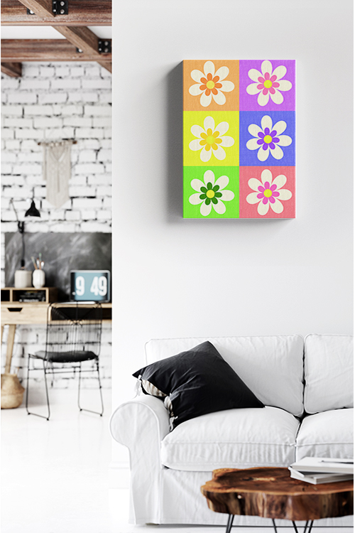
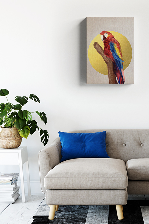
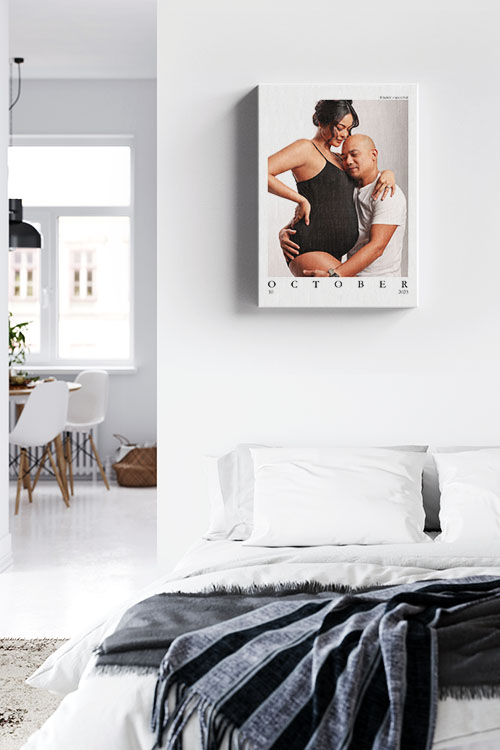
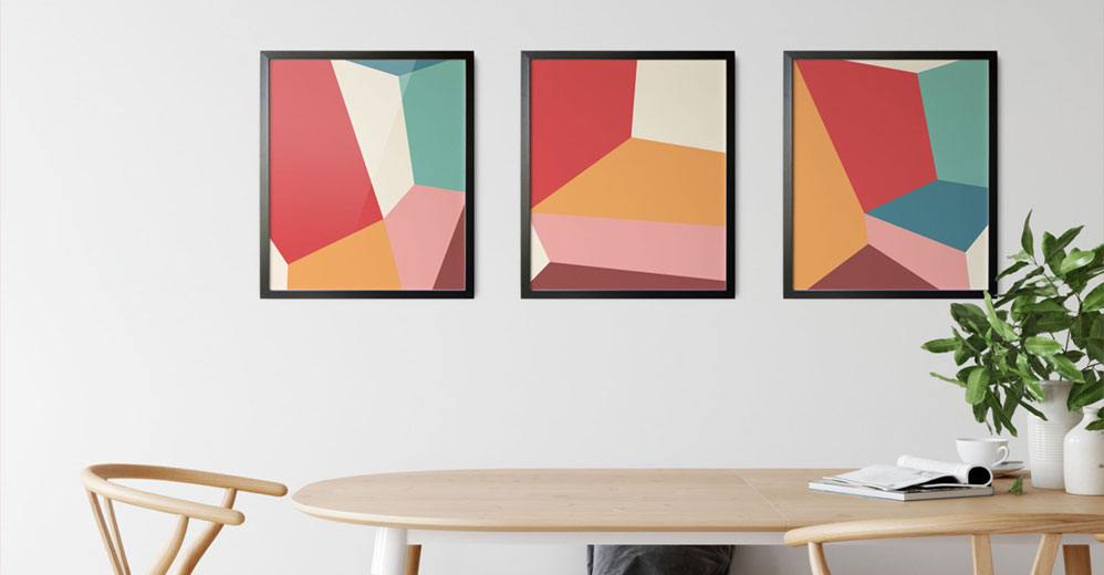
Room makeovers can be time-consuming and expensive. However, there are easy and creative ways to freshen up your space. Adding colors with trendy poster art is one impressive way to easily transform the interior appearance. 

The psychology of colors

By definition, color psychology is the study of hues as a determinant of human behavior. Several studies have shown that colors can affect a person’s mood and mind. This observation can be traced back to Ancient Egypt wherein they studied the effects of color on mood and used them to give people several benefits. 

Psychology these days has thoroughly studied the effects of color on human behavior. With impressive results, they have been used in many industries, such as business, advertisement, design, and art. In general, colors are divided into two groups, cool colors, and warm colors. Each group is known to affect the mood and behavior of humans and the room’s atmosphere.

Colors and interior decoration

You may wonder how colors affect the environment. There are three ways colors behave: active, passive, or neutral. For instance, neutral colors such as black, gray, white, and brown establish balance in the interior appearance. These colors can buffer the effects of cool and warm colors. 

Warm colors evoke warmth as they remind us of the sun and fire. Examples are red, yellow, and orange. Cool colors, such as blue, green, and purple, evoke a cool feeling as they remind us of water and plants. For hundreds of years, this concept has been studied and recorded and is used in many aspects. 

Here are some colors and their respective meanings:

  • Red is mostly associated with energy, war, danger, strength, power, determination, passion, desire, love, and intimacy. This is why many establishments decorate their interiors with shades of red during Valentine’s Day. The shade is also employed in the kitchen as it stimulates the appetite. Choose this color if you want to add excitement to your room. 
  • Orange is a color associated with sunshine, joy, and warm tropics. It also symbolizes happiness, creativity, success, encouragement, and stimulation. 
  • Yellow is likewise associated with joy, happiness, intellect, and energy. It is perfect for the kitchen, bathrooms, dining room, and hallway. If the right shade is chosen, yellow is a cheerful color. It can also blend with neutral colors for a more sophisticated-looking interior.
  • Green is the color of nature and is considered a calming color for the eye. The color symbolizes harmony, growth, freshness, and fertility. If you want a soothing and relaxing home, green is the perfect color to use. 
  • Blue is the most popular color in many countries. It symbolizes trust, loyalty, wisdom, confidence, intelligence, faith, and truth. This color is also said to be beneficial to the mind and body due to the effects it evokes. 
  • Purple – a mysterious color that can add drama and sophistication to the room. 

Final Thoughts

Imagine what a world would look like without colors—dull, boring, and somber. This is also what your home will look like without colors. Adding posters is one of the fastest and easiest ways to add color to the interior. In artdesign, we have many poster art that will make the interior look fun and interesting. Depending on the preference and personality of the homeowner, their choice of colors can set the appropriate mood in their homes.

Neutral Tone Abstract Poster

Neutral Tone Abstract poster with frame

Poster design with abstract art in neutral colors. Abstract art that will transform how your walls appear. Perfect for plain colored walls of your rooms as this can add a simple yet compelling wall accent. Along with the shapes are line art that blends well with the overall design of the poster.

How to Use Bold Prints in Home Decor

Torn Textures Canvas

Bold prints are a powerful way to inject personality, vibrancy, and visual interest into your home. They have the potential to completely transform a space, creating a new atmosphere and energy. Whether you’re drawn to geometric shapes, florals, abstract art, or animal prints, using them effectively can breathe new life into your home. The key lies in finding the right balance between making a statement and achieving style harmony. Here are some tips on how to incorporate bold prints into your home decor with confidence and flair. 

Start Small with Accents

If you’re new to bold prints, start with smaller decorative elements, such as throw pillows, rugs, curtains, or art prints. A floral or geometric pillow on a neutral sofa can bring life to your living room without overwhelming the space. Likewise, a bold-patterned rug can anchor a room while still allowing you to keep other elements simple and understated. These accents are easy to switch out seasonally or whenever you want a fresh look. 

Choose a Focal Point

Bold prints work best when they serve as the focal point of a room. A focal point is a design element that immediately draws your attention when you enter a room. You can choose one significant piece, such as a statement wall with wallpaper, a patterned sofa, or a large canvas print, that stands out. Let this be the centerpiece, and keep the surrounding decor more subdued. This helps prevent the space from feeling chaotic or too visually busy. 

Balance with Neutrals

Pairing bold prints with neutral colors is essential to achieving a cohesive design. For example, if you have bright, tropical curtains, opt for furniture in whites, grays, or soft earth tones. Neutrals help ground the room and allow the print to shine without clashing with other elements. 

Mix Patterns Carefully

It’s entirely possible to mix different bold prints, but it requires careful coordination. Stick to a standard color palette to tie the patterns together. For example, a striped chair in navy and white can complement a navy floral rug. Vary the scale of the prints–mix large florals with smaller geometrics or dots to avoid visual competition. 

Incorporate Art and Wall Decor

Wall art is one of the easiest ways to experiment with bold prints. A gallery wall featuring striking posters or prints can instantly energize a blank wall. Select themes or colors that complement each other, and use matching frames to achieve a clean, curated look. Bold artwork is especially effective in minimalist spaces, as it adds depth and character to the environment. 

Be Mindful of Space and Lighting

Bold prints can make small spaces feel even smaller if not used properly. In compact rooms, it’s best to stick to one or two bold elements and let natural light flow freely. In larger spaces, you can be more adventurous with multiple patterns or large-scale prints, as long as there’s enough room to breathe. When choosing bold prints for a small room, consider opting for smaller-scale prints or using them as accents rather than dominant features. 

In a Nutshell

Using bold prints in home decor is all about expressing your style while maintaining visual harmony. Whether you take a maximalist or minimalist approach, bold prints can bring energy, texture, and uniqueness to your interiors. With thoughtful placement and a balanced design, bold prints can transform any room into a dynamic and inviting space. 

Minimalist Bedroom Designs and the Art of a Thoughtful Wall

Texture line abstract Black and white No1 canvas

Minimalist bedroom design is more than just a trend; it’s a lifestyle. It’s a lifestyle choice that embraces simplicity, calm, and clarity. By stripping away the excess, you create a restful sanctuary that encourages relaxation and mindfulness. The tranquility of a minimalist bedroom can bring a sense of calm and peace to your daily life. But minimal does not mean boring. With the correct design elements and a carefully curated art wall, your minimalist bedroom can be both stylish and personal. 

Clean Lines and Neutral Colors

The foundation of any minimalist bedroom lies in its simplicity. Stick to clean, straight lines for your furniture and keep your color palette neutral. Think whites, soft grays, beige, or earthy tones. These colors create a serene environment, making your space feel more open and airy. Keep furniture functional and uncluttered, with only essential items, such as a bed, a side table, and perhaps a small dresser or chair.

Quality Over Quantity

Minimalism is all about choosing fewer but better things. Invest in high-quality bedding, a sturdy bed frame, and timeless decor pieces such as a simple vase, a classic lamp, or a well-crafted mirror that will stand the test of time. Keep surfaces clear and store personal items out of sight to maintain a clean and peaceful atmosphere. 

The Art Wall: A Personal Statement

Even in a minimalist space, art can play a decisive role. A thoughtfully designed art wall adds character and personality without overwhelming the space. Here’s how to do it right:

  • Choose with Intention – select a few pieces of art that genuinely resonate with you. This personal touch in choosing art can make your minimalist bedroom feel more connected and engaging. Stick to a consistent theme–whether that’s black-and-white photography, abstract shapes, or nature-inspired prints.
  • Keep It Balanced – in a minimalist room, the art wall should feel integrated, not overpowering. Limit the number of pieces and use matching or complementary frames to keep a sense of cohesion. 
  • Placement Matters – position the art above the bed or on a focal wall. Center the arrangement to draw the eye and enhance the room’s symmetry.
  • Negative Space is Key – don’t be afraid to leave space around your artwork. The freedom and openness of negative space are key elements in minimalist design. It allows your art to breathe and your room to feel more spacious.

In a Nutshell

A minimalist bedroom can be both beautiful and functional when the right balance of design and decor is achieved. By keeping your space simple and adding a carefully curated art wall, you can create a calm and stylish retreat that reflects your personality without clutter.

The Role of Color Psychology in Interior Design

A vibrant and colorful canvas print in brushes

Color is one of the most powerful tools in interior design. It profoundly impacts mood, emotions, and behavior. The study of color psychology, which focuses on how colors influence human feelings and actions, is instrumental in creating spaces that are harmonious, energizing, or calming, depending on their intended use.

Each color evokes a different emotional response. For instance, blue is often associated with calmness, stability, and serenity. It is frequently used in bedrooms and bathrooms to promote relaxation. Green, symbolizing nature and renewal, brings a refreshing, tranquil energy, making it an excellent choice for living rooms and home offices. Meanwhile, yellow radiates warmth and optimism, ideal for kitchens and dining areas where social gatherings occur.

On the other hand, red is a stimulating color that can increase energy levels and appetite, making it a popular choice for dining rooms and entertainment spaces. However, it can also feel overwhelming in large doses, so it’s often best used as an accent. Historically linked to luxury and creativity, purple can add a sense of sophistication to a space, while orange brings vibrancy and enthusiasm, suitable for workout rooms or creative studios.

Neutral colors like white, gray, beige, and black also have potent psychological effects. White suggests cleanliness and simplicity, making rooms feel more spacious. Gray offers balance and can create a sophisticated, modern atmosphere, while beige brings warmth and comfort. Black, used carefully, can add drama, depth, and elegance to a space.

The emotional impact of color also depends on factors such as tone, saturation, and lighting. Soft, muted shades generally have a calming effect, while bright, saturated hues can energize and excite. Natural and artificial lighting significantly alter the colors’ appearance and influence their psychological impact.

Successful interior design carefully considers these psychological effects to align with each space’s purpose. For example, a restful bedroom might feature cool tones and soft textures, while a lively family room could incorporate warmer hues and bold patterns.

Ultimately, the understanding and application of color psychology empowers designers to create environments that are not only visually appealing but also supportive of the well-being and activities of the people who use them. Thoughtful color choices can transform a house into a welcoming home or a workspace into a hub of productivity and creativity.

How to Create a Timeless Interior Design Style

SELFCARE BEIGE WITH VAN GOGH AND PAUL KLEE ARTWALL

Creating a timeless interior design style involves blending classic elements like traditional furniture and neutral colors with contemporary elements such as sleek lighting fixtures and minimalist decor, ensuring your space remains stylish for years. Here’s a guide to achieve this.

Choose a Neutral Color Palette

Start with a neutral base for walls, floors, and larger furniture pieces. Shades like soft whites, warm grays, and muted browns provide a timeless backdrop that won’t go out of style. They also create a versatile canvas for adding pops of color or changing decor over time. 

Invest in Quality Furniture

Select furniture pieces with classic designs and durable materials. Choose timeless shapes and neutral-toned fabrics like leather, linen, or cotton. Quality craftsmanship ensures longevity and enduring style. 

Embrace Timeless Patterns and Textures

Incorporate classic patterns such as stripes, plaids, herringbone, or geometric motifs in subtle ways through upholstery, rugs, or draperies. Textures like wood grain, natural stone, and polished metals add depth and sophistication.

Focus on Functional Layouts

When arranging furniture and decor, prioritize functionality and flow. Create inviting conversation areas and ensure ease of movement throughout the room. This approach maintains a timeless style and helps you feel at ease in your living space, without the clutter and overcrowding.

Mix Old and New Elements

Blend vintage or antique pieces with modern furnishings for an eclectic yet cohesive look. This juxtaposition adds character and presents the space from feeling dated.

Opt for Classic Lighting Fixtures

Choose timeless lighting designs, such as chandeliers, pendant lights, or wall sconces, with clean lines and finishes like brushed nickel or brass. Adequate lighting enhances ambiance and highlights key design elements.

Incorporate Natural Elements

Integrate natural elements such as wood, stone, or plants to bring warmth and texture to the space. Greenery adds life and a sense of tranquility, promoting a timeless connection to nature. 

Curate Art and Decor Thoughtfully

Select art and decor pieces that resonate with your style and complement the overall aesthetic. Consider investing in original artworks or timeless sculptures that will stand the test of time. 

Maintain Simplicity and Balance

Avoid trends that might quickly become outdated. Keep decor minimal and purposeful, focusing on quality over quantity. By balancing different elements, you can create a timeless design that exudes harmony and balance in your living space. 

Regularly Refresh with Accessories

Update the look by swapping out accessories like pillows, throws, or small decor items. This allows you to incorporate seasonal trends without overhauling the entire design.

In a Nutshell

Following these principles can create a timeless interior design style that reflects your personality while ensuring enduring elegance and comfort in your living space.

Finding Your Perfect Hue: A Guide to Paint Color Selection

Pink Dusk Poster

Choosing the right paint color for your space can be exciting and overwhelming. With endless options, finding the perfect hue requires careful consideration of lighting, room function, and most importantly, your personal style. This guide will help you navigate the process and confidently select a paint color that not only enhances your space but also reflects your unique taste.

Consider the Mood

Each color evokes a specific emotion, making it essential to align your choice with the atmosphere you want to create. Soft blues and greens bring a sense of calm and relaxation, making them perfect for bedrooms and bathrooms. Warm colors like red, orange, and yellow promote energy and conversation, making them ideal for dining rooms and living spaces. Neutrals such as beige, gray, and white provide versatility and can serve as a timeless backdrop.

Assess Natural and Artificial Lighting

Lighting plays a crucial role in how a paint color appears. Natural light can make colors look brighter, while artificial lighting can alter their tone. North-facing rooms often have more extraordinary, dimmer light, making colors appear slightly muted, while south-facing rooms receive warm, bright light that enhances warm tones. Understanding these lighting dynamics is key before committing to a color, so be sure to observe how it looks in different lighting conditions throughout the day.

Test Paint Samples

What looks perfect in the store may appear entirely different in your home. Instead of relying on small swatches, buy sample-sized cans of your top choices and paint large wall sections. This lets you see how the color interacts with your furniture, flooring, and décor. Live with the samples for a few days to ensure you love the color before making a final decision.

Take Inspiration from Existing Elements

If you struggle to find a starting point, look at your furniture, artwork, or textiles for inspiration. A favorite rug or artwork can be a foundation for your color palette. Consider the undertones of these elements—warm or cool—and choose a paint color that complements them.

Understand Color Undertones

Even neutral colors have undertones that can influence a room’s overall look. For example, a gray with blue undertones will feel cooler, while a gray with brown undertones will feel warmer. To avoid surprises, compare your chosen paint color to pure white to better see its underlying tones.

Use the 60-30-10 Rule.

A well-balanced color scheme follows the 60-30-10 rule. For instance, in a living room, 60% of the room could feature a dominant color on the walls, 30% could be a secondary color in the form of furniture or textiles, and 10% could be an accent color in the decor or accessories. This method ensures harmony and prevents too many competing shades from overwhelming the space.

Don’t Be Afraid to Go Bold

While neutrals are safe, bold colors can add personality and drama to a space. Deep navy, emerald green, or rich terracotta can create a stunning focal point. If committing to a bold color on all walls feels daunting, consider an accent wall or use it in a smaller space, like a powder room or hallway.

In a Nutshell

Choosing the perfect paint color requires intuition, strategy, and experimentation. By considering mood, lighting, and existing elements, you can find a hue that enhances your space and reflects your personality. With thoughtful planning and testing, your chosen color will bring new life to your home.

Mixing Patterns and Textures in Your Home

Flowers pattern colors Canvas

Mixing patterns and textures in home decor can transform a space, adding visual interest, depth, and personality. However, achieving a cohesive and aesthetically pleasing look requires thoughtful planning and a clear understanding of design principles. Following key guidelines, you can master combining patterns and textures to create a stylish and harmonious environment.

Establish a Neutral Base

The foundation of any well-designed space often begins with a neutral base. Neutral colors, such as whites, beiges, or grays, create a calm and versatile backdrop that allows patterns and textures to stand out without overwhelming the room. Use neutrals for large surfaces like walls, flooring, or significant furniture. This approach provides balance and ensures that the space remains adaptable to future updates.

Select a Cohesive Color Palette

A unified color palette is essential for successfully blending patterns and textures. To maintain harmony, choose complementary colors or stick to various shades of a single hue. For instance, pairing cool tones like blues and grays with warm accents like gold or terracotta can create a balanced and inviting atmosphere. Repeating colors across patterns and textures helps tie the design elements together.

Balance Pattern Sizes

One of the most effective ways to mix patterns is to vary their scales. Large, bold patterns work well for statement pieces, such as area rugs or accent walls, while medium-sized patterns are suitable for upholstery or curtains. Smaller patterns, like subtle prints or intricate designs, can be used for throw pillows or smaller accessories. Balancing different pattern sizes prevents the space from feeling chaotic and ensures that each element contributes to the overall design.

Incorporate a Variety of Textures

Texture plays a crucial role in adding depth and dimension to a room. Mixing soft, rough, and smooth textures creates a layered effect that interests the space visually. For example, pair a plush velvet sofa with a jute rug, a sleek glass coffee table, and a woven throw blanket. You can achieve a rich and dynamic look by blending different materials, such as wood, metal, fabric, and stone.

Anchor with Solids

Anchor your design with solid-colored elements to avoid overwhelming the space. Solids provide a visual rest and help balance the complexity of mixed patterns and textures. For example, a solid-colored bedspread can ground a bedroom filled with patterned pillows and textured throws. Similarly, a monochromatic sofa can be the perfect backdrop for various patterned cushions.

Experiment and Edit

Creativity and experimentation are essential when mixing patterns and textures. Start by gathering swatches or samples to see how different elements interact. Create a mood board or test arrangements before committing to large purchases. Editing is equally essential; if a particular element feels out of place, don’t hesitate to remove or replace it.

Reflect Your Style

Finally, the most successful designs reflect the homeowner’s personality and style. Incorporate unique pieces such as handmade ceramics, heirloom quilts, and travel souvenirs to add character and authenticity to your space. These personal touches make the room feel special and ensure it resonates with you.

By carefully combining patterns and textures, you can create a visually captivating, comfortable, and uniquely yours home. With a bit of planning and creativity, the possibilities are endless.

What is the best color for the living room?

Birds collection Parrot Canvas

Choosing the best color for a living room is an artful balance between style, mood, and functionality. The living room is a central space in the home, used for relaxation, entertainment, and gatherings, so selecting a color that feels inviting, comfortable, and complements the overall decor is essential. Here are some of the top color choices for living rooms and the effects they bring to the space.

Neutral Tones: Beige, Grey, and White

Due to their versatility, neutral colors are often considered ideal for living rooms. Beige, soft greys and warm whites create a calm, welcoming ambiance and work well as a base for other accent colors. Neutrals provide a backdrop that can easily accommodate different furniture styles, artwork, and textures, allowing you to change accessories without a major overhaul. These colors make a room feel more spacious and allow natural light to play a prominent role, adding a touch of elegance and sophistication.

Earthy Hues: Olive, Terracotta, and Warm Browns

Earth tones are famous for creating a cozy and grounded feel in the living room. Colors like olive green, terracotta, and warm brown develop a sense of warmth and connection to nature, making the space feel comforting and serene. These hues work particularly well in living rooms, incorporating natural materials like wood or stone, and pair beautifully with neutral furnishings. Depending on the decor style, earthy colors can also lend a rustic or bohemian vibe.

Soft Blues and Greens

For a more refreshing atmosphere, consider light blue or green shades. Soft blues evoke tranquility and openness, while greens offer a fresh, revitalizing feel. These shades effectively create a calm, relaxing environment that promotes peace. They pair well with white trim and natural textures, adding a subtle elegance that can make the living room feel like a serene escape.

Bold Colors: Navy, Charcoal, and Deep Teal

For those who prefer a more dramatic look, deeper tones like navy, charcoal grey, or teal add sophistication and depth to the living room. These colors can make a statement and create a more intimate, luxurious atmosphere, especially when paired with metallic accents or rich textures. Darker shades work well in larger living rooms, making the space feel more inviting without appearing too overwhelming.

Ultimately, the best color for a living room depends on personal preference and how you use the space. Consider your decor style, lighting, and the atmosphere you want to create, and choose a color that enhances the room’s purpose and comfort.

Great minimalist bedroom design for small rooms

Wedding Portrait canvas

Creating a minimalist bedroom in a small space is not just about design. It’s about achieving a sense of freedom. It combines simplicity with functionality, allowing the room to feel open and clutter-free. The minimalist design emphasizes clean lines, essential furniture, and a neutral color palette, perfect for smaller rooms with premium space. You can make even the tiniest bedroom feel spacious and serene with a few strategic choices.

Start with a Neutral Color Palette

The minimalist design relies heavily on a neutral color palette to create a calm, uncluttered look. Shades of white, beige, light gray, or even soft pastels can make the space appear larger and more open. Choose one or two primary colors and stick with them throughout the room to keep it cohesive. To add warmth, consider layering in subtle earth tones, like tan or taupe, through accessories like pillows, rugs, or wall art.

Invest in Multi-functional Furniture

Furniture serving multiple purposes is a lifesaver in a small bedroom. Opt for a bed with built-in storage drawers underneath or a platform bed with shelves for additional storage. A fold-down desk, floating shelves, or a wall-mounted bedside table can also help save valuable floor space while keeping everything you need within reach. If possible, keep the number of furniture pieces to a minimum—each item should have a purpose.

Keep Surfaces Clutter-Free

One of the hallmarks of minimalism is clean, uncluttered surfaces. Make sure your nightstands and dresser tops aren’t crowded with objects. Instead, limit it to just one or two essential items, like a reading lamp, alarm clock, or a small plant. For personal items and necessities, consider placing them in organized trays or boxes within drawers. Keeping surfaces clear will make the room feel larger and more inviting.

Maximize Natural Light

Light can make even the smallest rooms feel more expansive. If you have windows, keep window treatments simple and airy to allow as much natural light as possible to flow into the space. Sheer curtains or light blinds in neutral colors work well for this. To further amplify the light, use mirrors to reflect it around the room, creating the illusion of a larger space. A well-placed mirror opposite a window can dramatically enhance the light and openness in the room.

Stick to Simple, Clean Lines

Minimalist design is all about clean, straight lines, so choose furniture with a simple design and avoid overly ornate details. Sleek, low-profile beds, narrow nightstands, and streamlined storage solutions will keep the room from feeling cramped. When possible, select furniture that stands on legs rather than sitting directly on the floor—this will give the illusion of more space by allowing the eye to see the floor underneath.

Use Textures for Added Warmth

While minimalism often leans toward a clean and straightforward look, adding various textures can keep the room from feeling too stark or sterile. A soft, cozy throw blanket, a plush rug, or linen bedding can add subtle dimension without crowding the room. Stick with one or two texture types for balance; too many textures can clash and undermine the minimalist aesthetic.

Limit Your Decorations

When decorating a minimalist bedroom, less is more. Choose a few meaningful pieces of decor to display, such as art, a couple of small plants, or a single decorative object. Avoid too many picture frames, wall hangings, or collectibles, making a small space crowded. Each item should serve a purpose and add value to the room’s overall look.

In a Nutshell

Minimalist bedroom design for small spaces is not just about aesthetics, it’s about creating a peaceful sanctuary. It focuses on simplicity, function, and a calm color palette to maximize space and create an inviting atmosphere. By investing in multi-functional furniture, keeping surfaces clear, and letting in as much light as possible, you can transform a compact bedroom into a tranquil retreat that feels larger than it is. With thoughtful choices and a mindful approach to decor, a small bedroom can become a minimalist sanctuary.