With black and white photo art and inspiring quotes, you’ll have the perfect backdrop for a modern living room! Buy the complete art wall here.
Number of posters: 3
With black and white photo art and inspiring quotes, you’ll have the perfect backdrop for a modern living room! Buy the complete art wall here.
Number of posters: 3
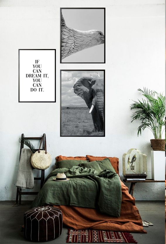
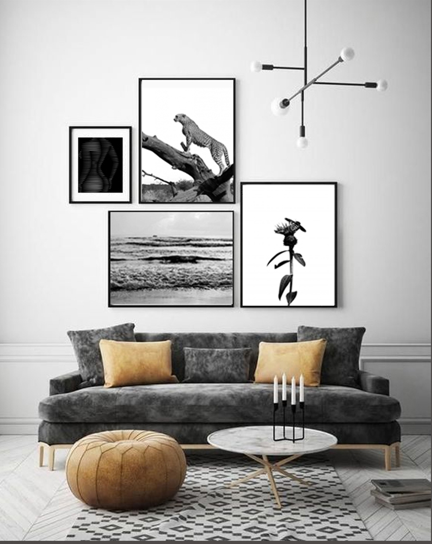
This gallery wall in grey-scale and classic black and white will add a timeless style to your living room! Buy the entire art wall here.
Number of posters: 2
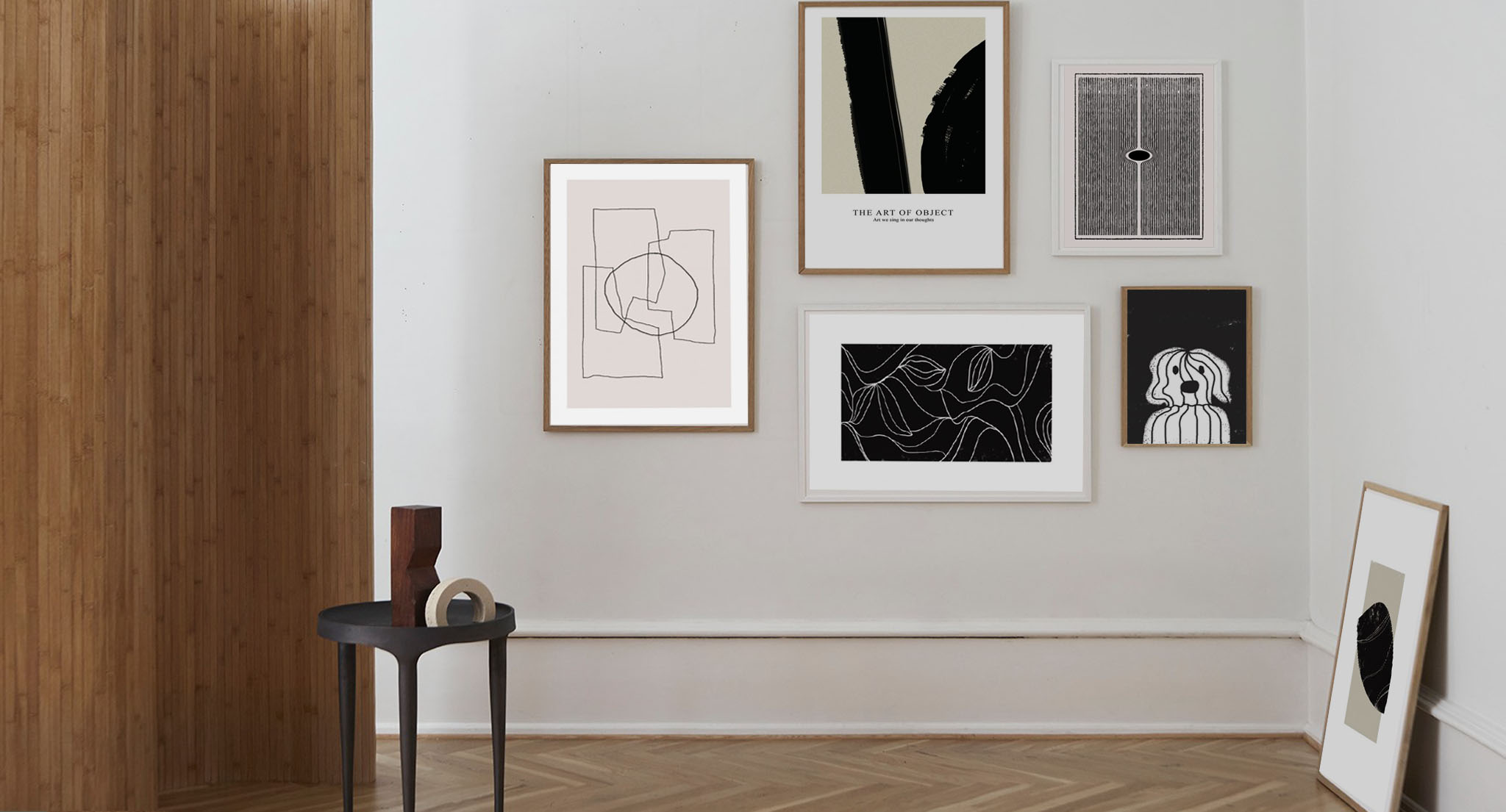
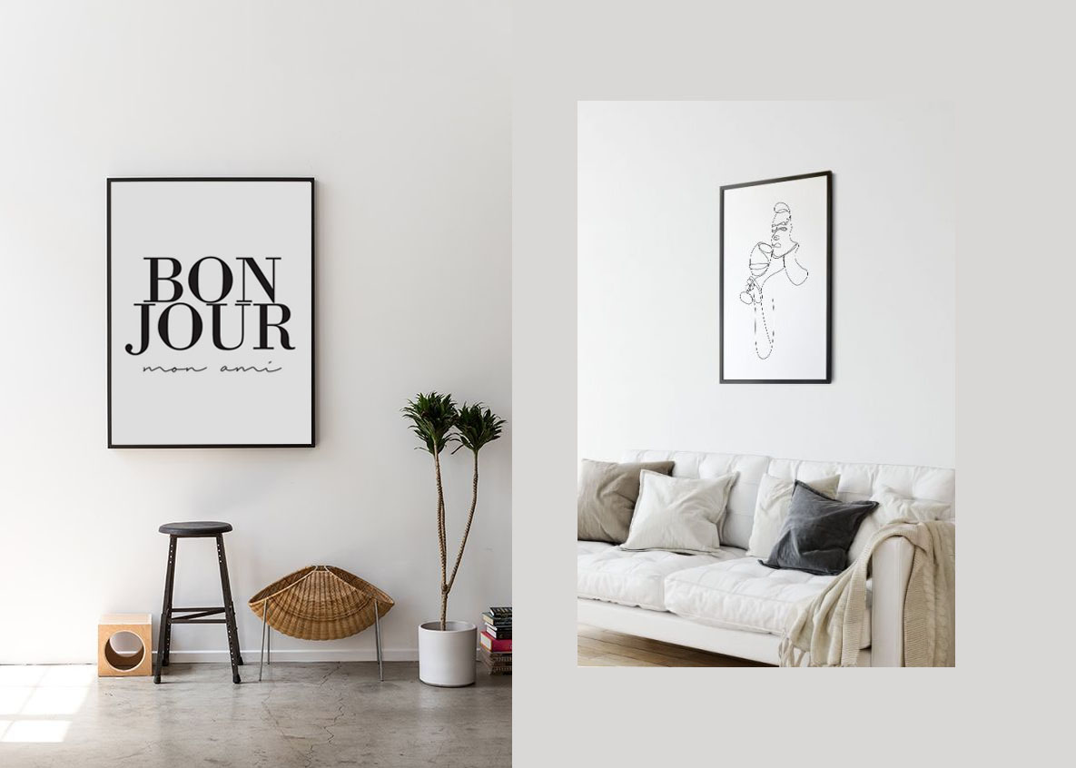
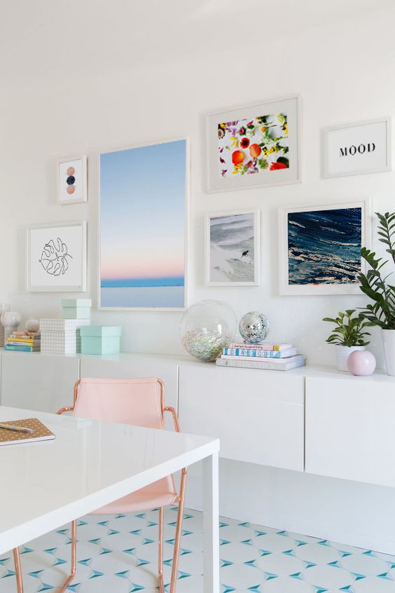
With black and white poster prints and line arts, you will have a minimalistic look in your room and a trendy touch to your walls. Shop all arts here!
Number of posters: 6
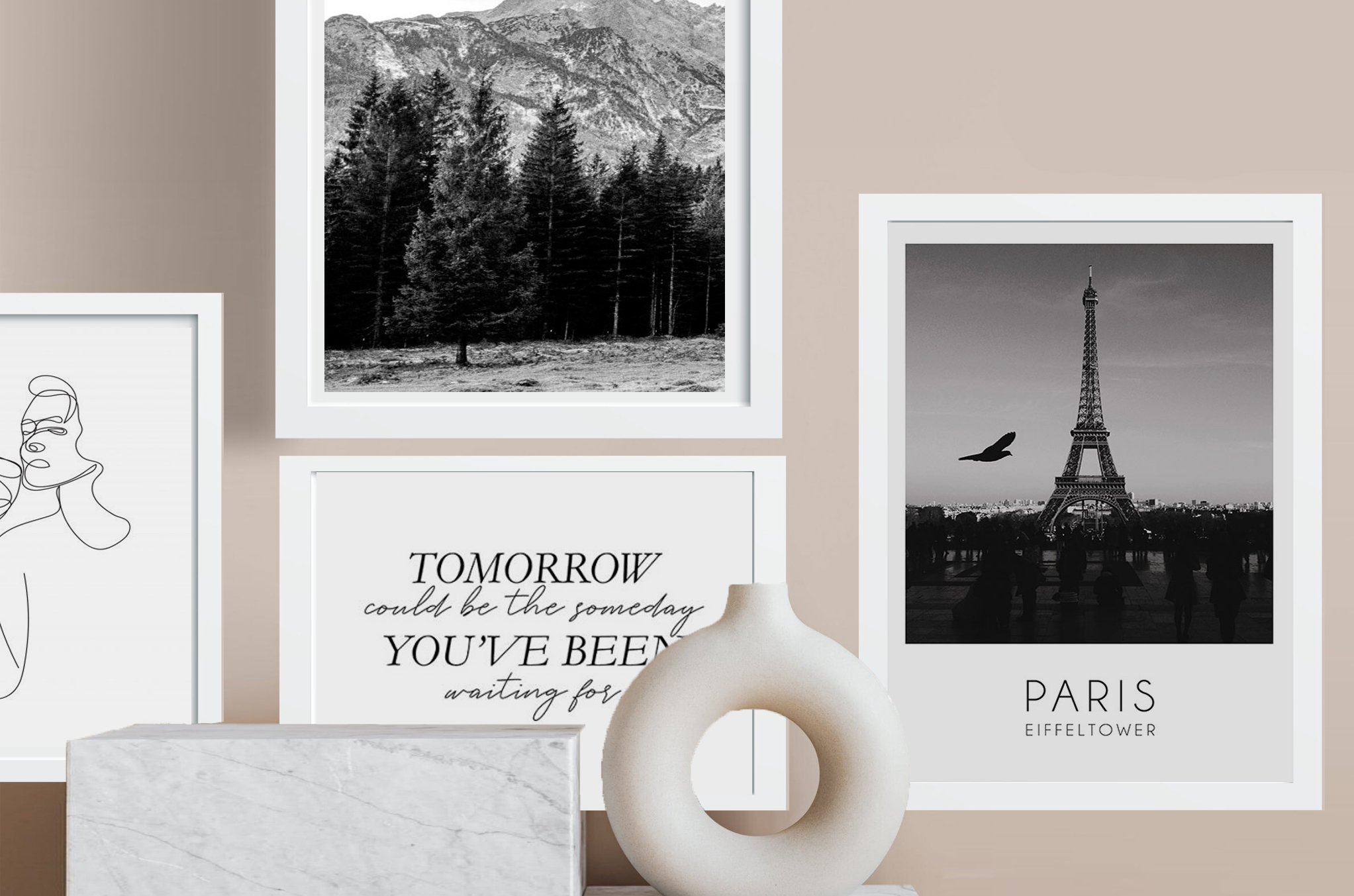
With black and white poster prints and inspiring quotes, you’ll have the perfect backdrop for a modern living room! Shop the complete art wall here.
Number of posters: 4
These minimalistic, typography and line art in white background will add a stylish and trendy touch to your walls! Shop all arts here.
Number of posters: 2
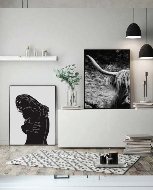
This art wall in grey-scale and classic black and white will add a timeless style to your living room! Buy all featured poster prints here.
Number of posters: 4
One of the trendy interior design styles these days is the Scandinavian design. Many homeowners have been incorporating the style in their living space due to its functionality, simplicity, and clean lines. The design style is proud of the harmony it evokes with the environment. Moreover, Scandinavian design style uses materials that last rather than being replaced in a short period of time. The style also promotes a simple home environment and complement the art of living well.
Scandinavian design style is known for its minimalist style. The design emerged during the 1930s within the countries of Denmark, Finland, Iceland, Norway, and Sweden. It originated from a design show in the United States and Canada between 1954 and 1957. The show highlighted the simple ways of living and featured the works and designs of Nordic designers.
The design style primarily focuses on clean lines and simple designs which are inspired by nature. In addition to these, the designs are appealing and of good quality. It makes use of sustainable and affordable materials that can be accessed by many people. Several exhibits during the 1950s showcased the design style. As such, it influenced the other design principles in both Europe and North America.
The design style is used for the improvement of the daily lives of humans. Designers and homeowners who employ the design style focus on the use of furniture pieces, lighting, fabric, accessories, dinnerwares, and utensils. Scandinavian design style is clearly associated with nature. It was likewise observed that there is a contrast between abstract and natural shapes. Natural materials are also used like wood, leather, hemp, and stones.
With the growing popularity of the design style, various designers have also become famous and greatly influenced the principles of Scandinavian design style. Examples of artists are Alvar Aalto, Poul Henningsen, Arne Jacobsen, Borge Mogensen, Hans Wegner, and Maija Isola.
The floors are usually made up of wood in light tones. Wooden floors are common in every room, except in the bathroom. The walls, ceilings, cabinetry, and furniture pieces are also made up of wood in warm tones. The good thing about this is that the walls can be decorated with wood-themed wall coverings.
It is also of utmost importance to use eco-friendly materials for the floors, walls, siding, and roofing. In addition to these, do not expect colorful rooms as it is common for the design style to have white walls and cool blue textiles. Pops of yellow and orange may also be seen in rugs and fabric.
One of the philosophies of Scandinavian design style is “less is more”. It is important to maintain a clutter less home or space. As such, the use of accessories is limited to avoid their accumulation. Lastly, some homeowners may also prefer to add fireplaces. Fireplaces are also common in Scandinavian design style due to the climate in the Scandinavian region. The materials used as well as the appearance of the fireplace are also simple-looking and appealing.
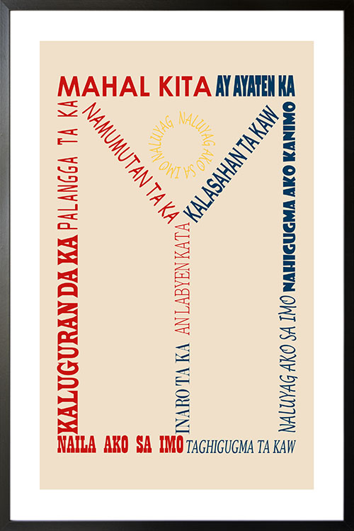
The Philippine flag in an interesting design. With the color white that symbolizes liberty, equality, and fraternity. The blue color represents peace, truth, and justice. While the red is for patriotism and valor. A cool poster design that will truly bring the Filipino spirit to your homes. Personalize your poster by sending your own quotes or sayings. Try it now!
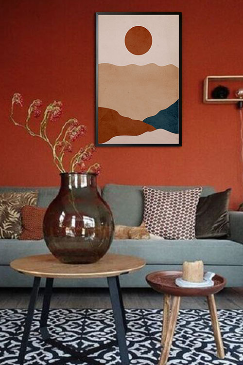
Over the years, experts believe that colors have significant effects on the behavior of many individuals. In general, warm colors can evoke a fun and exciting atmosphere in any room. Moreover, colors like red, orange, and yellow, were known for bringing out the positive aspect of life.
Science describes colors as visual perception and they are categorized in different categories. Studies have shown that when eyes connect with colors, various chemicals are released from the brain. These chemicals have particular effects on the physical and emotional levels of humans.
These are the reasons why in the world of advertising and marketing, certain colors are used to highlight the different products. Different color palettes have been used by companies in the packaging of their products and also in promotional materials. The color orange, for instance, is usually seen in restaurants due to the fact that the color stimulates appetite. Red, on the other hand, brings out masculinity. Many products for men use the color to encourage men in purchasing them.
Colors are also important in interior design. The use of colors is one of the important factors in creating the right atmosphere in a room. In many instances, home interiors are seen in neutral colors like black, blue, gray, and white. Unfortunately, these colors do not provide any health benefits as compared with warm colors.
Warm colors are those that are in the red area of the color spectrum. In human health, warm colors are known to have positive effects. These colors evoke emotions that range from warmth and comfort to anger and hostility. These colors stimulate the body that creates a happy emotion.
On the other hand, cool colors are those that are in the blue side of the color spectrum. Examples are blue, purple, and green. These colors are calming and relaxing. However, they also evoke a feeling of sadness.
The color with the longest wavelength and considered to be powerful. It can catch attention as compared with other colors. These are some of the reasons why red is used in traffic lights as it evokes physical and psychological responses.
The positive traits of red are courage, strength, warmth, energy, stimulation, and excitement. It was also observed that the color can stimulate circulation, thus increasing the circulation of blood and oxygen.
The color with a relatively long and stimulating wavelength. In color psychology, yellow is considered to be a strong color. The right shade of yellow can uplift the spirit and boost self esteem as well as self-confidence and optimism. On the contrary, yellow can promote the feeling of irrationality, fear, depression, and anxiety.
The color that results from the combination of red and yellow. This is another stimulating color that has effects on the mind. Orange also represents human needs, such as, food, warmth, shelter, and sensuality.
Warm colors are considered to be stimulating colors as they help activate mind and body. As such, blood circulation is increased to help the cells receive more oxygen. This in effect promotes cell growth and organ function. In addition to these, the immune system is also stimulated to fight disease causing microorganisms. The brain is also well oxygenated making the mind sharp and focused.
The first thing to consider in creating a home is the color. Creating a home color palette will make your decorating choices much easier and can create a flow between rooms. Your choice of colors completely depends on you. Experts recommend sticking to 3 to 5 colors for the color palette.
Monochromatic color scheme is ideal for homeowners who want to have a modern and clean home. Harmonious color schemes, on the other hand, can give you a calm and relaxing feeling. Complementary colors are opposite from each other on the color wheel and each color stands alone.
So, whatever color palette you choose, will reflect who you are and what atmosphere you want for your home.
Shades of blue are observed to be calming and people in blue bedrooms get more sleep than any other color. This is for the reason that there are receptors in our eyes that are sensitive to the color blue. The color can also lower the heart rate and blood pressure. Studies have also shown that blue bedrooms can make you feel happy when you wake up.
Yellow is said to be the second best color for the bedroom. It stimulates the nervous system and encourages relaxation and promotes coziness.
Green can also promote sleep and can help waking up with a feeling upbeat and positive. Warm colors are also observed to create a relaxing atmosphere that can aid digestion. The colors can likewise help warm and relax body muscles so that one may have a good night’s sleep.
Warm colors such as orange and red represent energy and activity. Cool blues and greens on the other hand, are soothing and calming.
Before settling on a color palette, think about what you want to feel in your bathroom. Is it energized or relaxed? Color orange is energizing but does not overwhelm when paired with neutral tile.
When red is paired with a clean white backdrop, the bathroom design mixes old and new to create something totally new. While classic neutrals such as beige and tan can create a casual, classic bathroom style that can be dressed up with colorful accessories.
When it comes to the kitchen, the common colors seen are white, gray, blue, red, yellow and green. Each one of them can do something for the room by creating a warm and welcoming atmosphere.
Red is also considered to be a warm color and can stimulate the appetite. The color is said to be one of the good choices for the kitchen. The color is likewise versatile and can be used on the cabinets or on the walls. White on the other hand, can energize the room and will wake you up the minute you step in. Color white on the countertops and backsplash can be fun especially when they are in brighter colors or designs.
Colors commonly seen in nature such as sky blue and leaf green have a calming effect on us. While red is stimulating and yellow is said to be uplifting. Experts recommend that decorating with one color on walls and furniture is to use different shades of the same color together. For instance, soft apple green sofa paired with emerald metal side tables can create a wonderful effect. If you want to have a dramatic and modern look, paint the walls with dark midnight blue. Add furniture in rich shades like a pink sofa.
Pastel colors such as powder blue, pink or lilac can be incorporated with striped or floral accessories to make the living room more interesting. Lighter shades of color can make the room feel as big as possible.


