Ideal Bedroom Colors To Sleep Better

Blue Elegance Art wall

Many people experience insomnia for various reasons. One of the main reasons is the bedroom’s appearance, which is influenced by different factors. The bedroom’s color dramatically affects the mood and contributes to the sleepless nights of many individuals. The right coloring with paint, posters, wallpaper and furnishings can help solve this problem. Here are some recommendations and ideas to set the mood in the bedroom for a longer and deeper sleep. 

Ideal bedroom colors

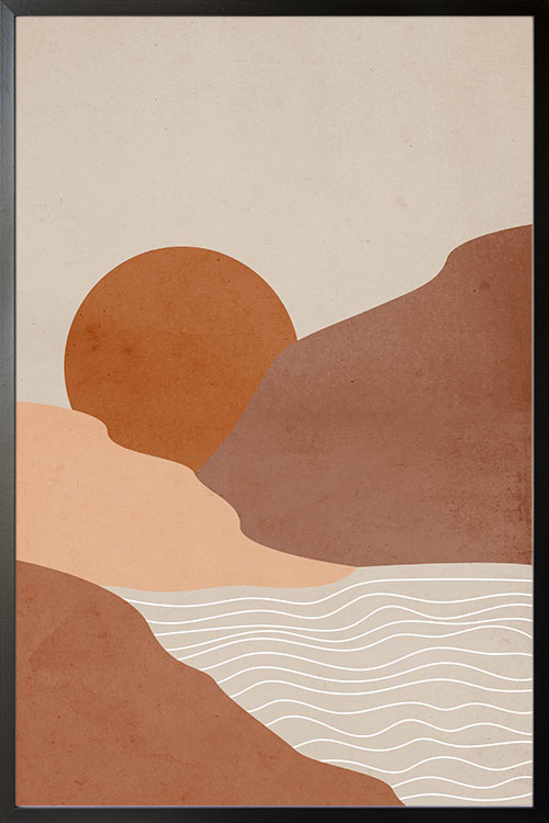
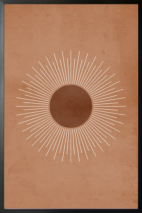
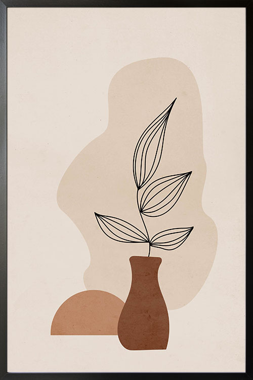
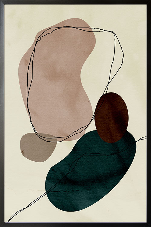
There are ways to help an individual have a deep sleep. Design the interior, particularly the colors. Choosing the right bedroom color can help people have a good sleep pattern. Cool colors such as blue and green create a calming and relaxing room. The addition of colors can be done in different ways. One of the most popular is the addition of posters or personalized prints. Wallpaper, tapestries, murals, and other wall coverings also help add colors and set the bedroom’s atmosphere. 

Relationship between sleep and colors

Colors are proven to have effects on the behavior of an individual. Studies have been continuously conducted to look for the relationship between colors and sleep. 

Cool colors, like blue, help people enjoy longer sleep compared to others in a room with different colors. Hues are associated with calmness and can relieve lower blood pressure and heart rate. People staying in a room with shades of blue can sleep for an average of 7 hours and 52 minutes. The impressive effect is why homeowners prefer posters of water, seas, sky, and beaches

The reason why the color blue promotes good sleep is because of receptor cells in the retina. Ganglions in the eye are responsible for sending information directly to the brain. 

If blue does not suit your taste, you can still use other colors and hues to promote deep sleep. Neutral colors like gray and silver are also known to promote good sleeping habits. In addition, pale yellow can have the same effects as that neutral colors. 

Other colors may also contribute to sleeping patterns, yet the average hours of sleep are shorter than those of people in a bedroom with shades of blue. Yellow, for instance, promotes sleep for around 7 hours and 40 minutes, green for 7 hours and 36 minutes, orange for 7 hours and 28 minutes, purple for 5 hours and 56 minutes, gray for 6 hours and 12 minutes, and brown for 6 hours and 5 minutes. 

Wall decor and sleep

The display of trendy art and personalized posters is one of the easiest and fastest ways to set the mood and atmosphere of the bedroom. The designs and images featured in posters come in a wide variety. They also come in colors that can help promote sleep. With the creation of wall art in the bedroom that is dominated by hues of blue, individuals will be able to have a good sleeping pattern. 

Check out www.artdesign.ph for posters with colors that will help you create the right ambiance in the bedroom. We have designs that will suit your taste. You can request customized prints to give your wall a more personal touch. 

Best Colors for Small Living Rooms

Choosing a paint color for small living rooms may be challenging but can be a fun activity. It may be confusing as well as there are a lot of shades and hues to choose from. Although those neutral shades are commonly used, there are still many hues in the color wheel that will look best in small living rooms. If you are having trouble deciding which color to use, worry no more as this article may help you with your interior decorating project. 

White

Pure white is excellent but not much used as many would think. Some whites reflect tones of blue, pink, and green. The color is ideal in a small living room as it reflects natural light, making it look more spacious and cozy. Having the color also creates a room that appears pure and clean. This is one of the reasons why hospitals and clinics prefer to use white. Moreover, white is seen in minimalist rooms and can be blended with many decors and styles. 

Cream

Many homeowners prefer the color and ideal in small living rooms as it makes them look open and bright. The color is best to be paired with hardwoods and other natural materials. The color cream is safe to use as it can be a perfect backdrop for other decors and colors. 

Yellow

Bright yellow may be too bright for most people, but you can use a softer tone. This can instantly make any dull room look warm and bright. It is a versatile color that can easily blend with contrasting colors such as red. It is also an ideal substitute for white and cream. 

Gray

Use gray if you are confident enough to make a difference in a small living room. The color can add depth and create a visually cozy and trendy interior appearance. Just like white, you can easily blend the color with any hues and decors. Darker shades of gray can be partnered with patterns and pops of color mixes to achieve an eclectic look in the room. 

Indigo

Just like gray, many homeowners choose this color in their small living rooms. It can help create a moody and sensual atmosphere. In addition to these, the small living room can have a cozy feel with a cool and relaxing feel. What makes the color more interesting is that it can easily be blended with other colors and decors. The dark indigo tone can likewise be a great backdrop for any wall decor and wall art. If you have this color on the walls then the ceiling should be in the color white. 

Warm Colors For A Happier Ambiance

Memphis art blue snake like in orange poster

Experts believe that colors affect the mood of people. In general, colors are divided into whether they are cool or warm. Warm colors can evoke fun and exciting atmosphere in any room, and they can bring out the positive aspects of life. Examples are red, orange, and yellow.

Colors and mood

Science describes colors as visual perception and that they are categorized in different categories. It was observed that when eyes connect with colors, various chemicals are released from the brain. These chemicals have particular effects on the physical and emotional levels.

These are the reasons why in the advertising and marketing industries, certain colors are used to highlight the brand. Different color palettes have been used by companies in the packaging of their products and also in designing their promotional materials. The color orange, for instance, is usually seen in restaurants since it stimulates appetite. Red, on the other hand, brings out masculinity.

Colors are also important in interior design. The use of colors is one of the important factors in creating the right atmosphere in a room. In many instances, home interiors are seen in neutral colors like black, blue, gray, and white. Unfortunately, these colors do not provide any health benefits as compared to warm colors.

Why use warm colors

Warm colors are those that are in the red area of the color spectrum. In human health, warm colors are known to have positive effects. These colors evoke emotions that range from warmth and comfort to anger and hostility. These colors stimulate the body that creates a happy emotion.

On the other hand, cool colors are those that are on the blue side of the color spectrum. Examples are blue, purple, and green. These colors are calming and relaxing. However, they also evoke a feeling of sadness. 

Red

The color with the longest wavelength and considered to be powerful. It can catch attention as compared with other colors. These are some of the reasons why red is used in traffic lights as it evokes physical and psychological responses. 

The positive traits of red are courage, strength, warmth, energy, stimulation, and excitement. It was also observed that the color can stimulate circulation, thus increasing the circulation of blood and oxygen.

Yellow

The color with a relatively long and stimulating wavelength. In color psychology, yellow is considered to be a strong color. The right shade of yellow can uplift the spirit and boost self-esteem as well as self-confidence and optimism. On the contrary, yellow can promote feelings of irrationality, fear, depression, and anxiety.

Orange

The color that results from the combination of red and yellow. This is another stimulating color that has effects on the mind. Orange also represents human needs, such as food, warmth, shelter, and sensuality. 

Final thoughts

Warm colors are considered to be stimulating colors as they help activate the mind and body. As such, blood circulation is increased to help the cells receive more oxygen. This in effect promotes cell growth and organ function. In addition to these, the immune system is also stimulated to fight disease-causing microorganisms. The brain is also well-oxygenated making the mind sharp and focused.

Neutral Boho 5 poster with Black Frame Nordic Interior Wall Decor

Neutral Boho 5 Poster

Bohemian-styled poster art that will add beauty to your rooms. The display of this poster is one of the fastest and easiest ways to make your room attractive and interesting. The earthy colors help create a room atmosphere that is comfortable and relaxing. This art is also one of the ways to boost the wall design to add value to your home.

Neutral Boho 4 poster with Black Frame Nordic Interior Wall Decor

Neutral Boho 4 Poster

Bohemian-styled poster art that will add beauty to your rooms. The display of this poster is one of the fastest and easiest ways to make your room attractive and interesting. The earthy colors help create a room atmosphere that is comfortable and relaxing. This art is also one of the ways to boost the wall design to add value to your home.

Neutral Boho Illustration 2 poster with Black Frame Nordic Interior Wall Decor

Neutral Boho Illustration 2 Poster

Bohemian-styled poster art that will add beauty to your rooms. The display of this poster is one of the fastest and easiest ways to make your room attractive and interesting. The earthy colors help create a room atmosphere that is comfortable and relaxing. This art is also one of the ways to give your home a touch of nature.

Neutral Tone Abstract Poster with Black Frame

Neutral Tone Abstract poster with frame

Poster design with abstract art in neutral colors. Abstract art that will transform how your walls appear. Perfect for plain colored walls of your rooms as this can add a simple yet compelling wall accent. Along with the shapes are line art that blends well with the overall design of the poster.

Pops Of Colors As Inspired By Paul Klee

Art wall 224

Paul Klee was a German-Swiss artist born in 1879 who fell in love with colors and tones. You may have seen some of his works and they can be described as child-like, simple, and can be appreciated by all ages and levels. His paintings are also rich in geometric forms and shapes. Some of his works can even be used to help kids in their learnings, such as letters, animals, and numbers. Some are in abstract form and can be used to add colors and design to your walls. 

The use of warm and cool colors

Over the years, colors are used to make any space look attractive. There are different types of colors and you can check the color wheel for references. Colors can also be divided into two groups, cool and warm colors. Warm colors are fun and exciting and can make you think of sunlight and heat. These are orange, yellow, and red, and a combination makes the team of warm colors. 

On the other hand, cool colors are blue, green, and purples. These colors are calming and sooting. If your want your bedroom to have that ambiance that is perfect for resting and sleeping, then cool colors are a perfect choice.  

Tones what are they

Tones are created by adding neutral colors such as white, gray, or black. These colors, when added to primary or secondary colors alter their lightness. If you are on a decorating project, remember that darker colors help you to bring light color more in focus. 

Who inspired Paul Klee

Paul Klee was known as an avid reader and lover of music. With his paintings filled with shapes and colors, they are rich with rhythm motivated by the modulations of Mozart and Bach or even the cadence of poems by Apollinaire and Rilke. Klee was also inspired by the art of kids as well as those who are suffering from psychological disorders. Their art was regarded as a pure form of expression. In 1914, during a trip to Tunisia with Macke and Louis Moilliet, Klee was deeply inspired. As a result, his artworks were added with the rich color palette and distinctive language of mystical symbols.

One of the most important personalities who have inspired Klee was Kandinsky. He is considered to be the godfather of abstraction along with the other members of the Munich-based group, Macke, Marc, Alexej von Jawlensky. In addition to these, the lyrical patterns and transcendent color palette of Robert Delaunay also affected Paul Klee. 

What’s so special about Paul Klee

Paul Klee was one of the prominent artists in the 1900s. He is known for changing the course of modern art. As a passionate artist, he was also one of the artists who have influenced younger generations of artists. Remember the time when painting became less popular, it surged again because of the influences of Paul Klee. His works can be considered to be unconventional as it encompasses almost any style like the art created by disabled people and practitioners of the occult.