Decorate Your Space With Posters

During our teenage years, we have loved decorating our rooms with posters. Whether they are the posters of your favorite band or most-loved films, posters have transformed how our rooms appear. Posters are for everyone, regardless of your age or status. Decorating with posters is a wonderful way to display any artwork on your walls without paying a large amount of cash. When displayed properly, they can make any simple-looking wall into something remarkable. 

Motivate yourself with a poster on your workstation

Work for home is one of the trends these days. Display motivational prints to inspire yourself to be productive. Not only that the poster will look great on your desk, but it can be a wonderful reminder for your to accomplish your goal. 

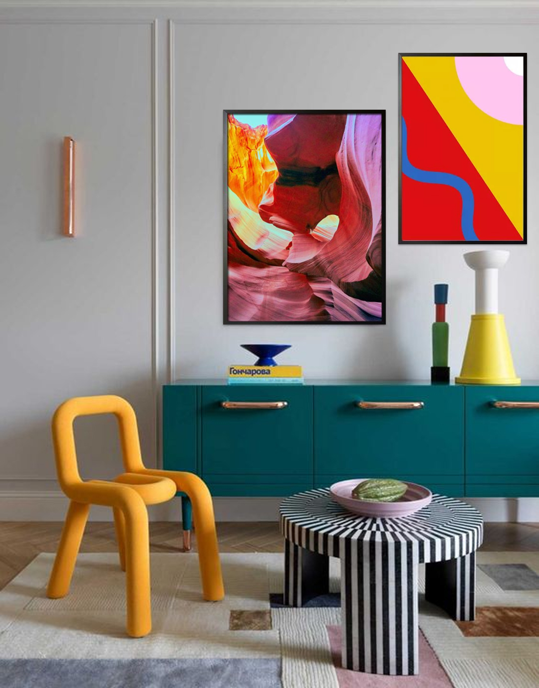
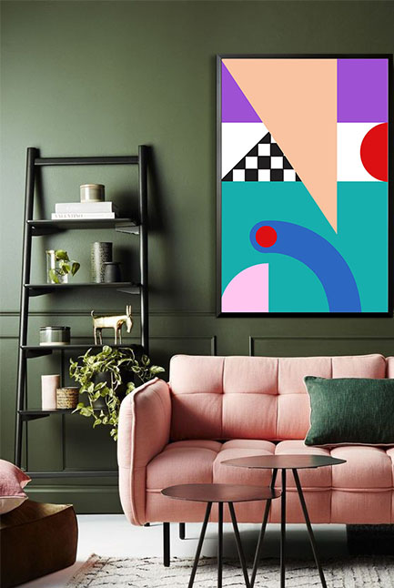
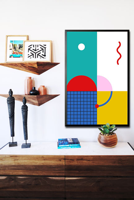
Create a focal point

Your poster can be the statement of your room as long as they are displayed properly. Choose a large poster for a more impressive look on your wall. This can already be the focal point as long as the other decorative items are simple and muted. 

Movie posters

Still not decided what poster design to add to the walls of your entertainment room? Make it look and feel like a real movie theater with posters of your favorite movies. Look for posters of the same size and arrange them in a layout of your choice. These posters can create interesting wall art and can likewise be a cool topic when your friends visit you. 
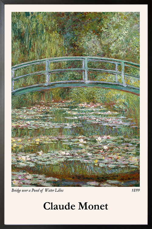
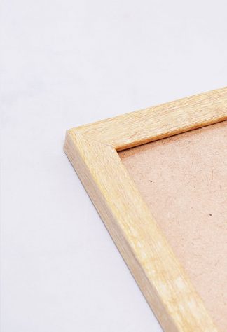
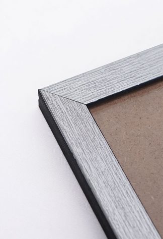
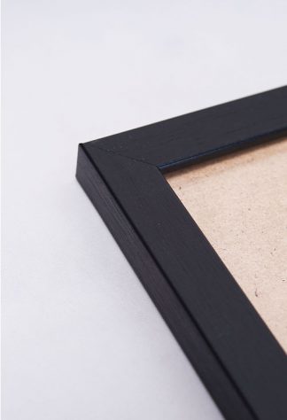
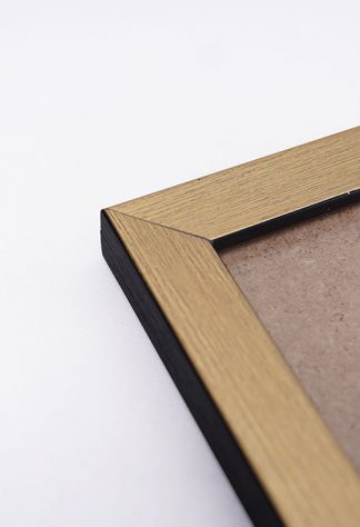
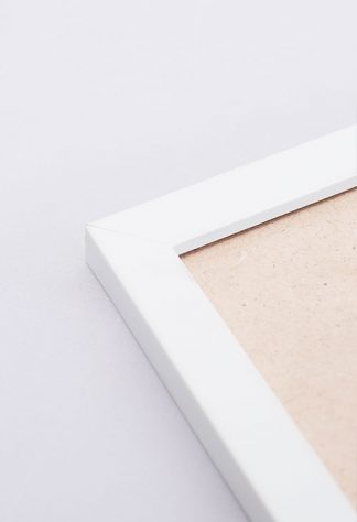
Frame your prints

Want to make your posters look elegant? Add a frame as this can transform the appearance of your poster. There are different frames available and you can go with black or white-colored frames. 

Collage them

If you are looking for a fun and exciting way to boost your wall appearance, then create a poster collage. Simply collect all the posters that you love and arrange them in a layout that will cover a part of your wall or even the entire wall. 

Be creative in displaying your prints

There are many ways to display posters aside from using frames or just by sticking them on the walls. Be creative and use different materials such as wooden hangers. These hangers make the posters look more polished and easy to hang. 

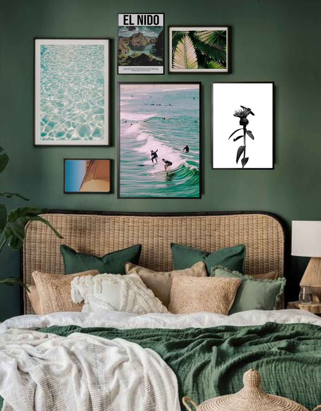
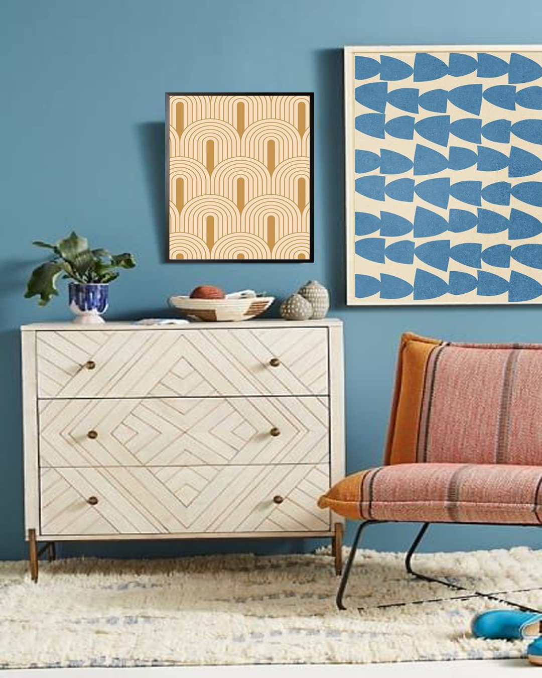
Create an Eclectic wall gallery

Since there are different sizes of posters, they are great for making a wall gallery. You can start with your favorite poster design and then layer in more posters with similar colors but different sizes. 

Minimalist look

The trend these days is to go minimal. This interior design style evokes a comfortable and cozy feel. You can still decorate the walls with posters and still evoke the simplicity you love. 

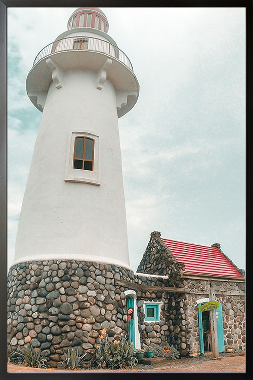
Give your home a touch of nature

Bring the outdoor in with nature-themed posters. Time to bring green into your home even if you do not have indoor plants. Nature-themed prints will easily add a touch of nature and will help create a cool and refreshing vibe. 

Final Thoughts

Decorating with posters is simply amazing. There is no question about what they can do to your walls. There are tons of designs and themes to choose from and they can easily make your wall look appealing and interesting.

Choose The Right Color Scheme For Your Home

Art wall 247

Adding colors to your home make it look more personal. Choosing the right color scheme is vital when decorating your home. Of course, at first, choosing and adding colors to your home may be a difficult task. But with some help from experts, and even inspiration from various websites or magazines, you will be able to achieve the appearance that you love. Read on to learn more about colors and how they can personalize your space. 

The colors we know

Many of us have been taught that colors come in different varieties. This includes primary, secondary, and tertiary colors. The primary colors are red, blue, and yellow. These colors are considered to be pure. Secondary colors are orange, green, and violet, and these are created by mixing two primary colors. For instance, blue and yellow give green. While tertiary colors are combinations of primary and secondary colors in different proportions. 

Create your color scheme

To create the right color scheme for your interior, it is recommended to use the color wheel. There are four types of colors schemes:

  • Monochrome – this color scheme uses the hues of the same color with the application of black and white to lighten or darken the tinge. 
  • Analogous – the color scheme makes use of neighboring colors from the color wheel. Yellow is used in combination with green or orange while blue will go with green or violet. As a result, you will be able to create a color scheme that can be soothing and dynamic.
  • Contrasting – this color scheme is brighter and a triad of contrasting colors may be applied: yellow-orange, yellow-blue, red-violet. These color combinations make any space look bright and exciting. 
  • Complementary – this color scheme makes use of two opposite colors such as orange and blue to create a bold palette. 

Expats recommend not to add colors to the wall immediately. Colors of paint can easily be found while matching furniture can be difficult. It is best to choose and add the furniture pieces and decorative items, then proceed with adding colors to the walls. It is common for homeowners to add neutral colors to the walls as they are the safest to use to whatever colors the furniture and decorative items have.

The impact of colors on your home

Colors are known to have significant effects on the interior of any space. In general, colors are categorized into two: cool and warm colors. Warm colors are known to be stimulating while cool colors are relaxing and calming. Check out the colors below and the effects they evoke in your home interior. 

  • White – the color is usually associated with pureness and hygiene. It is known to reflect sunlight making any room appear lighter and expanding the space. Small rooms are recommended to use white, especially where light is scarce. 
  • Black – never use this color in a dark room as things may get gloomy. Use the color only in well-lit areas.
  • Gray – it is calm and neutral but can be dull and boring. Do not use gray as the main color of your room. If you want, you can use lighter shades of gray and they can be a good color for a background. 
  • Red – this is a stimulating color and promotes activity. It is recommended to use the color for entryways, living rooms, dining rooms, and kitchens. However, avoid using the color in the bedroom as well as the nursery.
  • Yellow – this color is known to stimulate the learning process and develop intellect. This is the reason why yellow is highly recommended in the nursery.
  • Orange – though less stimulating than red, orange contributes to better communication and harmonization of relationships. Use this color in the living room, dining room, or kitchen.
  • Brown – a neutral color and preferred to be used for furniture. It works best when paired with beige and peach colors.
  • Light blue – this shade of blue is calming and comforting. Use this color in the bedroom as it promotes a better quality of sleep. However, avoid shades of blue in the kitchen or dining room as it reduces appetite.
  • Violet – considered to be the most mysterious color. It has different hues and influences us in various ways. 
  • Green – this color has both warm and cold hues. Both hues are known to evoke different moods. Shades of green help people to concentrate and are ideal to be used in the kids’ room or study area. 

Wall decors to add colors to your space

Once you have decided on the color scheme to use, you can start planning what wall decor to add. Walls can be decorated with paintings, posters, photos, and others. They can be art installations or DIY decors. You can be creative and unleash your artistic side to create wall art that will take the center stage in your home.

Stunning Wall Accent You Can Do In Your Home

Art wall 244

Wall accents are always in trend and these days, they look and feel better. Try blending color, texture, and tone and be able to create a space that will change your life forever. With a little creativity and resourcefulness, you will be able to create a wall that can be the focal point of your room.

Paint the walls

Of course, the most common way to add life to your walls is by painting them. It is common to see walls with only one color of paint. However, think bolder and add style with stripes, circles, chevrons, or any design or pattern you prefer. All you need are some additional materials like painter’s tape, a pencil, and a level.

Use what already exists

Before finalizing your plan of adding accents on your walls, see if it already has any existing structure or decor. Some homes may have a fireplace present that needs to be dressed up. This can be done with colors, paneling, stonework, and others. 

Create a feature wall

Time to bring out all the photos you have kept over the years. May these be in the album or in your hard drive, they can be displayed to create a feature wall of memories. Have them in frames and arrange them in a layout that fits your taste. Not only that the photos are able to create a nostalgic atmosphere, but they will also look great as an accent to your walls. 

Patchwork

Fabric can be used to create a funky wall accent. What makes fabric perfect is that they come in different colors and are affordable. Choose a selection of coordinating fabrics and wrap them around sturdy cardboard or very thin wood or plastic squares. Stick them on the wall with the use of double-sided mounting tape. 

Cover with wallpaper

Wallpaper is one of the most common wall coverings that is used over the years. These days, wallpapers are easier to install and even easier to remove. This makes it one of the preferred wall coverings. 

Wall murals

Another impressive wall covering is wall murals. These are innovative wall decors and come with different designs or images. Just like wallpaper, wall murals are easy to install and will surely be loved by all members of your family. 

Posters

Posters are great! They are affordable and made from high-quality materials. You just have to choose the right shop to order since there are those that print art on not-so-good materials. There are also numerous designs to choose from and they can easily be matched with any interior design style that your space has. 

Tile your walls

Tiles were once thought to be used only in particular places like the bathroom and kitchen. Nowadays, tiles can accent almost any wall due to the wide range of styles and sizes available in the market. When used in the kitchen, tiles can be used as a backsplash along a wall and can be stretched to the ceiling. 

Stickers

Stickers are easy to install, yet some may be difficult to remove. Just like posters and wallpapers, stickers come in many designs. All you need is a little imagination and creativity to have compelling wall art.

Why the 80s Style Keeps Coming Back

Memphis art checkered and triangle poster in interior

It is a fact that the 80s design style is making a comeback. Many of us have witnessed the highlights of the decade and there are many good words to describe them. Technology may not be that advanced at that time, but life was enigmatic. Kids then were more engaged with physical activities. Music and films were also phenomenal. Of course, the styles then were remarkable. Though there are things that should be left behind, the 80s design style defies that catch-phrase. It keeps coming back and there are many good reasons why. 

History of the style of the 80s

It is no joke when you hear that the 80s design is synonymous with “bad taste”. In fact, there are many queer styles that emerged during the decade. But, just like any other thing, the 80s gave birth to extraordinary creativity and freedom of design. Although it is a period of experimentation and trials and errors, we can learn so much from the 80s. 

To make things more fun and exciting, the 80s design cradled some of the very diverse movements. For instance, the 80s design style was greatly influenced by art deco. The interior is seen with lots of mirrors, while the color palette is filled with soft colors and pastels. Furniture pieces were bold and heavy and can be overwhelming at first glance. 

The 80s also became popular because of Shabby Chic design style. Old items underwent upcycling to add a touch of elegance and sophistication. It is also common to see chintzes, antique chandeliers, skirted furniture, and creamy colors in the 80s. Though these were popular decades ago, they still remain famous up to this day. 

The most striking of all is the Memphis design since it is about the use of colors, patterns, and others. Many find this style bizarre, but it has elements that make it appealing and stimulating. 

How to achieve the 80s style

If you think that achieving the 80s design style is challenging and complicated, think again. You may already have some items needed to look like the 80s. Huge rooms, carpeted bathrooms, psychedelic colors, geometric patterns, and more. Some of these may have gone too soon but there are those that still hit the trend these days. 

The color scheme of the 80s

The color wheel plays an important role in interior design. When talking about the colors of the 80s, just think about the wildest and boldest color combination that you can imagine. At first, the dominant colors are pastels along with black and white, teal, and coral. The Memphis design introduced color blocking with primary colors

Patterns and graphic design

Geometric patterns are common in the 80s design style. Other styles that are recognizable are animal prints and doodles. Be sure that these are colorful and funky.

Color blocking

Color blocking is the mixing of two to three bold and contradictory colors. As a result, bold statements are created. 

Mix and match

80s interior design style is not about being subtle and classic. It is about decorating your home to your heart’s content. Sometimes decorating the interior means matching the patterns on your furniture, rugs, dress, and others. Think about being unusual and bold. 

Happy decorating!

Facts About The Water Lilies of Claude Monet

Water Lilies poster

Claude Monet was a French painter and the founder of Impressionist painting which is known to have great influences on modernism. He expressed the philosophy of Impressionism through his paintings of nature and the outdoor. As an Impressionist artist, one should have a wide understanding of the effects of light on the local color of objects and the effects of colors with each other. He made light the focus of his paintings. Oftentimes, he would complete a painting in one sitting and demonstrated how light altered color and perception of reality. 

The water lily series

Monet mainly used his garden in London as his subject. Included are the water lilies, their pond, and bridge. The Water Lilies was a significant moment in the life and career of Claude Monet. It involves a huge number of paintings and drawings from around the garden of the artist. The series has captured the beauty, fragility, and radiance of nature. There are 250 individual paintings that were created during the last 30 years of his life. 

By viewing the series, one can see the subtle changes that take place in the natural world as well as the artist. This makes the Water Lilies series popular and unique. The paintings show the passage of time, the aging process, and the impermanence of light. Many people have scrutinized his works, yet they still became influential to other styles and forms. Here are some facts about the series that you will find interesting.

  • Water Lilies and the Starry Night by Vincent van Gogh are the most iconic images of Impressionism.
  • The first series (25 canvases) of Water Lilies was exhibited at the Galerie Durand-Ruel in 1900. Nine years later, the second series with forty-eight canvases were exhibited. He considered his Water Lily series as an obsession that he kept on working with them until his old age. 
  • Monet focused more on the surface of the water. The sky or land was included only as reflections. 
  • The water lilies were planted by Monet before he painted them. He arranged his property in Giverny as though it were a huge painting and later said that his finest masterpiece was his garden. 
  • One of the loyal supporters of Monet, Prime Minister Clemenceau, urged the artist to work on a larger project. The project was for a set of large canvases depicting water lilies that would be displayed together. 
  • At the age of eighty-two, Monet discovered that he has a cataract and scared the artist. Monet then wrote, “I realized with terror that I could see nothing with my right eye. A specialist… told me that I had a cataract and that the other eye was also slightly affected. It’s in vain that they tell me it’s not serious, that after the operation I will see as before, I’m very disturbed and anxious.” He was operated on thrice in 1923 to correct his eye. The reds and yellows of the Water Lilies indicate that the sight of Monet has been impaired. However, the combination of colors and light created an emotive effect. 
  • The series opened the path to abstract painting. His works have greatly influenced the world of art. He set a precedent for later artists, particularly the Post-impressionist, Expressionist, and abstract-expressionist movements. 
  • The Water Lilies Series in the Orangerie, Paris is the last series that Claude Monet worked on before he died. 

The Lighthouses of Batanes

Behind Breathtaking Batanes poster

The Philippines is rich in natural resources and tourist destinations. Batanes is one of the favorite travel destinations in the world. Some of the famous landmarks of Batanes are its lighthouses. There are several lighthouses known to exist in the province. All of them are important functionally as well as to the tourism industry of the country. Read on to learn more about these colossal landmarks.

Facts about lighthouses

Lighthouses have been in existence since ancient times. A little trivia that is good to know. IN fact, the first known lighthouse was the Pharos of Alexandria, Egypt. This was constructed by Ptolemy I and his son Ptolemy II in 300 and 280 BC. This was one of the Seven Wonders of the Ancient World. Eventually, this was destroyed by natural disasters and wars. 

A lighthouse is a tower with a bright light on the top. Its main purpose is to help sailors in locating dangerous areas and likewise serves as a navigational aid that helps to keep ships and boats safe. A lighthouse station is usually composed of the lighthouse, the keeper’s house, and other structures. 

Batanes – a paradise worth visiting

The country is known for a number of tourist destinations and Batanes is on the top of the list. Batanes was shaped by nature millions of years ago. It is well-known for its rugged and scenic views. Green, rolling pastures, orange sunsets, crisp, clean art are some of the things that you will experience in the province. 

If you want to experience fresh, clean air and a peaceful vibe, then Batanes is the place to visit. These are also the reasons why many local and foreign travelers go to the province. It is known for its rock formations, impressive lighthouses, and wild horses that freely roam in the vast pasture. 

Batanes lighthouses

There are a lot of good things to say about lighthouses. By just staring at them, you can see that they are full of charm and enigma. What makes them more appealing is that they always have the best view. Especially those that stand in the hills of Batanes. These structures are often visited by tourists and photographs of them have been used for various reasons. 

Now, Batanes has three existing lighthouses and are quite similar in many ways. These structures are part of a project that was headed by Rep. Abad in the early 2000s. They were erected to guide seafarers across dangerous waters of the Pacific Ocean and the West Philippines Sea. Interestingly, these lighthouses also act as tourist attractions. The three are all capped with a red-painted concrete lantern room with narrow storm panes. The main tower is made of rubble masonry. 

Basco Lighthouse

This lighthouse was first lit in 2003 and the first to be completed. Basco Lighthouse is located in Naidi Hills where the old telegraph facility was during the American era. The lighthouse is white in color and crowned with a red lantern room. It is a 6-story structure allowing a majestic view of the West Philippine Sea, Mt. Iraya, and the Basco Town Proper.

Tayid Lighthouse

Tayid lighthouse was erected on a hill on Batan Island. Just like its counterpart in Basco, it is also capped with a red lantern room and roof. The base bears rubble masonry, similar to the other lighthouses of Batanes. Tayid faces the Pacific Ocean and can be seen from Marlboro Country and Diura Fishing Village. 

Sabtang Lighthouse

It stands on a cliff just beside the port. This lighthouse is the first man-made structure that you will see while you are on approach Sabtang island. It is a round tower with a rubble masonry finish all the way to the gallery deck. This gives the lighthouse an organic appeal. It also has a red lantern room, just like the other lighthouses mentioned earlier. 

Art wall 221

Art wall 221

Add depth and detail to your walls with colors and patterns. The effect will put a smile on anyone’s face. Make your room comfy and charming that will be adored by your family and friends.

Number of posters: 2

Behind Breathtaking Batanes poster

Behind Breathtaking Batanes poster

The lighthouse of Basco, Batanes is one of the famous landmarks in the Philippines, Admire the majestic structure as it guides travelers and seafarers. An impressive photo captured by Michelle Quezon.

The Impressionism

Bridge over a Pond of Water Lilies poster

Impressionism was a movement that started in the late 1800s. It was mainly focused on painters of Paris and rebelled against classical subject matter and embraced modernity. The artworks usually feature how light could define a moment in time, with color providing definition instead of the usual black lines. As such, painters of the movement practiced painting outside. This style has long been embraced as one of the most popular and influential art styles in Western history. 

The origin of Impressionism

The movement was formed in the 1860s when a group of painters including Claude Monet, Alfred Sisley, and Pierre-Auguste Renoir pursued painting outside together. These artists discovered that they shared an interest in painting landscape and contemporary life rather than historical or mythological scenes. They often used countryside scenes as their subject in their artworks. 

One of the key personalities of Impressionism was Edouard Manet. He is known for his early influence on and close friendships with the members of the movement. The movement adopted many of the techniques of Manet especially his embrace of modernity as subject matter and the spontaneity of his brushstrokes, together with the use of color and lighting. 

The movement was formally announced in 1874 in a show that was hosted by the Paris photography studio of Felix Nadar. The name Impressionist was based on one of the paintings of Claude Monet, Impression, Sunrise. 

Claude Monet

Claude Monet was the leader of the Impressionist movement. His works were known for their brief brush strokes and fragmented color application. These made their way into the works of others. Monet was very much interested in the passage of time in his portrayal of light. These are seen in his series of paintings capturing Rouen Cathedral at different times of the day and year. His knowledge and skills in Impressionism were further enhanced with his series of paintings of the waterlily pond. 

Pierre-August Renoir

Renoir was regarded as one of the leaders of the Impressionist movement. He likewise shared the interests of Claude Monet but mostly preferred to capture artificial light in places like dance halls and directed his studies of the effects of light on figures, especially the female form. Renoir also preferred “everyday life” as his subject matter. 

Final Thoughts

Impressionism is one of the most important movements in the history of modern painting. Artists of the movement tried to put on canvas the impression of how a landscape, thing, or person appeared to them at a certain moment in time. This meant that artists used lighter and looser brushwork than traditional painters. These styles pushed the emergence of modern art as well as the philosophy of the avant-garde.

Styles That You Have Loved In The 80s

Memphis art white sun in turqouise poster in interior

Take a walk down memory lane and see how beautiful the styles that are popular even in films are. You probably have used them in your home for years until other trends have come along. These days, the styles of the 80s are making a comeback and are being used in many homes, offices, restaurants, and other establishments. Read on to know more about the styles that many people have loved over the years. 

Chintz

Chintz is a printed cotton fabric with a glazed finish and multicolored patterns. It was originally used for upholstery, curtains, and clothing. These days, chintz refers to the floral patterns seen in fabric and other decorative materials, such as wallpaper. It is common to see designs and patterns such as nature, flowers, and leaves. 

Pastels

Pastel colors belong to a pale family of colors that are described to have high value and low saturation. The colors of this family are considered to be soothing. The most commonly used pastels are pink, mauve, baby blue, mint green, peach, periwinkle, and lavender. 

Country Style

Country interior style is any design that appears casual and cozy. The overall appearance eludes the feeling of simple country life. It includes color palettes that are bright along with pastel colors. In addition to these, the colors should also be able to blend perfectly with other design elements like vintage wares and second-hand accessories.

Verdigris

Verdigris is a green or bluish patina that forms on copper, brass, or bronze surfaces that is exposed to air for long periods of time. It consists mainly of copper sulfate. 

Open Kitchens

The open kitchen is a remarkable design for homes that are small. The absence of barriers or doors allows spaces to flow into each other. This design makes the home look more spacious than it is. The good thing about open kitchen design is that it also keeps the family in touch by integrating meal preparation with nearby activities like watching television in the family room. 

Memphis-Inspired Design

The Memphis Design is one of the most popular styles ever created. It is known for the use of bright neon, primary and pastel colors, geometric shapes, and bold, repetitive patterns, such as black and white stripes. 

Preppy

Preppy interior design showcases genteel mix patterns. Plaid is the traditional pattern of preppy style, but not the only one. Think about stripes, houndstooth, herringbone, and gingham checks mix to create a curated look that is anything but stuffy. 

Shabby Chic

Shabby Chic is defined as having a soft, relaxed, romantic style that appears cozy and inviting. The design style usually is related to females, On the other hand, masculine shabby chic appears to be rusty, along with deeper or richer colors. Other decorative items that may be used to achieve the design style are rustic furniture, unfinished wood, denim, burlap, sailcloth, and homespun. 

Japanese Zen

Soothing and spiritual, Japanese-inspired design was a popular trend in the 80s. Zen refers to meditation and has become a popular principle for interior designers. The design style focuses on creating balance, harmony, and feelings of relaxation through a minimalist approach.